| Main index | Placemat software on GitHub | About author |
Julian D. A. Wiseman
Publication history: only at www.jdawiseman.com/papers/placemat/placemats_list.html. Usual disclaimer and copyright terms apply. Also see the main feature, the program that makes the placemats.
Contents: Top; Introduction; ≥2028; 2027; ’26; ’25; ’24; ’23; ’22; ’21; ’20; ’19; ’18; ’17; ’16; ’15; ’14; ’13; ’12; ’11; ’10; ’09; ’08; ’07; 2003–’06; ≤2002; Grace.
This is a list of the placemats made with the placemats software. It contains all, or almost all, the placemats made by the software’s author, and an incomplete set of those made by others. If you are willing to have yours added to this list, please do send a link.
Some observations about the software and my use of it.
Functionality has changed over the versions. Mostly, that has been the addition of page types and of settings. Less often, functionality has been removed, either because it was unreliable, or was too difficult to maintain, or was thought that it somehow didn’t fit, or was ugly. Sometimes, there has been, within functionality, a change of constants such as spacing between items, line widths, shades of grey. Hence the code’s backward compatibility is good but not total.
My style has shifted.
In early placemats the Titles were very heavy and black, with the mistaken objective of them being readable through the liquid.
Then the patterning become stronger and more varied. But the varied patterning made it more difficult to compare colours.
More white behind the liquid makes the colour easier to perceive, done by /InlineTitlesMaxNumberContours 1 def, since Aug 2014 this look being frequent—in Feb 2025 there being some discussion of details.
Hence the modern preference for this light consistency.
Indeed, this can be said more strongly. Some of the designs are so cluttered, so dominated by decorative gaudiness, that they are awful. Even though some designs are good, I’m not proud of all of them.
Despite which, a little playfulness is still good. Do play.
The software and its user-written parameters are in PostScript (wikipedia, PLRM3), and the code has many places that enable, indeed encourage, code injection. The user has access to the code’s internal parameters, and to the full power of the PostScript programming language. It is almost certain that I use this more than other users of the software.
Most of the placemats in this list were made with earlier versions of the software, and some required expert use of the program’s features. Not all can be precisely replicated with the current software; not all the others can be precisely replicated by those new to the software. But the manual is a big help: see GitHub.com/jdaw1/placemat/, and the code extracts in this page.
There has been a brief discussion about this page.
Some of the placemats are shown as small bitmaps, typically at 50% scale. These bitmaps were not consistently generated. A black 0.24pt line appears in some as faint gray (“Apple Quartz PDF Importer”); in others as a black pixel (“dynapdf Importer”). If it matters, inspect the PDF. If it really matters, inspect a printout of a relevant page of the PDF.
◊ Sun 23 Apr 2051 2011 Horizontal Planning www.jdawiseman.com/2051/20510423_2011s.pdf
PostScript source, in case I should become, ahem, permanently unavailable.
◊ Tue 29 Dec 2026 In-Law Invasion Zombie Escape Planning www.jdawiseman.com/2026/20261229_zombies.pdf
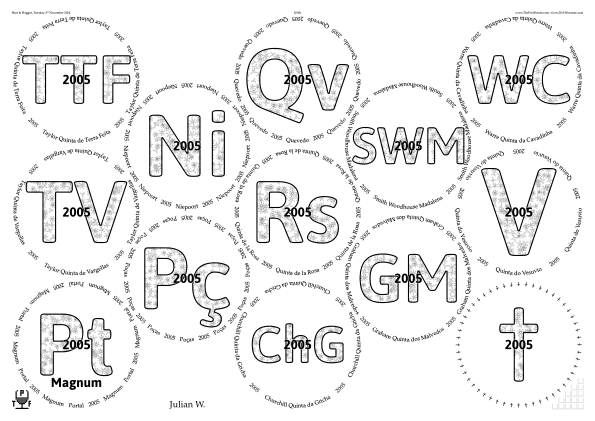
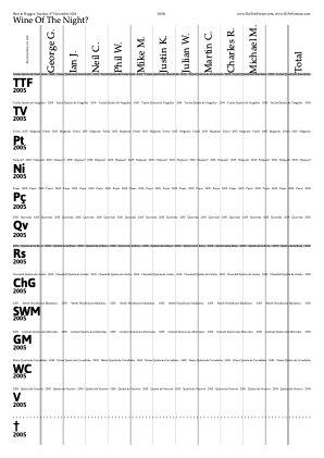
◊ Tue 03 Nov 2026 2005s Planning www.jdawiseman.com/2026/20261103_2005s.pdf
◊ Tue 09 June 2026 Ramos Pinto Planning www.jdawiseman.com/2026/20260609_Ramos_Pinto.pdf


Somewhat echoing the style of the placemats at the previous Ramos Pinto vertical on 21st October 2014.
Drafting these revealed a peculiar bug in the software when distilled by GhostScript, as described in issue 174,
“1 setgray ≉ 0.99999997 setgray”, in which the problem is described and fixed but not understood. Help would be welcomed, but is not expected.
◊ Tue 05 May 2026 SW + GC + QH: Triple Vertical Planning www.jdawiseman.com/2026/20260505_SW_GC_QH.pdf


% Organisation info on log page.
% Integers near "length" and "get"
% depend on PortData's structure.
/PrefaceCode
{ [
	(\nBottles with bringer:\n)
	PortData  % An array of arrays
	{
		dup length 7 ge
		{
			dup 3 get exch ( )  exch
			dup 0 get exch (  ) exch
			6 get (\n)
		} {pop} ifelse  % length 7 ge
	} forall  % PortData

	(\nBottles without: )
	PortData  % An array of arrays
	{
		dup length 7 lt
		{
			dup 3 get exch 0 get (; )
		} {pop} ifelse  % length 7 lt
	} forall  % PortData
	(; ) ne {
		(:-\)  All bottles assigned.)
	} {(.)} ifelse  % (; ) ne

	(\n\n)
] ASCIIfy OutputToLog} def
To make the house names and years appear as two-line text on the vote-recorder sheets, /VoteRecorderSubtitleFontSizeProportionTitles 1 def.
This parameter had the default value 0.5 from introduction in June 2010 until late 2011, thereafter /Automatic, which is the lesser of ½ and the sub-titles fitting snugly.
Only once before has VoteRecorderSubtitleFontSizeProportionTitles been changed from its default value, on 17th March 2016, then to 0.4.
◊ Thu 23 Apr 2026 2011s Review Planning www.jdawiseman.com/2026/20260423_2011s.pdf


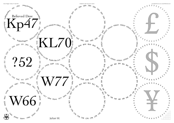
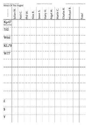
◊ Tue 21 Apr 2026 Elizabeth II’s 100th Review Planning Food www.jdawiseman.com/2026/20260421_Elizabeth2_100.pdf
The design echoes that of Elizabeth II becomes the UK’s longest-reigning Monarch and of Victoria’s 200th.
◊ Tue 14 Apr 2026 ’60 @ 66 Planning www.jdawiseman.com/2026/20260414_1960s.pdf
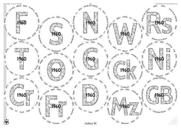
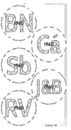

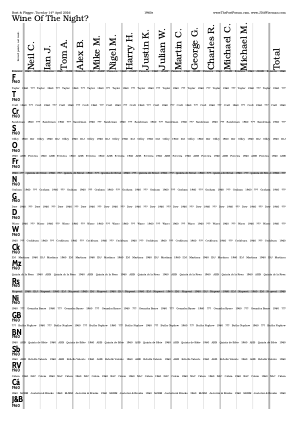
% Formatting as for 66 @ 60 on 17 March 2026.

/JandB
[
	(J)
	{
		/OrigFontSize CurrentFontSizeY def
		/SprScrptAmpsd OrigFontSize 0.18 mul def
		CurrentFontName OrigFontSize 2 div selectfont
		0 SprScrptAmpsd rmoveto
	}  (&)  {
		SprScrptAmpsd 5 div SprScrptAmpsd neg rmoveto
		CurrentFontName OrigFontSize selectfont
		currentdict /SprScrptAmpsd undef
		currentdict /OrigFontSize undef
	}
	(B)
] bind def  % JandB
◊ Thu 19 Mar 2026 Ferreira in New Jersey Planning: ThePortForum, FTLoP www.jdawiseman.com/2026/20260319_Ferreira_NewJersey.pdf
Made by Mike J. W., there having been discussion in the software thread.
◊ Tue 17 Mar 2026 ’66 @ 60 Planning www.jdawiseman.com/2026/20260317_1966s.pdf
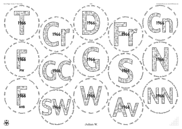
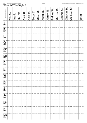
% Formatting reused for 60 @ 66 on 14 April 2026.

/TitlesFont /CabinCondensed-Bold def

/BelowtitleMaxFontSizeProportionTitles 0.125 def
/OvertitleMaxFontSizeProportionTitles  0.2 def
/FontSizesSetsAboveBelowOver [ 0 1 2 ] def

/InlineTitlesBlackWidth 1.44 def
/InlineStrokePreformatting {1 setlinejoin  0 setgray} def

/ShapesInTitles true def
/ShapesInOvertitles  false def
/ShapesInBelowtitles false def
/ShapesToUse [ /Star ] def
/ShapesTitlesStroke {0 setgray stroke} def
/ShapesTitlesFill
{
	ShapesIntX 2 mul ShapesIntY 3 mul add WithinTitles add
	5555 add 5 mod   0.04 mul 0.8 add setgray fill
} bind def  % /ShapesTitlesFill
/ShapesAverageSeparation 15 def
/ShapesEnclosingCircleRadiusMin 6 def
/ShapesEnclosingCircleRadiusMax 8 def
Observed bug, described in issue 173, believed dodged as of 21st March 2026.
/TitlesFont       /OpenSans-Condensed-Bold def
/CirclearraysFont /Bookman-Light           def

% While testing fonts, some were missing /fi ligature. This
% automated ligature usage. Mutatis mutandis, re-usable for
% "Offley", "Quinta do Bomfim", "Skeffington", "Fortified".
/PaxtonWhitfield {currentfont /CharStrings get /fi known
	{[(Paxton & Whit) /fi (eld)]}
	{(Paxton & Whitfield)}
ifelse} bind def  % /PaxtonWhitfield

% aShape, bShape, cShape used in Titles, Circlearrays, etc
/aShape {
	/EffectiveNumCharacters 1 def
	3 dict begin
	{currentpoint} stopped {0 0 2 copy moveto} if
	/Y exch def  /X exch def  /FS2 CurrentFontSizeY 2 div def
	% Observe (45 - ArcTan(0.8))*2 ~= 12.68 degrees ~= 90/7.1.
	FS2 0.8 mul  FS2            2 copy   0           FS2 2 mul   rcurveto
	FS2          FS2 -0.8 mul   2 copy   FS2 2 mul   0           rcurveto
	FS2 -0.8 mul FS2 neg        2 copy   0           FS2 -2 mul  rcurveto
	FS2 neg      FS2 0.8 mul    2 copy   FS2 -2 mul  0           rcurveto
	closepath   gsave 1 setgray fill grestore
	clipsave clip  1.44 setlinewidth  0 setgray stroke  cliprestore
	X FS2 2 mul add  Y  moveto
	end
} def  % /aShape, not bind'd

/StarPaint {
	/EffectiveNumCharacters 1 def
	2 dict begin
	/Step exch def   /NumPoints exch def
	/Left /Bottom CurrentFontSizeY /Height 0 NumPoints Step false true Star
	gsave 1 setgray fill grestore
	clipsave clip 1.44 setlinewidth 0 setgray stroke cliprestore
	dup /RightX get exch /BottomY get moveto
	end
} def  % /StarPaint, not bind'd

/bShape { 8  3  StarPaint} def
/cShape {12  5  StarPaint} def

/VerticalMiddlingTitlesAlwaysMatchNone [
	/dagger /daggerdbl ($) /dollar /sterling /Euro /yen
	/aShape load   /bShape load   /cShape load
] def  % /VerticalMiddlingTitlesAlwaysMatchNone, not bind'd

/TitleMaxHeightProportionInnerRadius 1.3 def

/PackingStyles [
	[ /RectangularDislocation  /OnlyIfSheetNumMax 0  ]
	[ /RectangularDislocation  /OnlyIfSheetNumMin 1  /Mirror ]
] def  % /PackingStyles

% Reaches into Winedata array of arrays.
/CrossHatchingInside {Winedata WithinTitles get 0 get /Port     eq} def
/CrossHatchingTitles {Winedata WithinTitles get 0 get /Sparkles eq} def

/CrossHatchingCentreX {
	NumSheets SheetNum add 2 mod 1 eq {/Left} {/Right} ifelse
} bind def  % /CrossHatchingCentreX

/CrossHatchingCentreY {
	% Meaning =   SN    WP    X|Y;     'SheetNum' is constant.
	GlassPositions 1 get 0 get 1 get
	GlassPositions 1 get 2 get 1 get  add 2 div
} bind def  % /CrossHatchingCentreY
◊ Wed 25 Feb 2026 Somethings Planning Food www.jdawiseman.com/2026/20260225_Somethings.pdf


Names were assigned to the shapes:
= ‘four’,
= ‘eight’, and
= ‘twelve’.
On the day, not preferred to the usual currency markers =
/sterling ($) /yen /Euro, because the very large (Titles) and the small (Circlearrays) needed different ratios between stroke width and font size, which made too inconsistent the optical effect on the printout.
And there was equivalent difficulty in choosing the stroke-widths in the little SVGs near the start of this paragraph.
◊ Tue 10 Feb 2026 Fonseca 1948–’97 Planning www.jdawiseman.com/2026/20260210_Fonseca.pdf


/FontSizesTitlesNotSmallerIfTitlesNotLonger true def
/OvertitleMaxFontSizeProportionTitles 0.133333 def

/TitlesFont       /ClearSans-Bold def
/CirclearraysFont /DroidSerif     def

/InlineTitles false def

/ColourSchemeTitles /MidGrey def  % /MidGrey /Black

/ShapesInTitles true def
/ShapesInOvertitles  false def
/ShapesToUse [ /Flower ] def
A faint echo of the placemat style used for the small Fonseca vertical on 13th June 2009. Fonts: /ClearSans-Bold and /DroidSerif, which worked well.
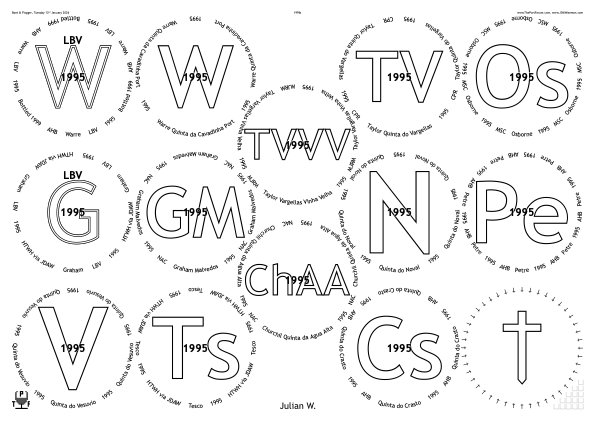
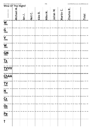
◊ Tue 13 Jan 2026 1995s Review Planning www.jdawiseman.com/2026/20260113_1995s.pdf

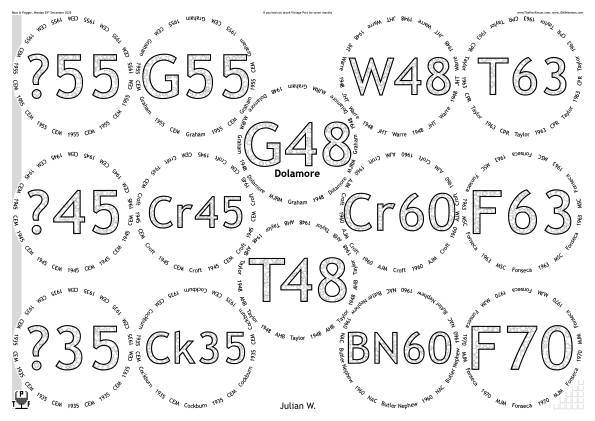
◊ Mon 29 Dec 2025 Seven Months Without (aka Zombie Invasion, aka In-Law Invasion) Planning Food www.jdawiseman.com/2025/20251229_SevenMonths.pdf

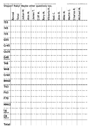
◊ Thu 11 Dec 2025 Unknown Shipper and His Peculiar Friends Planning www.jdawiseman.com/2025/20251211_White_Horse.pdf
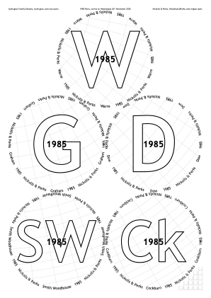
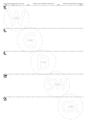
◊ Wed 26 Nov 2025 Nickolls & Perks, Symington 1985s Notice Tickets www.jdawiseman.com/2025/20251126_1985s_NickollsPerks.pdf
Wine merchant Nickolls & Perks’ online tasting of Symington Family Estates’ 1985s. This placemat was sent to N&P in early October: it might be used by them; it might be that we’ll have to print our own.
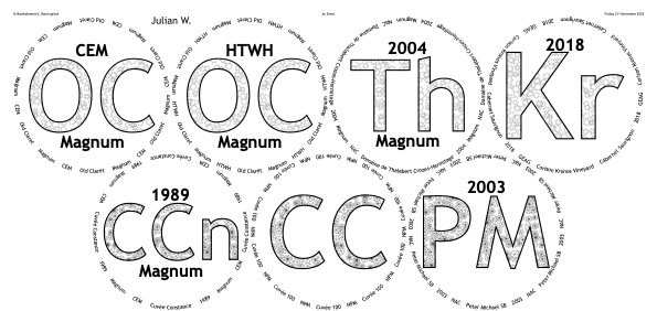
◊ Fri 21 Nov 2025 An Event, Buntingford www.jdawiseman.com/2025/20251121_Buntingford.pdf
Two sheets of trimmed /A3.
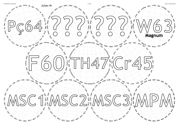
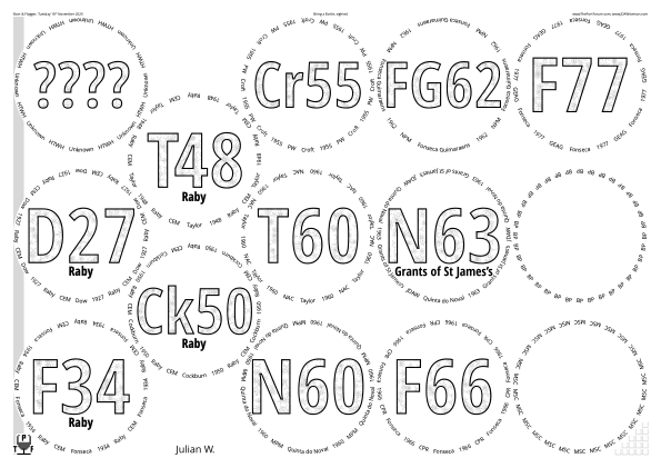
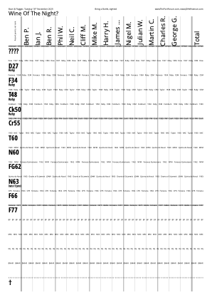
◊ Tue 18 Nov 2025 Bring a Bottle, sighted Review Planning Food www.jdawiseman.com/2025/20251118_sighted.pdf
Fonts:
/TitlesFont /OpenSansCondensed-Bold def
/CirclearraysFont /OpenSans-Regular def
/BelowtitlesFont /OpenSans-SemiBold def

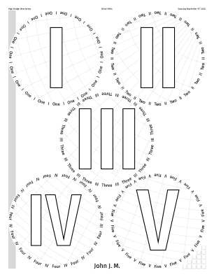
◊ Sat 15 Nov 2025 Blind 1995s in New Jersey Reviews: TPF, FTLoP ‘Planning’ www.jdawiseman.com/2025/20251115_Blind_1995s.pdf
Fonts: /TitlesFont /FiraSansExtraCondensed-SemiBold def
/CirclearraysFont /FiraSans-Regular def
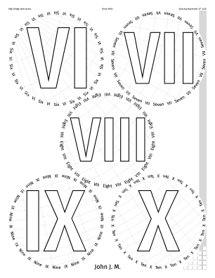
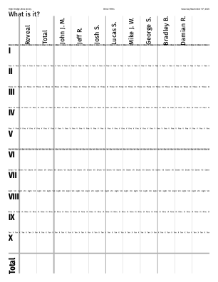
◊ Thu 13 Nov 2025 Heritage Bed & Breakfast, near Weymouth www.jdawiseman.com/2025/20251113_Heritage_LargeFormats.pdf
This typewriter style of placemats is, in effect, a lightly mocking parody of the usual style. Nonetheless, its old‑school typewriterness has a pleasing creaky charm. It was heralded in the not‑placemats for the non‑tasting not in August 1997.
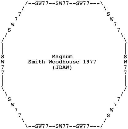
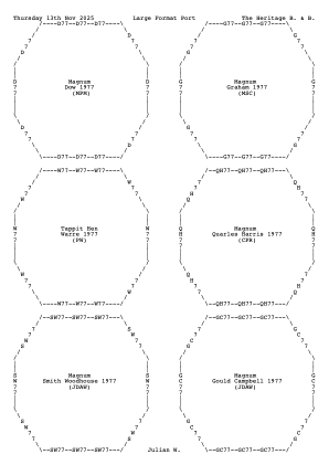
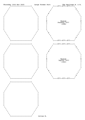
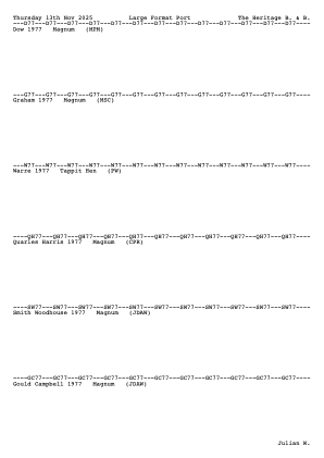
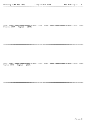
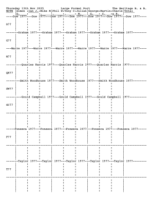
But then not used. :‑( The placemats were neatly laid out in the Wine Room; but we failed to rise from the dinner table, there informally re‑using glasses.
◊ Tue 28 Oct 2025 The pheonix lives on: Blind Bring a Bottle Planning www.jdawiseman.com/2025/20251028_Pheonix.pdf
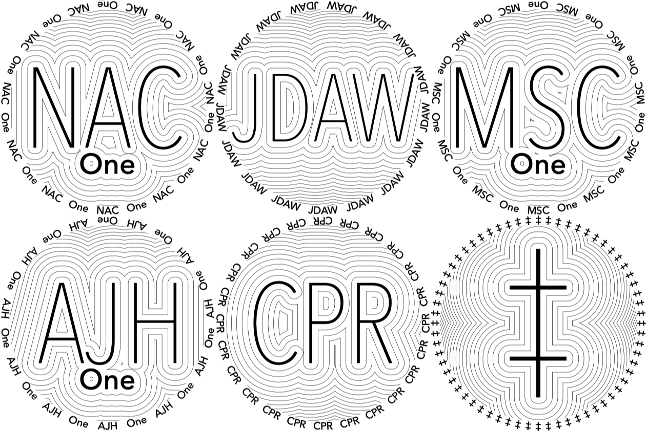
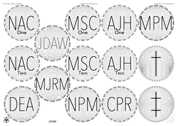
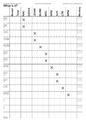
Inspired by those of 01 Feb 2010: “The visual effect is cool, but not necessarily appropriate for a port tasting.”
Fonts: /TitlesFont /AvenirNextCondensed-UltraLight def
/CirclearraysFont /AvenirNext-Medium def
/BelowtitlesFont CirclearraysFont def
◊ Mon 13 Oct 2025 Old Taylor Planning www.jdawiseman.com/2025/20251013_Taylor.pdf


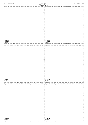
Extracts from the code for the placemats:
/TitlesFont       /TrebuchetMS-Bold def
/CirclearraysFont /TrebuchetMS      def
/OvertitlesFont   /LiberateBold     def
/SubtitlesFont    {TitlesFont}      def

/VoteRecorderIncludeGuessing false def

/InlineTitlesMaxNumberContours 3 def

/ExclusionAnnulusProportionInnerRadiusTitlesAboveBelow 0.02 def

/Droplets true def
/DropletsCharges [  % Length a multiple of 4
	/All  [ 0  4]  -1     0  % SheetNum Location Charge Spin.
	/All  [ 9 13]   1  -300
] def  % DropletsCharges
/DropletsPathLength 7 def
/DropletsAverageSeparation 30 def
Extracts from the code for the custom images in the TN threads:
/TestingSuppressPageTypes [
	/TastingNotes 0  /VoteRecorder 0  /DecantingNotes 0
	/Accounts 0  /CorkDisplay 0  /NeckTags 0  /PrePour 0
	/PlaceName 0  /DecanterLabels 0  /BottleWrap 0
	/OneCircle 0  /StickyLabels 0  /DistillerLog
] def  % /TestingSuppressPageTypes

/PaintBackgroundCode
{
	/Glasses TypeOfPagesBeingRendered eq
	{
		gsave
		GlassPositions SheetNum get NameNum get aload pop
		Radii SheetNum get
		0  360  /m  ArcAccurate  clip
		<<  % PLRM3, table 4.11 on p262; and table 4.14 on p268
			/ShadingType 3
			/ColorSpace /DeviceRGB
			/Coords [
				GlassPositions SheetNum get NameNum get aload pop  0
				3 copy pop   Radii SheetNum get
			]  % /Coords
			/Domain [ 0 1 ]
			/Function <<  % PLRM3, table 3.12 on p108
				/FunctionType 2
				/Domain [ 0 1 ]
				/Range  [ 0 1  0 1  0 1 ]
				/Order  1
				/C0 [ 1   1   1   ]
				/C1 [ 0.5 0.5 1   ]  % Not convinced this optimal.
				/N  5                % Not convinced this optimal.
			>>  % /Function
		>> shfill
		grestore
	} if  % /Glasses
} bind def  % /PaintBackgroundCode

/PageLabelOverride true def
/PageLabelOverrideWith {[          % So GraphicConverter names
	(20251013_Taylor_g0_)           % PNGs correctly, without
	TitlesTastingNotes NameNum get  % human copy-paste errors.
]} def  % /PageLabelOverrideWith

/Names [
	(Alex B.)   15 1 sub {dup} repeat  % Number of circles
] def  % /Names
The special custom images are in the TN threads: 1878, ’84, ’90, ’96, 1900, ’08, ’12, ’17, ’20, ’24, ’27, ’35, ’42, ’45, ’48.
◊ Thu 02–Fri 03 Oct 2025 1970s Review (first of each flight: 0:A, 1:QH, 2:TV, 3:Mz, 4:RP) Planning: Thu, Fri www.jdawiseman.com/2025/20251003_1970s.pdf
Extracts from the code:
/FillTextPedantry /Sensible def
/FillTextAngle {SheetNum 2 mod 2 mul 1 sub  20  mul} bind def  % 70 from vertical

/PaperType {SheetNum 0 eq {/A2} {/A3} ifelse} bind def

/HeadersLeft [
	 0  [(Boot & Flogger, Thursday 2) {SuperscriptOn} (nd) {SuperscriptOff} ( October 2025)]
	 1  [(Boot & Flogger, Friday 3)   {SuperscriptOn} (rd) {SuperscriptOff} ( October 2025)]
	10  3 index
	11  3 index
	15  [
		(Boot & Flogger, 2) {SuperscriptOn} (nd) {SuperscriptOff}
		/endash (3) {SuperscriptOn} (rd) {SuperscriptOff} ( October 2025)
	]
] def  % /HeadersLeft
/HeadersCenter [
	 0  (1970s: Flight 0)
	 1  (1970s: Flight 1)
	 2  (1970s: Flight 2)
	 3  (1970s: Flight 3)
	 4  (1970s: Flight 4)
	10  (1970s: Flight 0)
	11  (1970s: Flight 1)
	12  (1970s: Flight 2)
	13  (1970s: Flight 3)
	14  (1970s: Flight 4)
	15  (1970s)
] def  % /HeadersCenter
/PageOrderingSections [
	  0  ()      1 index  (Thu 2 Oct, flight 0, glasses)
	  1  ()      1 index  (Fri 3 Oct, flight 1, glasses)
	  2  ()      1 index  (Fri 3 Oct, flight 2, glasses)
	  3  ()      1 index  (Fri 3 Oct, flight 3, glasses)
	  4  ()      1 index  (Fri 3 Oct, flight 4, glasses)
	 10  ()      1 index  (Thu 2 Oct, flight 0, TNs etc)
	 11  ()      1 index  (Fri 3 Oct, flight 1, TNs etc)
	 12  ()      1 index  (Fri 3 Oct, flight 2, TNs etc)
	 13  ()      1 index  (Fri 3 Oct, flight 3, TNs etc)
	 14  ()      1 index  (Fri 3 Oct, flight 4, TNs etc)
	100  ()      1 index  (General stuff)
] def  % /PageOrderingSections

/PageOrderingGlasses [ 0  1  2  3  4 ] def
/PageOrderingTastingNotePages [
	0 1 GlassesOnSheets length 1 sub {
		dup 10 add exch GlassesOnSheets exch get length 6 div ceiling cvi 1 sub {dup} repeat
	} for  % TNSheetNum
] def  % /PageOrderingTastingNotePages
/PageOrderingPrePourPages [ PageOrderingGlasses {10 add} forall ] def

/PageEdgingEdges [  [/Left /Right]  PageOrderingGlasses length 1 sub {dup} repeat ] def

/PackingStyles [
	[ /Array  /GlassesNumMin 10  /GlassesNumMax 10  /Positions
		      [1 2 3 2 ] [3 2] [5 2 3 2]
		[0 1 3 1] [2 1 3 1] [4 1 3 1] [6 1 3 1]
		      [1 0 3 0 ] [3 0] [5 0 3 0]
	]
	[ /Array  /GlassesNumMin 21  /GlassesNumMax 21  /Positions
		   [1 3] [3 3] [5 3] [7 3] [9 3]
		[0 2] [2 2] [4 2] [6 2] [8 2] [10 2]
		   [1 1] [3 1]       [7 1] [9 1]
		[0 0] [2 0] [4 0] [6 0] [8 0] [10 0]
	]
	[ /SquareGrid  /GlassesNumMin 9  /GlassesNumMax 9
		/HorizontalAlignment /Centre  /VerticalAlignment /Top
		/RowsNumMin 3  /RowsNumMax 3
	]
] def  % /PackingStyles

/OuterGlassesMarginB
{
	0
	1 {
		21  GlassesOnSheets SheetNum get length  le
		{
			pop
			420 360 mul 127 div 54 sub  % A2 usable height, in points
			594 360 mul 127 div 48 sub  % A2 usable width, in points
			12 div                      % Radius
			3 sqrt 3 mul 2 add  mul  sub
			exit
		} if  % 21 or 22
	} repeat  % 1
} bind def  % /OuterGlassesMarginB

/ShrinkRadii [ 0  99 99 99 99 ] def

/GlassesClusteredOnCorkDisplay [   GlassesOnSheets { [ exch ] } forall   ] def
/PageOrderingCorkDisplay [ 10    11 12 13 14 ] def
In October 2025 PackingStyles’s sub-parameter /GlassesNumMin
was renamed to /OnlyIfGlassesNumMin, and likewise …Max.
At 557 the largest number of pages ever in a placemat document, the previous record holder (435 pages) having been the 1963 horizontal in October 2013, third place (272 pages) being the Fonseca Guimaraens vertical in April 2011, fourth place (227 pages) being the Sandeman vertical in May 2011, then fifth (223 pages), sixth (222), and seventh (217).
In the OneCircle GIF animation the flights are indicated by background colour, using the default value of the new parameter OneCircleBackgroundPaintCode.
Of course, in the actual placemats all the backgrounds are white, for both PDF and printed.

Weird bug never before seen: the pre-pour pages printed smaller in the central third of a portrait A4, as if the printer software failed to rotate, scaled to fit unrotated, and centred. This bug is described in issue 173, and believed dodged as of 21st March 2026.
◊ Tue 16 Sep 2025 Martin’s Mystery Evening Planning Food www.jdawiseman.com/2025/20250916_Mystery.pdf
Fonts:
/TitlesFont /RobotoCondensed-Bold def
/CirclearraysFont /Roboto-Regular def


◊ Sat 02 Aug 2025 In Elton www.jdawiseman.com/2025/20250802_Elton.pdf
◊ Mon 21 July 2025 1975s at Fifty Planning www.jdawiseman.com/2025/20250721_1975s.pdf


◊ Tue 01 July 2025 1955s Review Planning www.jdawiseman.com/2025/20250701_1955s.pdf


◊ Sat 07 June 2025 LBVs, Nineteen Eighties and Nineties Planning www.jdawiseman.com/2025/20250607_LBVs.pdf
At the Watchung Valley Golf Club, NJ 07069‑6267 ⟹ American paper sizes: /Tabloid = 17″×11″ and /USL = US Letter = 8½″×11″.


◊ Tue 27 May 2025 1985s at Forty Review Planning www.jdawiseman.com/2025/20250527_1985s.pdf


◊ Thu 08 May 2025 1945s, Eighty Years After VE Day Review Planning www.jdawiseman.com/2025/20250508_1945s_VE_day.pdf
Echoing style of placemats from Sat 09 May 2015.


/BackgroundTextsFont /TrebuchetMS-Bold def
/CircletextFont /Baskerville def
/TitlesFont {
	TypeOfPagesBeingRendered dup
	/TastingNotes eq exch
	/CorkDisplay  eq   or
		{CircletextFont}
		{BackgroundTextsFont}
	ifelse  % TN | CD
} def  % /TitlesFont
◊ Mon 14 Apr 2025 Emergency Review Planning www.jdawiseman.com/2025/20250414_Emergency.pdf


/PageEdgingPaintCode {0.75 setgray fill} bind def
◊ Thu 03 Apr 2025 BFT Masterclasses www.jdawiseman.com/2025/20250403_BFT_Blandy.pdf www.jdawiseman.com/2025/20250403_BFT_SPW.pdf www.jdawiseman.com/2025/20250403_BFT_Taylor_VinteVinteChocolate.pdf
The Big Fortified Tasting is an annual trade fair for fortified wine. The 2025 show was held on Thursday 3rd April 2025 at Church House, Westminster SW1P 3NZ. Such trade fairs typically include some masterclasses: at BFT 2025 including Blandy’s, Unconventional Madeira; Moscatel de Setúbal: Terroir vs House Style — the Winemaker’s Perspective; and Taylor’s Port Wine and Chocolate — A match made in heaven (who brought their own placemats).
Adding bitmaps to placemats in PostScript is fiddly. But, as described in the manual, it can be done. Those not wanting that fiddliness could choose to do it as a manual post-process, perhaps with a program such as Illustrator.


◊ Wed 02 Apr 2025 Pre-BFT, 1955–’66 Planning www.jdawiseman.com/2025/20250402_pre_BFT.pdf


◊ Tue 18 Mar 2025 2003s Review Planning www.jdawiseman.com/2025/20250318_2003s.pdf


◊ Mon 10 Mar 2025 1970s www.jdawiseman.com/2025/20250310_1970s.pdf
The WhatsApp arrangement thread specified “free-pour, no placemats”: hence these spoof placemats.
◊ Wed 05 Mar 2025 Emergency: nineteen-eighties, or not nineteen-eighties Food Planning www.jdawiseman.com/2025/20250305_Emergency.pdf


◊ Wed 19 Feb 2025 Niche interest and old reliables Review Planning www.jdawiseman.com/2025/20250219_niche.pdf
First use of PageEdging, as discussed in issue 169, Grey edge to Glasses sheets.


◊ Mon 10 Feb 2025 2000s Review Planning www.jdawiseman.com/2025/20250210_2000s.pdf
There was discussion of the values of InlineTitlesMaxNumberContours (new preferred value = 1) and InlineTitlesBlackWidth (2.16 rather than 1.44), resulting in the new parameter /InlineStrokePreformatting {0 setlinejoin} bind def, the value embedded in code previously having been 1.


◊ Thu 16 Jan 2025 Bordeaux in Southwark www.jdawiseman.com/2025/20250116_Bordeaux_2005.pdf
◊ Thu 12 Dec 2024 TPF Xmas Tasting Review Planning www.jdawiseman.com/2024/20241212_White_Horse.pdf
◊ Sat 07 Dec 2024 Unicorn Ports www.jdawiseman.com/2024/20241207_Einhornprobe.pdf


◊ Tue 03 Dec 2024 2004 Wine Dinner www.jdawiseman.com/2024/20241203_2004.pdf


◊ Tue 19 Nov 2024 Peterborough Port Club chez The Port Forum www.jdawiseman.com/2024/20241119_PeterboroughPortClub.pdf
Echoing the FillTexts design used five years before for the joint tasting with both the March Porters and the Peterborough Port Club.


◊ Mon 18 Nov 2024 Bring a blind bottle Planning www.jdawiseman.com/2024/20241118_Blind.pdf


/TitlesFont {
	/Glasses TypeOfPagesBeingRendered eq
		{/GillSansMT-ExtCondensedBold}
		{/GillSans-CondensedBold}
	ifelse  % /Glasses
} def  % /TitlesFont
/NamesFont       /GillSans-Light def
/CircletextFont  /GillSansMT def
/AbovetitlesFont CircletextFont def
/OvertitlesFont  CircletextFont def
/SubtitlesFont   CircletextFont def
◊ Sat 16 Nov 2024 Graham in High Bridge, New Jersey www.jdawiseman.com/2024/20241116_Graham.pdf
Made for Big Love.
New Jersey is in the USA, hence /PaperType /USL def and /TastingNotesPaperType /USL def (because /USL = US Letter = 8½″×11″).


◊ Thu 14 – Fri 15 Nov 2024 Weymouth www.jdawiseman.com/2024/20241114_Weymouth.pdf
Non-default use of PageOrderingGlasses, PageOrderingTastingNotePages, PageOrderingVoteRecorder, PageOrderingCorkDisplay, GlassesClusteredOnCorkDisplay, GlassesClusteredOnVoteRecorders, and PageOrderingSections.
◊ Wed 23 Oct 2024 Blind Emergency for Rob Coombes (1961–’70) Planning www.jdawiseman.com/2024/20241023_RAYC.pdf
Harry included because, standing orders, Harry always to be included. Bottles: RAYC was Sandeman 1963; JDAW was Smith Woodhouse 1970 (chosen because in 2011 Rob C. had organised a triple‑vertical of GC + SW + QH); and † was Graham 1985.
The tasting-note section was made too cluttered by the blue noise of the Droplets.
Hence after this tasting the code was changed such that the default value of Droplets_SideBySide_UnderTNs became false.


/SideBySideGlassesTastingNotes true def
/TitlesFont     /AvenirNextCondensed-DemiBold def
/CircletextFont /AvenirNext-Regular           def

/FontSizesTitlesNotSmallerIfTitlesNotLonger true def

/Droplets true def
/DropletsCharges [
	/All  [ 0  2]    -2    0
	/All  {[GlassPositions SheetNum get 1 get 0 get  GlassPositions SheetNum get 0 get 1 get]}  1 -200
	/All  {[GlassPositions SheetNum get 1 get 0 get  GlassPositions SheetNum get 2 get 1 get]}  1  200
] def  % DropletsCharges
/DropletsProportionBackwards 1 99 div def
◊ Tue 15 Oct 2024 Chambolle-Musigny Dinner www.planetmeehan.com/dlfiles/241015/20241011_CM_dinner_2.pdf
Made by Mike Meehan.
The long TitlesVoteRecorder, not hitherto my style, worked well.

◊ 10–15 Oct 2024 Blanks for Portugal trip www.jdawiseman.com/2024/20241000_Portugal.pdf
General-purpose blanks, the Titles being Kerned I–XII, the Circlearrays containing these and the number words in English and Portuguese. But the Names, Headers…, and ExternalLinks are all blank.


◊ Tue 08 Oct 2024 1970s, Undisturbed and others Planning www.jdawiseman.com/2024/20241008_1970s.pdf


% Perhaps the first time that CirclearraysPrePour (because
% of CirclearraysTastingNotes) did not equal Circlearrays.
/CirclearraysTastingNotes [ Circlearrays {
	[ exch {
		dup (Rel. 2016) eq {pop (2016 Release)} if
	} forall ]
} forall ] def  % /CirclearraysTastingNotes

/CircletextsMinCopies 3 def
/CircletextFontSize 15 def

/TitlesFont /AvenirNextCondensed-DemiBold def

/ExclusionAnnulusProportionInnerRadiusTitlesAboveBelow 0.01 def

/InlineAbovetitles true def
/InlineBelowtitles true def
/InlineTitlesMaxNumberContours 2 def
/InlineAbovetitlesMaxNumberContours 1 def
/InlineBelowtitlesMaxNumberContours 1 def
/InlineAbovetitlesBlackWidth {InlineTitlesBlackWidth 1.5 div} def
/InlineBelowtitlesBlackWidth {InlineTitlesBlackWidth 1.5 div} def

/Droplets true def
/DropletsCharges [
	/All  [3  8]  -3    0
	/All  [1  5]   2  300
	/All  [9 13]   2  300
] def  % DropletsCharges

/PrePourReverseOrder false def
◊ Tue 01 Oct 2024 50-Year Tawnies Planning www.jdawiseman.com/2024/20241001_50y.pdf
Request: “Re style, "Fri 16 Apr 2010 Pre-Warre Exercises" , please” (below).


/TitlesFont     /HelveticaLTStd-BoldCond def
/CircletextFont /TimesNewRomanPS-BoldMT def
/NamesFont      /TimesNewRomanPSMT def

/TitleMaxHeightProportionInnerRadius 1.666666 def

/InlineTitlesMaxNumberContours 2 def
/InlineBelowtitles true def
/InlineBelowtitlesMaxNumberContours 1 def
◊ Tue 24 Sep 2024 Port to Celebrate Symmetry’s Tenth Anniversary Planning Food (menu) www.jdawiseman.com/2024/20240924_Symmetry.pdf
Also see Colleagues and Five Semi-Blind Ports, 10 May 2023.
There is a manual page about including bitmap images.
First use of FillTitles for 3⅓ years.


/TitlesFont      /Asap-Bold      def
/CircletextFont  /Cochin         def
/AbovetitlesFont /Cochin-Bold    def
/BelowtitlesFont AbovetitlesFont def
/OvertitlesFont  AbovetitlesFont def
/BackgroundTextsFont TitlesFont  def

/TitleMaxHeightProportionInnerRadius   1.333333 def
/BelowtitleMaxFontSizeProportionTitles 0.25     def
/OvertitleMaxFontSizeProportionTitles  0.333333 def

/FillTitles true def
/FillAbovetitles false def
/FillBelowtitles false def
/FillOvertitles  false def
/FillTexts [ (Symmetry) Titles length 1 sub {dup} repeat ] def
/FillTextMinFontSizeAbsolute 6.5 def
/FillTextMinFontSizeProportionLargestTitleAboveBelowOver 0 def
/FillTextPedantry /Fussy def  % /Quick, /Sensible, /Fussy

/BackgroundTextsGlasses true def
/BackgroundTextsGlassesTexts [
	[(1) {-0.51 VKern -0.159375 Kern} (4)]
	(S)  % Symmetry, this time not Sandeman.
] def  % /BackgroundTextsGlassesTexts
/BackgroundTextsOrientation /Portrait def
/BackgroundTextsAlignmentVertical /Bottom def
/BackgroundTextsDecanterLabels false def
◊ Thu 19 Sep 2024 George’s Madeira Evening www.jdawiseman.com/2024/20240919_Madeira.pdf


◊ Tue 10 Sep 2024 1982s Planning www.jdawiseman.com/2024/20240910_1982s.pdf
MSC: “excelled … I really like the background”, which was done by /CrossHatchingInside true def /CrossHatchingCentreX /Name def.
All fonts = /Neon80s.


◊ Mon 02 Sep 2024 Emergency at Hawksmoor Air Street Planning www.jdawiseman.com/2024/20240902_emergency.pdf


◊ Thu 22 Aug 2024 PFL — Crazy Like Harry Planning www.jdawiseman.com/2024/20240822_CrazyLikeHarry_v.pdf
1 srand
/RotationTABOC [ 30 WineData length 1 sub {rand 61 mod 30 sub  2 copy mul 0 gt {neg} if} repeat ] def
/RotationTitlesAboveBelowOverCirclearray {//RotationTABOC WithinTitles get} def
currentdict /RotationTABOC undef

/InlineTitles false def

/ColourSchemeOvertitles /MidGrey def  % /MidGrey /Black

/ShapesInTitles true def
/ShapesInAbovetitles false def
/ShapesInBelowtitles false def
/ShapesInOvertitles  false def
/ShapesToUse [ /Star ] def  % At least one of: /Flower /Star /Heart /Circle
/ShapesStarsPointsAndStepsArray [[3 1.31844] [4 1.79214] [5 2.27823] [6 2.77012] [7 3.26502] [8 3.76162] [9 4.25925]] def
/ShapesAverageSeparation 12 def
/ShapesTitlesStroke {} def
/ShapesTitlesClip false def


◊ Wed 14 Aug 2024 Port Younger than 1815, Blind Planning www.jdawiseman.com/2024/20240814_post1815.pdf


/TitlesFont     /TrebuchetMS-Bold def
/CircletextFont /TrebuchetMS      def
/NamesFont /DancingScript-Regular def

/Droplets true def
/DropletsCharges [
	/All  [1 2]  +1    0
	/All  [3 4]  +1  300
] def  % DropletsCharges
/DropletsPathLength        10 def
/DropletsAverageSeparation 30 def
◊ Sat 10 Aug 2024 In Elton www.jdawiseman.com/2024/20240810_Elton.pdf
◊ Mon 23 July 2024 1960/’63/’66 Matrix Planning Food www.jdawiseman.com/2024/20240723_SixtiesMatrix.pdf


◊ Mon 01 July 2024 Strawberry Fields Forever—Spot The Taylor Vertical Planning Food www.jdawiseman.com/2024/20240701_Strawberry_Fields.pdf


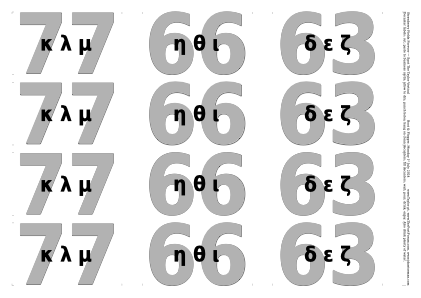
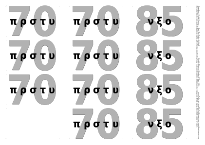
Decanter labels not used, as a different blinding technique was adopted.
◊ Tue 11 June 2024 1977s Planning www.jdawiseman.com/2024/20240611_1977s.pdf


◊ Sun 26 May 2024 E2 ≥ L14 Planning
The death of the Queen postponed this tasting until, at the earliest, Monday 27th December 2094.
Louis IV of France reigned for 72 years and 110 days. Elizabeth II acceded to the throne on 6th February 1952; which, plus 72 years, plus 110 days, is Sunday 26th May 2024.
◊ Thu 23 May 2024 LBVs, the ‘Young Turks’ Planning www.jdawiseman.com/2024/20240523_LBVs.pdf


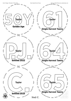
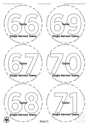
◊ Thu 16 May 2024 Taylor Single Harvest Tawny Planning www.jdawiseman.com/2024/20240516_Taylor_tawny.pdf
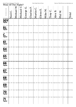
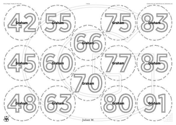
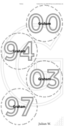
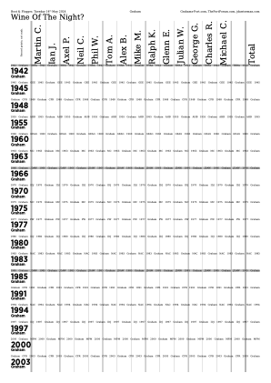
◊ Tue 14 May 2024 Graham Vertical Review Planning www.jdawiseman.com/2024/20240514_Graham.pdf
Fonts at their new default values: /TitlesFont /GothamNarrow-Bold def /CircletextFont /DejaVuSerif def.
◊ Tue 23 Apr 2024 BFT Masterclasses www.jdawiseman.com/2024/20240423_BFT_SPW.pdf
The Big Fortified Tasting is an annual trade fair for fortified wine. The 2024 show was held on Tuesday 23rd April 2024 at Church House, Westminster SW1P 3NZ. Such trade fairs typically include some masterclasses: at BFT 2024 including Moscatel de Setúbal, Terroir, Time & Innovation.
Adding bitmaps to placemats in PostScript is fiddly. But, as described in the manual, it can be done. Those not wanting that fiddliness could choose to do it as a manual post-process, perhaps with a program such as Illustrator.
Note to self: make placemats for all masterclasses, even those for which it is claimed to be unnecessary. There might hypothetically be ‘adminstrative issues’ with the placemats needed for some of the masterclasses.
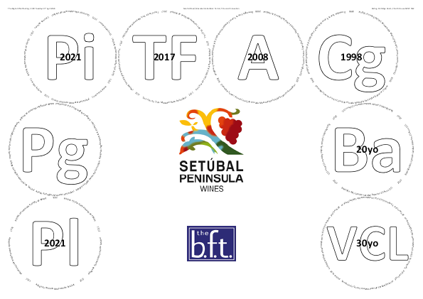
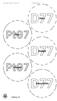
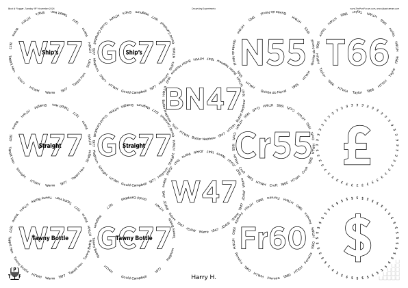
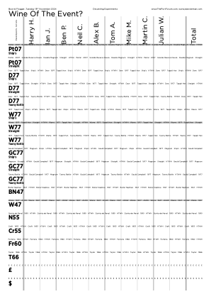
◊ Thu 11 Apr 2024 Decanting Experiment Review Planning www.jdawiseman.com/2024/20240411_Decanting_Experiment.pdf
/GlassesOnSheets [
	[ 5  1  Titles length 1 sub {} for ]
	[ 0 1 2 3 4 ]
] def  % /GlassesOnSheets

/PackingStyles [
	[ /RectangularDislocation  /GlassesNumMin 6 ]  % Not used

	[ /Diamonds                /GlassesNumMin 6 ]  % Not used

	[ /DiamondsAndRectangular  /GlassesNumMin 6 ]

	[ /Array
		/GlassesNumMin 5  /GlassesNumMax 5  /OnlyIfOrientation /Portrait
		/SuppressOrnamentsRight
		/Positions [0 3] [0 1] [1 4 0 4] [1 2 0 2] [1 0 0 0]
	]  % 5 glasses

	[ /Array
		/GlassesNumMin 4  /GlassesNumMax 4  /OnlyIfOrientation /Portrait
		/SuppressOrnamentsRight
		/Positions [0 3] [0 1] [1 2 0 2] [1 0 0 0]
	]  % 4 glasses, not used

	[ /LeftSide
		/GlassesNumMax 3  /OnlyIfOrientation /Portrait
		/SuppressOrnamentsRight /SuppressOrnamentsCentre
		/VerticalAlignment /Justify
	]  % <= 3 glasses, not used
] def  % /PackingStyles
In October 2025 PackingStyles’s sub-parameter /GlassesNumMin
was renamed to /OnlyIfGlassesNumMin, and likewise …Max.
From this event the two former sub-parameters /SuppressNonLeftOrnaments and /SuppressNonRightOrnaments split into three: /SuppressOrnamentsRight, /SuppressOrnamentsCentre (not used here), and /SuppressOrnamentsLeft (not used here). Also:
/LogThisExtra [
	(Distilled soon after upgrading macOS beyond the level at which Distiller Pro XI would work.\n)
	(Alas, ps2pdf, aka GhostScript, is unable to see most of the fonts on my system (help would be welcomed).\n)
	(So used pstopdf, aka PSNormalizer.framework, which alas seems to ignore `pdfmark`.\n)
	(Hence this PDF lacks a table of contents.)
] def  % /LogThisExtra
And, alas, per Apple’s announcement of 04 Dec 2023, even PSNormalizer.framework is dying (present up to macOS 13.6.6 = Ventura; removed from macOS 14 = Sonoma).
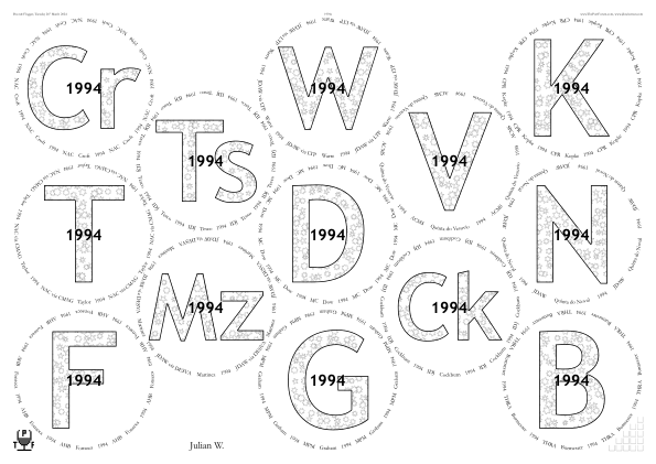
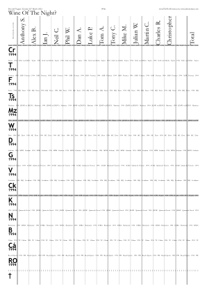
◊ Tue 26 Mar 2024 1994s Review Planning Food www.jdawiseman.com/2024/20240326_1994s.pdf


◊ Mon 11 Mar 2024 Blind Fun Planning Food www.jdawiseman.com/2024/20240311_Blind.pdf
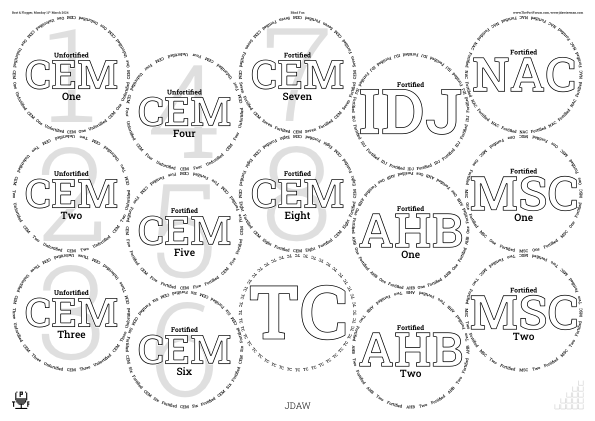
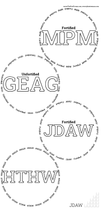
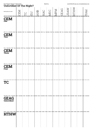
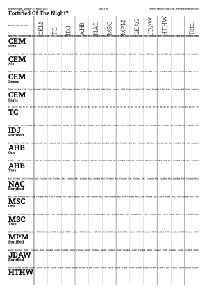
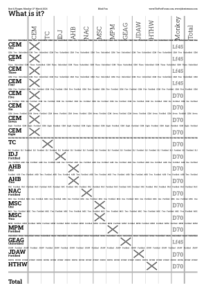
/Fortified [(Forti) /fi (ed)] def
/Unfortified [(Unforti) /fi (ed)] def
/JDAW [(JDA) {-0.08 Kern} (W)] def

/CorkDisplayNumCopies    0 def
/NeckTagsNumCopies       0 def
/DecanterLabelsNumCopies 0 def
/DecantingNotesNumCopies 0 def
/AccountsNumCopies       0 def

/GlassesOnSheets [
	[ 0  1  Circlearrays length 4 sub {} for ]
	[ Circlearrays length 3 sub  1   Circlearrays length 1 sub {} for ]
] def  % /GlassesOnSheets

/PackingStyles [
	[ /RectangularDislocation     /GlassesNumMin 4 ]
	[ /Diamonds                   /GlassesNumMin 4 ]
	[ /DiamondsAndRectangular     /GlassesNumMin 4 ]
	[ /RectangularAlternateNudge  /GlassesNumMin 4  /ImprovementPointsMin 2 ]
	[ /RightSide  /GlassesNumMax 3  /OnlyIfOrientation /Portrait  /VerticalAlignment /Justify  /SuppressNonRightOrnaments ]
	[ /Array
		/GlassesNumMin 4  /GlassesNumMax 4  /OnlyIfOrientation /Portrait  /SuppressNonRightOrnaments
		/Positions [1 3] [0 2  1 2] [1 1] [0 0  1 0]
	]
] def  % /PackingStyles

/VoteRecorderTopTexts [  % Must be same length as GlassesClusteredOnVoteRecorders, each sub-array containing some number of TopTexts
	[ [Unfortified ( Of The Night?)] ]
	[ [  Fortified ( Of The Night?)] ]
	[ (What is it?) ]  % If uncommenting this, insert a 'true' into the VoteRecorderShowTotalRow array.
] def  % /VoteRecorderTopTexts, Must be same length as GlassesClusteredOnVoteRecorders
/VoteRecorderShowTotalRow [ false false true ] def  % Same length as VoteRecorderTopTexts
/GlassesClusteredOnVoteRecorders [
	[ [ 0  1  Abovetitles length 1 sub {dup Abovetitles exch get   Fortified eq {pop} if} for  ] ]
	[ [ 0  1  Abovetitles length 1 sub {dup Abovetitles exch get Unfortified eq {pop} if} for  ] ]
	[
		[ 0  1  7 {} for  ]
		[ 8  1  Abovetitles length 4 sub {} for ]
		[ Abovetitles length 3 sub  1  Abovetitles length 1 sub {} for ]
	]
] def  % GlassesClusteredOnVoteRecorders

/CircletextFont      /RobotoSlab-Medium def
/TitlesFont          /RobotoSlab-Bold   def
/NamesFont           /RobotoSlab-Light  def
/AbovetitlesFont     TitlesFont         def
/BelowtitlesFont     CircletextFont     def

/AbovetitleMaxFontSizeProportionTitles 0.2 def

% Array of length 3, representing which of Abovetitles, Belowtitles, and Overtitles are considered together for font-size purposes
/FontSizesSetsAboveBelowOver [ 0 1 2 ] def

/InlineTitlesPrefillWhite true def

/VoteRecorderMonkeyVote {Abovetitles WithinTitles get Unfortified eq {(Lf45)} {(D70)} ifelse} def

/PaintBackgroundInsideGlassCircles  % 'Undertitles'
{
	(CEM)  Titles WithinTitles get  eq
	{
		/UndertitleFontSize where {pop}  % Compute this only once.
		{
			NamesFont 1000 selectfont
			/UndertitleFontSize   RadiiCirclearrayInside SheetNum get 2 mul
			0   [ (2) (7) ] {StringPathBBox 3 -1 roll sub dup mul 3 1 roll sub dup mul add  2 copy lt {exch} if pop} forall
			sqrt div 1000 mul def  % /UndertitleFontSize
			/UndertitleFontSizeLogged where {pop}
			{
				mark
					(## UndertitleFontSize = ) UndertitleFontSize (pt)
					( ~= Radii)               ( * ) UndertitleFontSize Radii                  SheetNum get       div
					( ~= RadiiCirclearrayInside * ) UndertitleFontSize RadiiCirclearrayInside SheetNum get       div
					( ~= TitleFontSizes[0])   ( * ) UndertitleFontSize TitleFontSizes         SheetNum get 0 get div
					(, ##\n## with UndertitleFont = ) NamesFont (. ##)
				ConcatenateToMark OutputToLog
				/UndertitleFontSizeLogged true def
				(PaintBackgroundInsideGlassCircles = ) /PaintBackgroundInsideGlassCircles load ToString Concatenate OutputToLog
			} ifelse  % /UndertitleFontSizeLogged where
		} ifelse  % /UndertitleFontSize where
		0.9 setgray   NamesFont UndertitleFontSize selectfont
		WithinTitles 1 add 1 string cvs
		dup StringPathBBox  3 -1 roll add -2 div 3 1 roll add -2 div exch moveto  show
	} if  % CEM
} bind def  % PaintBackgroundInsideGlassCircles
Effective April 2024, /SuppressNonRightOrnaments replaced with /SuppressOrnamentsLeft /SuppressOrnamentsCentre, there also being /SuppressOrnamentsRight.
In October 2025 PackingStyles’s sub-parameter /GlassesNumMin was renamed to /OnlyIfGlassesNumMin, and likewise …Max.
◊ Tue 05 Mar 2024 Aged LBVs Review Planning www.jdawiseman.com/2024/20240305_LBVs.pdf
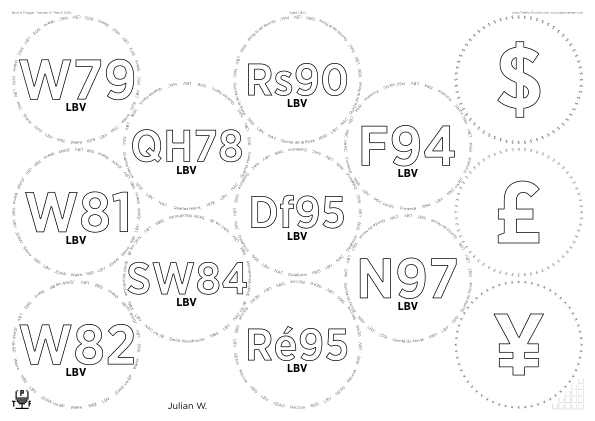
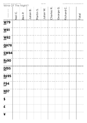
/TitlesFont     /GothamNarrow-Bold def
/CircletextFont /Gotham-Light      def
/NamesFont      /Gotham-Book       def
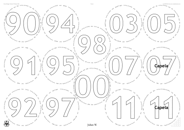
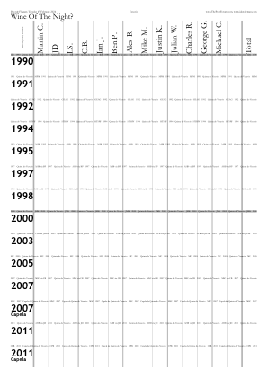
◊ Tue 06 Feb 2024 Quinta do Vesuvio Planning www.jdawiseman.com/2024/20240206_Vesuvio.pdf
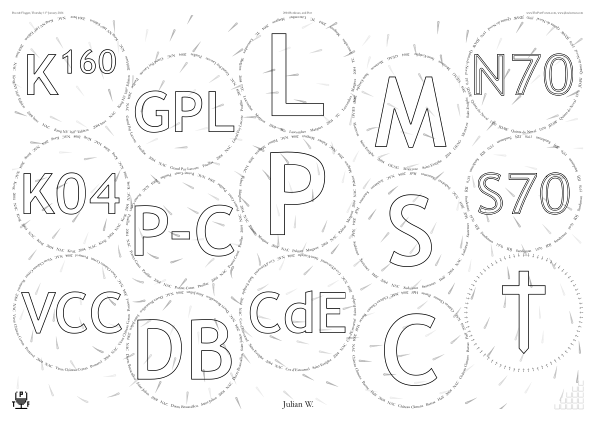
◊ Thu 11 Jan 2024 2004 Bordeaux at 20 Planning www.jdawiseman.com/2024/20240111_Bordeaux.pdf
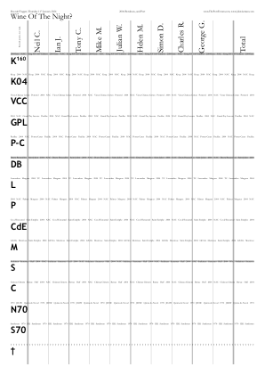
◊ Thu 28 Dec 2023 Blind from Sixties or Seventies or Eighties Planning Food www.jdawiseman.com/2023/20231228_blind.pdf
First use of VoteRecorderMonkeyVote, which had been added to the software for this tasting.
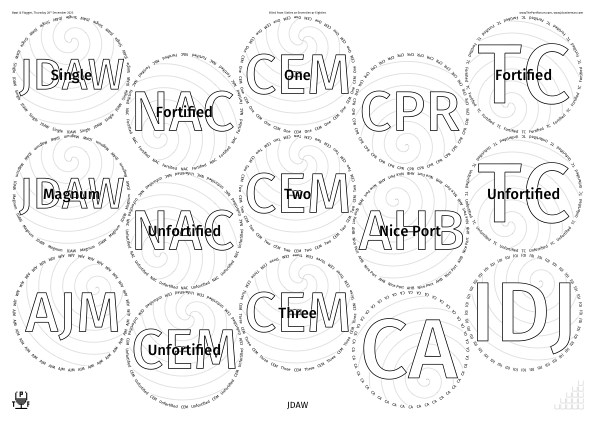
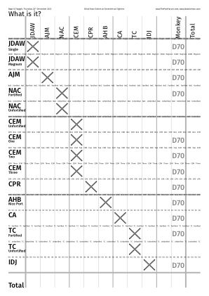
◊ Thu 14 Dec 2023 White Horse Planning www.jdawiseman.com/2023/20231214_White_Horse.pdf
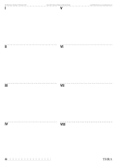
% If table likely to be very space-constrained, set to 2.
/TastingNotes_NumVerticalSections 2 def

% Most people can fit their TNs into an eighth of a page.
/GlassesOnSheetsMaxPerTNSheet 8 def
◊ Mon 04 Dec 2023 2003 Wine Dinner Planning www.jdawiseman.com/2023/20231204_2003s.pdf
Requested, “a different pattern for each of the wine groups”. Done, but not loved by me.
The Bordeaux radiating lines were done by the equivalent of /SpiralRadiusBetweenArms 2147483647 def.
Believed to be the first use of OutlineTitles since
26 Feb 2013 (prior to which
31 Jan 2012,
29 Dec 2010,
12 Oct 2010,
19 Apr 2010,
01 Feb 2010,
17 Dec 2009,
11–12 Sep 2009,
11 June 2009,
18 Apr 2009,
04 Jan 2009,
03 Jan 2009,
11 July 2008,
14 Feb 2008,
01 Jan 2008,
31 Oct 2007,
09 June 2007 — many of which were an aesthetic disaster).
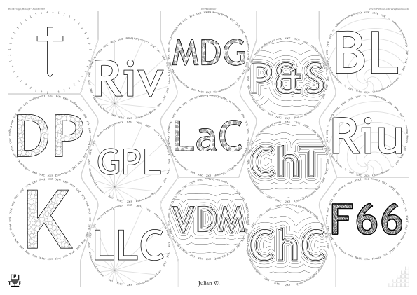
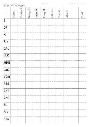
◊ 16–17 Nov 2023 1963s in Weymouth for Alex’s 60th www.jdawiseman.com/2023/20231116_Weymouth.pdf
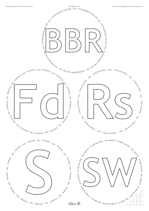
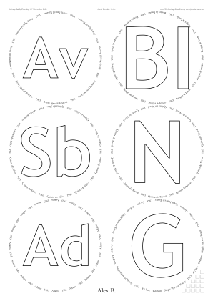
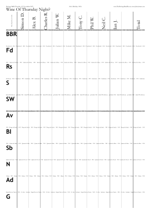
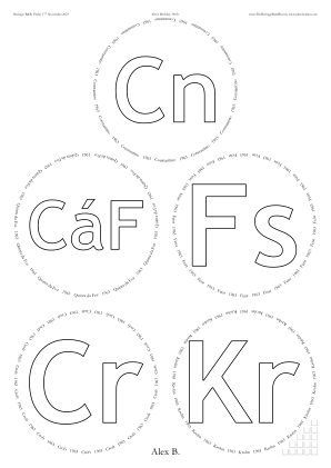
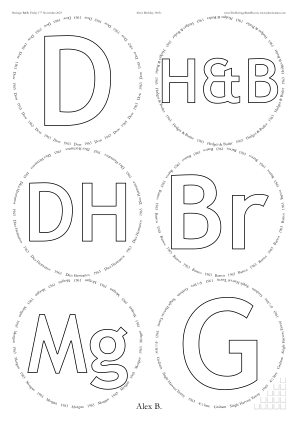
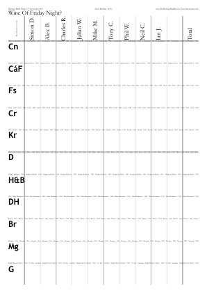
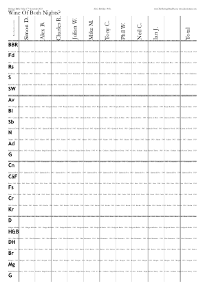
/PageOrderingSections [
	0  ()
	0  [/bullet ( Thu 16th Nov ) /quoteright (23)]
	10 ()
	10 [/bullet ( Fri 17th Nov ) /quoteright (23)]
] def  % /PageOrderingSections
/PageOrderingGlasses         [ 1 1  10 10 ] def
/PageOrderingTastingNotePages PageOrderingGlasses def
/PageOrderingVoteRecorder    [ 1    10 10 ] def
/PageOrderingCorkDisplay     [ 1    10    ] def
The first use of PageOrderingSections since Alex’s 50th birthday. And the Smith Woodhouse, was, again, 1966 (unsurprisingly because from same batch).
◊ Tue 07 Nov 2023 Croft Review Planning Food www.jdawiseman.com/2023/20231107_Croft.pdf
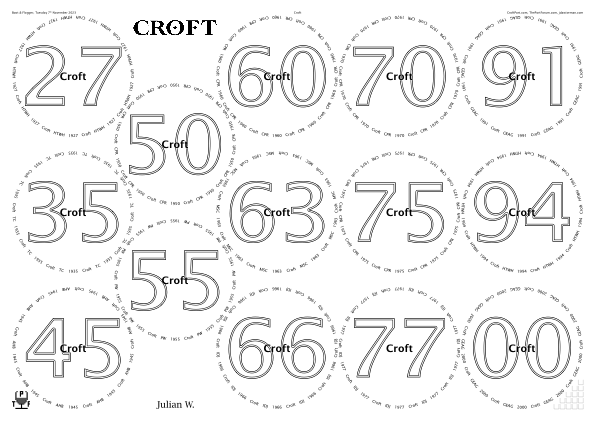

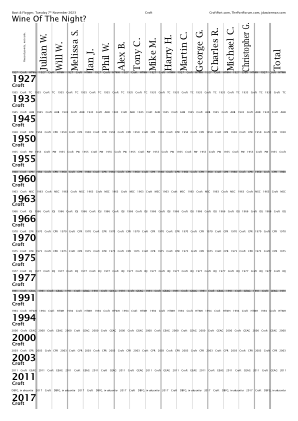
% Lucida used at the Croft verticals
% on 29 Oct 2014 and on 16 Jan 2012.
/TitlesFont     /LucidaSans-Demi def
/CircletextFont /LucidaSans      def
/NamesFont      /LucidaBright    def

/FontSizesRatioTitlesMin 999 def

/OvertitleMaxFontSizeProportionTitles 0.125 def

% Echoing Croft vertical on 29 Oct 2014.
/InlineTitlesMaxNumberContours 2 def
As described in issue #158, this layout of fourteen on A3 could theoretically be wiggled in various ugly ways, to slightly enlarge the circles.
◊ Tue 12 Sep 2023 1966s Review Planning www.jdawiseman.com/2023/20230912_1966s.pdf
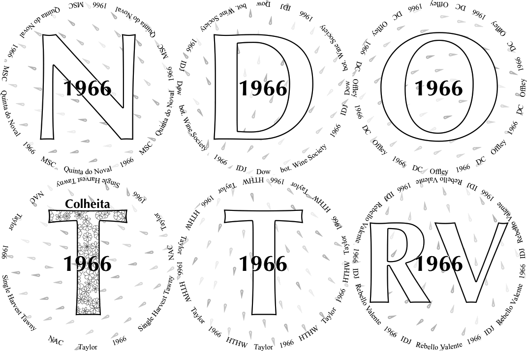
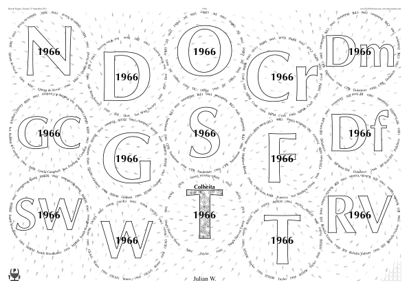
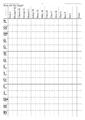
/TitlesFont     /Optima-Bold       def
/CircletextFont /TimesNewRomanPSMT def
/CircletextFontSize 10.28 def

/FontSizesSetsAboveBelowOver [ 0 1 2 ] def
/AbovetitleMaxFontSizeProportionTitles 0.08 def
/OvertitleMaxFontSizeProportionTitles  0.225 def
/TastingNotesTitlesFontSizeMax 14 def

/InlineTitlesPrefillWhite true def

/ShapesInTitles {(Colheita) Abovetitles WithinTitles get eq} def
/ShapesInAbovetitles false def
/ShapesInBelowtitles false def
/ShapesInOvertitles  false def
/ShapesToUse [ /Flower ] def

/Droplets true def
/DropletsPathLength 10 def
/DropletsAverageSeparation DropletsPathLength 3 mul def
/DropletsCharges [  % Length a multiple of 4
	/All  {GlassPositions SheetNum get 0 get  GlassPositions SheetNum get  4 get  {add 2 div} //false TwoArraysFunction}   1    {Radii SheetNum get}
	/All  {GlassPositions SheetNum get 7 get  GlassPositions SheetNum get 11 get  {add 2 div} //false TwoArraysFunction}   1    {Radii SheetNum get neg}
	/All  {GlassPositions SheetNum get 9 get  GlassPositions SheetNum get 13 get  {add 2 div} //false TwoArraysFunction}  -2    0
] def  % DropletsCharges
◊ Wed 30 Aug 2023 1948s www.jdawiseman.com/2023/20230830_1948s.pdf
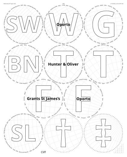
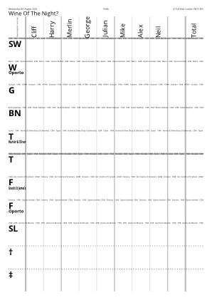
/PaperType /A3 def
/Orientation /Portrait def
/OuterGlassesMarginB
	420 360 mul 127 div 54 sub  % A3 - T,B margins
	297 360 mul 127 div 48 sub 6 div  % radius
	3 sqrt 2 mul 4 add  % Num radii going down
	mul sub  % = 77126 3 sqrt 33608 mul sub 127 div
def  % /OuterGlassesMarginB ~= 148.93887pt ~= 52.54mm

/TitlesFont     /OpenSans-Bold def
/CircletextFont /OpenSans-Regular def

/FontSizesTitlesEquivalences
	0 1 2
	0 2 2
	 2 2
	0 3 3
] def  /FontSizesTitlesEquivalences
/FontSizesRatioTitlesMin 1.1 def
/OvertitleMaxFontSizeProportionTitles 0.125 def

/CrossHatchingInside true def
/CrossHatchingCentreX {1 SheetNum sub PageWidth mul} def
/CrossHatchingCentreY {
	GlassPositions SheetNum get  7 get 1 get
	GlassPositions SheetNum get 10 get 1 get  add 2 div
} def  % /CrossHatchingCentreY

/TastingNotesTitlesFontSizeMax 14 def
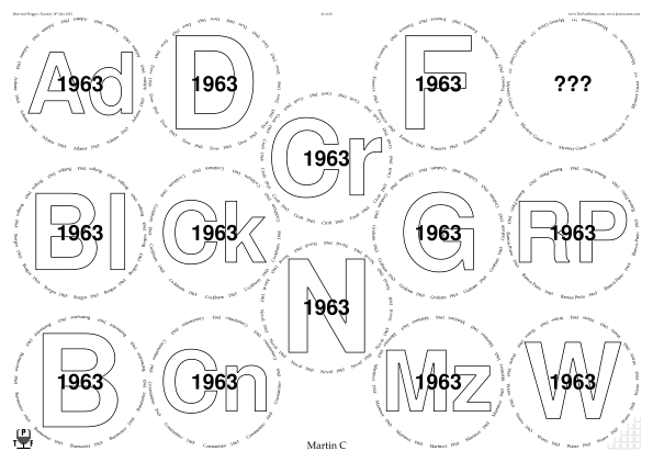
◊ Tue 18 July 2023 1963 at 60 Planning Food www.jdawiseman.com/2023/20230718_1963s_Coulson.pdf
Made by Martin Coulson using the placemat wizard.
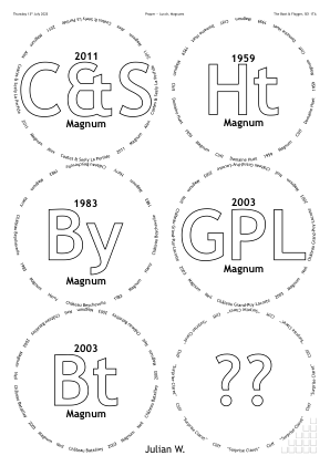
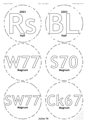
◊ Thu 13 July 2023 P—L www.jdawiseman.com/2023/20230713_magnums.pdf
My second ‘P—L’, the first having been on 15 Sept 2022.
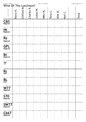
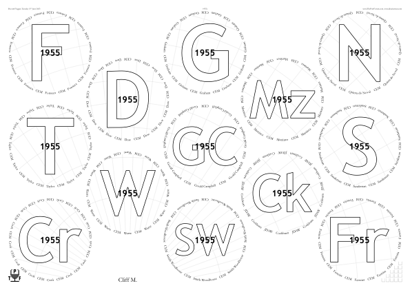
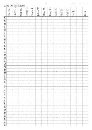
◊ Tue 13 June 2023 1955s www.jdawiseman.com/2023/20230613_1955s.pdf Planning
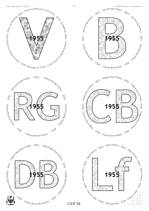
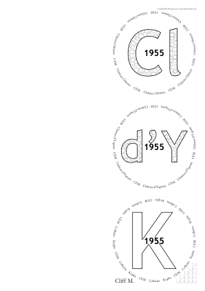
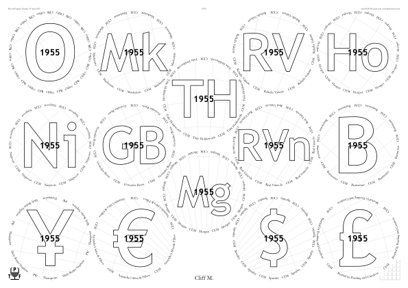
◊ Thu 25 May 2023 1983s at Forty www.jdawiseman.com/2023/20230525_1983s.pdf Review Planning
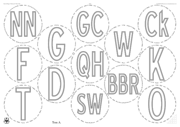
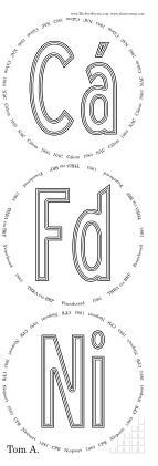
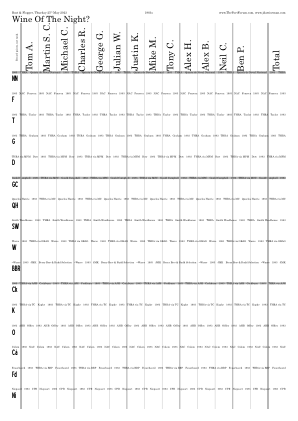
/TitlesFont     /BlueHighwayFreeCondensed def
/CircletextFont /CenturySchoolbook        def
◊ Tue 23 May 2023 Champagne, Burgundy, Port, Madeira www.jdawiseman.com/2023/20230523_67PM.pdf
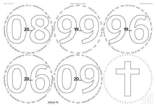
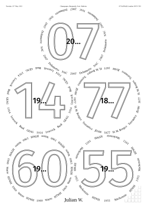
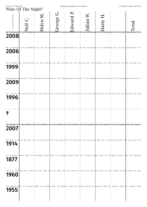
/FrPremiere [(1) {-0.16 Kern} {SuperscriptOn} /egrave (re) {SuperscriptOff}] def

/GlassesOnSheets [
	[ 0 1 2 3 4 5 ]
	[ 6 1 Circlearrays length 1 sub {} for]
] def  % /GlassesOnSheets
/GlassesOnTastingNotePages GlassesOnSheets def
/GlassesClusteredOnVoteRecorders [ 1 {GlassesOnSheets} repeat ] def

/PaperType {SheetNum 0 eq {/A3} {/A4} ifelse} def
/PackingNestingColumnMajor {SheetNum 0 eq} def

/BurgundyCircle  120   2 div 360 mul 127 div def  % 120mm was actually too small
/OuterGlassesMarginR {
	SheetNum 0 eq {
		420  360 mul 127 div  24 24 add sub  BurgundyCircle 6 mul sub
	} {0} ifelse
} def  % /OuterGlassesMarginR
/OuterGlassesMarginB {
	SheetNum 0 eq {
		297  360 mul 127 div  24 30 add sub  BurgundyCircle 4 mul sub
	} {0} ifelse
} def  % /OuterGlassesMarginB
/PackingStyles [
	[ /SquareGrid  /HorizontalAlignment /Left  /VerticalAlignment /Justify ]
	[ /RectangularDislocation  /OnlyIfOrientation /Portrait ]
	[ /DiamondsAndRectangular  /OnlyIfOrientation /Portrait ]
	/Diamonds
] def  % /PackingStyles
/MaxRadius 999 def
/ShrinkRadii /NotAtAll def

/ThePortForumIconPlacement /None def
/ThePortForumIconTastingNotePlacement /None def

/Rotate180AlternateNames
	{TypeOfPagesBeingRendered /Glasses eq {SheetNum 0 ne} {true} ifelse}
def

/TitlesFont     /FiraSans-Medium def
/CircletextFont /LucidaBright    def

/CircletextsMinCopies 3 def
/CircletextFontSize { [12 10.8] SheetNum get} def
/CircletextsTweakSize true def

/OvertitleMaxFontSizeProportionTitles 0.15 def

/InlineTitlesMaxNumberContours {SheetNum 1 add} def

/TastingNotesTitlesFontSizeMax 12 def
◊ Wed 10 May 2023 Colleagues and Five Semi-Blind Ports www.jdawiseman.com/2023/20230510_colleagues.pdf …/20230510_colleagues_dl.pdf Planning
Also see Port, to Celebrate Symmetry’s Tenth Anniversary, 24 Sep 2024.
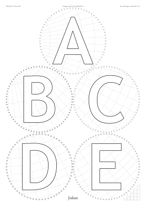
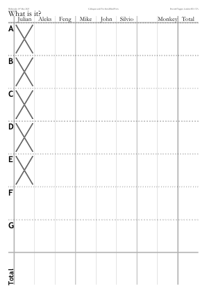
/CrossHatchingInside true def
/CrossHatchingCentreX {MgnL} def
/CrossHatchingCentreY
	{GlassPositions SheetNum get 0 get 1 get}
def  % /CrossHatchingCentreY

/VoteRecorderCrossedBox
{
	VoteRecorderShowTotalRow VoteRecorderSheetNum GetEU dup
		{pop NameNum 0 eq WithinTitles 5 lt and}
	if
} def  % /VoteRecorderCrossedBox
◊ Wed 03 May 2023 Port Fit For a King’s Coronation www.jdawiseman.com/2023/20230503_Coronation.pdf Planning
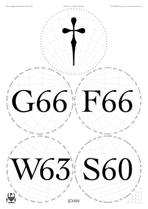
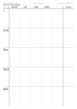
/CrossHatchingInside true def
/CrossHatchingNumRadialLines 40 def
/CrossHatchingCentreX {PageWidth MgnL MgnR sub add 2 div} def
/CrossHatchingCentreY
{
	0 1 2 {GlassPositions SheetNum get exch get 1 get} for
	add add 3 div
} def  /CrossHatchingCentreY
◊ Mon 24 Apr 2023 Reprise of a tasting thirty years before Review Planning Food www.jdawiseman.com/2023/20230424_reprise.pdf
Fonts: /TitlesFont /Cochin def /CircletextFont /Optima-Regular def.
/CrossHatchingInside true def, /CrossHatchingTitles true def, /CrossHatchingCentreX /Name def, /CrossHatchingCentreY /Name def, the meaning of the last having changed to be the approximate vertical centre of a name, rather than where it touches the margin.
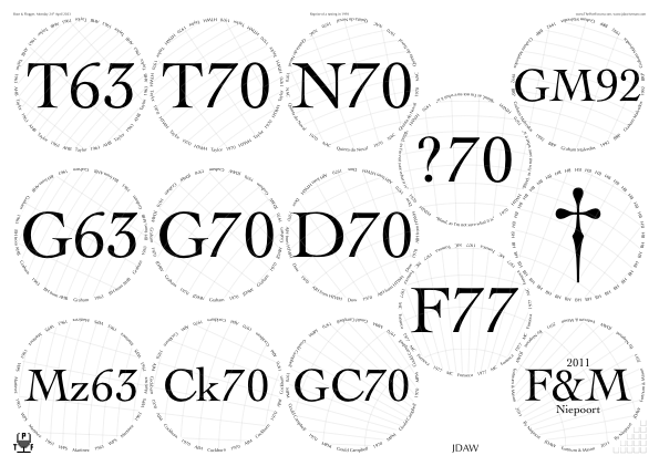
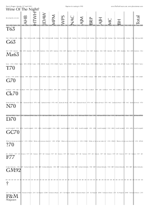
◊ Thu 20 Apr 2023 Big Fortified Tasting, Masterclasses www.jdawiseman.com/2023/20230420_BFT_RCV.pdf …/20230420_BFT_SPW.pdf …/20230420_BFT_Kopke.pdf
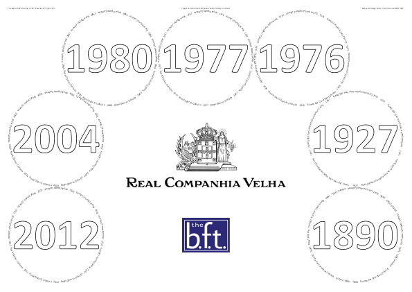
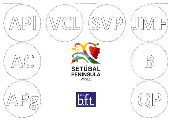
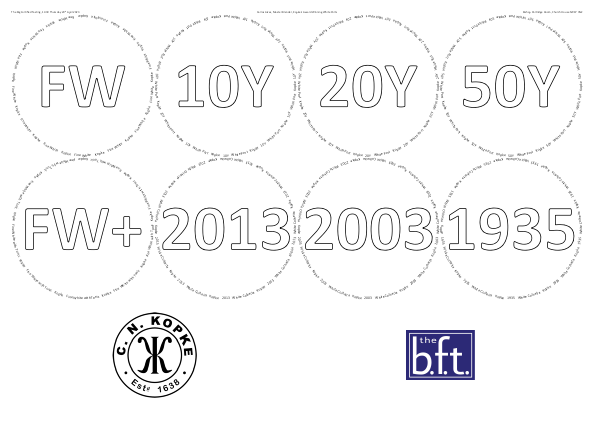
The Big Fortified Tasting is an annual trade fair for fortified wine. The 2023 show (guide) was held on Thursday 20th April 2023 at Church House, Westminster SW1P 3NZ. Such trade fairs typically include some masterclasses: at BFT 2023 Real Companhia Velha: History In A Glass (Real Companhia Velha); Moscatel de Setúbal, An historic fortified wine (Setúbal Peninsula Wines); and Kopke’s Award Winning White Port (Kopke).
Adding bitmaps to placemats in PostScript is fiddly. But, as described in the manual, it can be done. Those not wanting that fiddliness could choose to do it as a manual post-process, perhaps with a program such as Illustrator.
/Names [  ()  ] def

/VoteRecorders false def
/CorkDisplayNumCopies 0 def
/NeckTagsNumCopies 0 def

/PackingStyles [
	/PostsAndLintel
] def  % /PackingStyles

/WaterBoxes /None def

/TitlesFont     /Calibri-Bold def
/CircletextFont /Calibri def
/FontSizesRatioTitlesMin 99 def

/ExclusionAnnulusProportionInnerRadiusTitlesAboveBelow
	0.025
def

/OutputLogToPage false def
/PackingStyles [
	[ /Array  /Positions
		[0 0]
		[0 1]
		[0 2]
		[1 2]
		[2 2]
		[3 2]
		[3 1]
		[3 0]
	]
] def  % /PackingStyles
/PackingStyles [
	[
		/SquareGrid
		/RowsNumMin 2
		/RowsNumMax 2
		/HorizontalAlignment /Justify
		/VerticalAlignment /Top
	]
] def  % /PackingStyles
AHB: “I love the look of the RCV placemat — their logo and layout of the glasses is just so pleasing on the eye.” But it was then replaced by placemats supplied by the company. And likewise for Kopke.
◊ Tue 28 Mar 2023 Warre Cavadinha Review Planning Food www.jdawiseman.com/2023/20230328_Cavadinha.pdf
Formatting echoing that of 23 Feb 2023, 06 Oct 2021, and 02 Oct 2009.
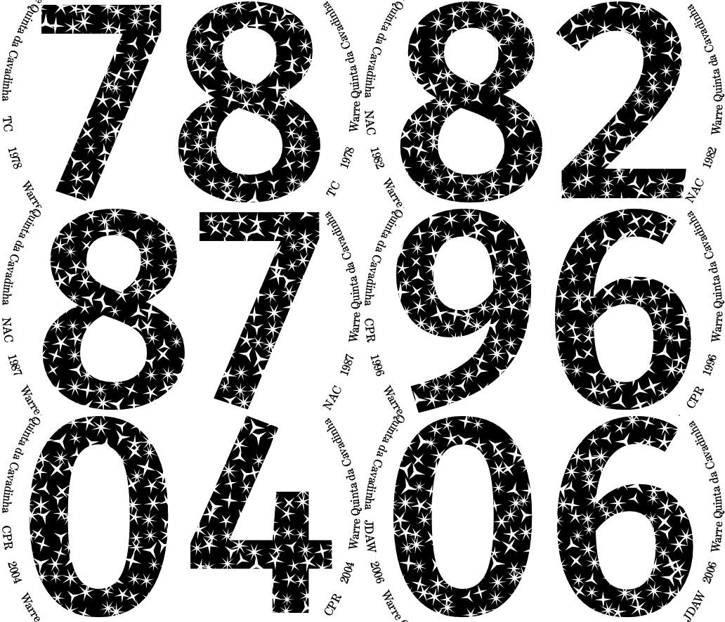
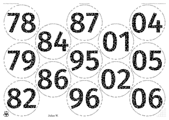
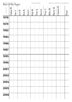
/TitlesFont      /FiraSans-Medium def
/CircletextFont  /AnnualNormal    def

/InlineTitles false def

/ShapesInTitles      true  def
/ShapesInAbovetitles false def
/ShapesInBelowtitles false def
/ShapesInPlaceNames  false def
/ShapesToUse [ /Star ] def
/ShapesStarsPointsAndStepsArray [
	[3 1.31844] [4 1.79214] [5 2.27823]
	[6 2.77012] [7 3.26502] [8 3.76162]
] def  % /ShapesStarsPointsAndStepsArray
/ShapesTitlesClip false def
/ShapesAverageSeparation        11   def
/ShapesEnclosingCircleRadiusMin  5   def
/ShapesEnclosingCircleRadiusMax  7.5 def

/CircletextFontSize 8.2 def

/VerticalMiddlingStringTitles (7) def
◊ Tue 28 Feb 2023 Decanting Experiments with 1977 Magnums Planning www.jdawiseman.com/2023/20230228_decanting_experiments.pdf
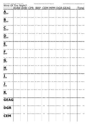
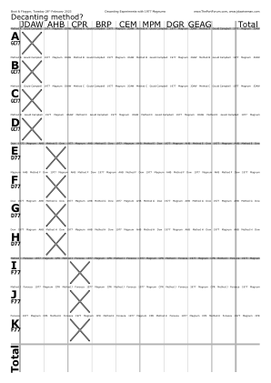
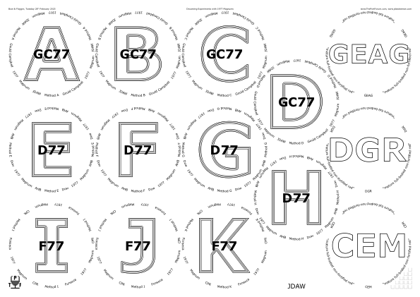
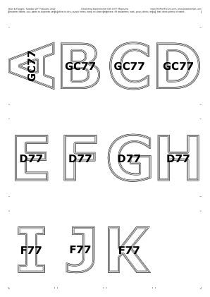
/PackingNestingColumnMajor false def
/PackingStyles [   [ /DiamondsAndRectangular  /RectColsToLeftOrRowsBelow 3 ]   ] def
/GlassesOnSheets [ [
	0  1  2   11
	        3
	4  5  6   12
	        7
	8  9 10   13
] ] def  % /GlassesOnSheets

/DecanterLabelsNumCopies {WithinTitles 11 lt {1} {0} ifelse} def

/VoteRecorderTopTexts [
	[ (Wine Of The Night?) ]
	[ (Decanting method?) ]
] def  % /VoteRecorderTopTexts. Must be same length as GlassesClusteredOnVoteRecorders
/VoteRecorderShowTotalRow [ false true ] def  % Same length as VoteRecorderTopTexts
/VoteRecorderMonkeyWhenShowTotalRow false def
/VoteRecorderCrossedBox {VoteRecorderShowTotalRow VoteRecorderSheetNum GetEU dup
	{pop Circlearrays WithinTitles get dup length 1 sub get ASCIIfy ThisName ASCIIfy eq ThisName length 0 gt and}
if} def  % /VoteRecorderCrossedBox
/GlassesClusteredOnVoteRecorders [
	[ [0 1 2 3] [4 5 6 7] [8 9 10] [11 12 13] ]
	[ [0 1 2 3] [4 5 6 7] [8 9 10] ]
] def  % /GlassesClusteredOnVoteRecorders

/TitlesFont          /Verdana-Bold def
/CircletextFont      /Verdana def
/CircletextFontSize 8.8464 def
/CorkDisplayTitleFontSizeMax 12 def

/TitleMaxHeightProportionInnerRadius  2 sqrt  def
/OvertitleMaxFontSizeProportionTitles 1 6 div  def

/InlineTitlesMaxNumberContours {Overtitles WithinTitles get length 0 gt {3} {1} ifelse} def
◊ Thu 23 Feb 2023 Private Cellar v. original release Planning (earlier planning thread) Food www.jdawiseman.com/2023/20230223_warre_private_cellar.pdf
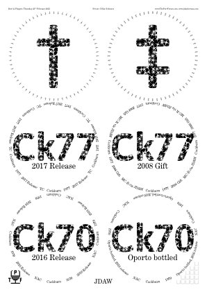
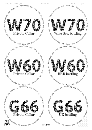
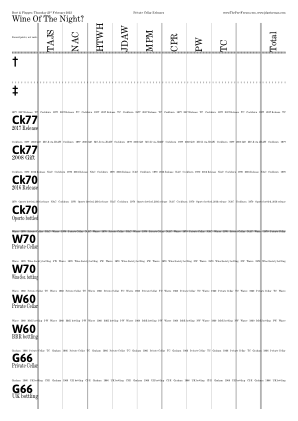
/Ck70 [(Ck) {-0.04 Kern} (70)] def
/Ck77 [(Ck) {-0.04 Kern} (77)] def
/JDAW [(JDA) {-0.06 Kern} (W)] def
/Warre [(W) {-0.06 Kern} (arre)] def

/TitlesFont /Asap-Bold def
/CircletextFont /AnnualNormal def

/FontSizesTitlesNotSmallerIfTitlesNotLonger true def
/BelowtitleMaxFontSizeProportionTitles 0.2 def
/CircletextFontSize 10 def

/InlineTitles false def

/ShapesInTitles true def
/ShapesInBelowtitles false def
/ShapesTitlesClip false def
/ShapesToUse [ /Star ] def
/ShapesStarsPointsAndStepsArray [
	[3 1.31844] [4 1.79214] [5 2.27823] [6 2.77012]
	[7 3.26502] [8 3.76162] [9 4.25925]
] def  % /ShapesStarsPointsAndStepsArray
/ShapesAverageSeparation 12 def
/ShapesEnclosingCircleRadiusMin  8 def
/ShapesEnclosingCircleRadiusMax 10 def
◊ Tue 02 Feb 2023 ThePortForum Awards Review Planning www.jdawiseman.com/2023/20230207_awards.pdf
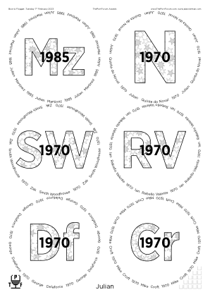
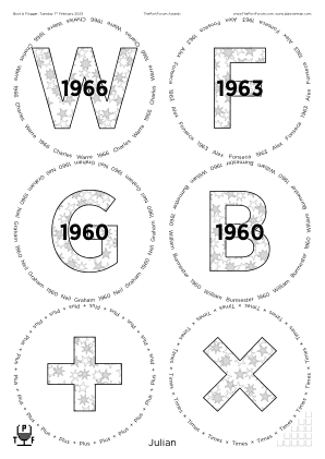
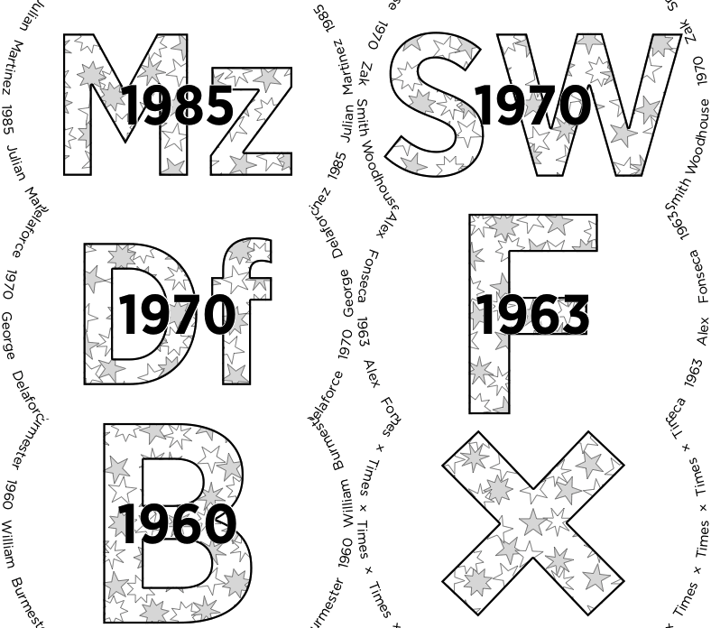
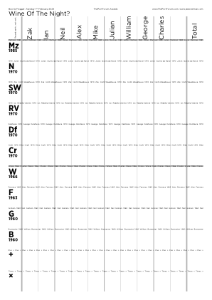
/TitlesFont     /GothamNarrow-Bold def
/CircletextFont /Gotham-Book def
/TitleMaxHeightProportionInnerRadius {
	Titles WithinTitles get type /nametype eq {1.125} {1.75} ifelse
} def  % /TitleMaxHeightProportionInnerRadius, because + = /plus

/OvertitleMaxFontSizeProportionTitles  0.275 def
/CircletextsMinNumSpacesBetween 2 def
/CircletextFontSize 10 def

/ShapesInTitles true def
/ShapesInOvertitles  false def
/ShapesToUse [ /Star ] def
/ShapesStarsPointsAndStepsArray [[5 2] dup [7 3] [8 3]] def
/ShapesAverageSeparation        22 def
/ShapesEnclosingCircleRadiusMin 11 def
/ShapesEnclosingCircleRadiusMax 11 def
/ShapesAverageMaxTweakPlusMinus  6 def
/ShapesTitlesFill {
	ShapesIntX ShapesIntY add 2 mod 0 eq {0.875} {1} ifelse
setgray fill} def  % /ShapesTitlesFill
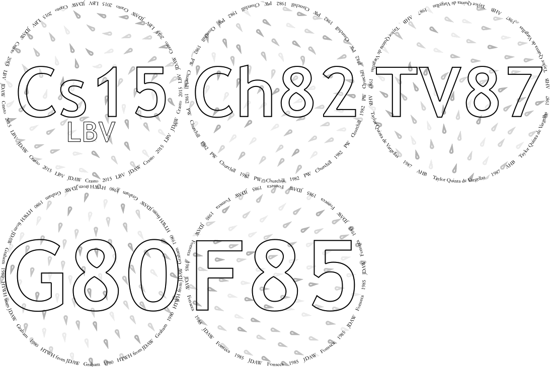
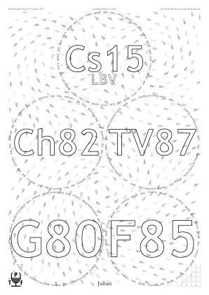
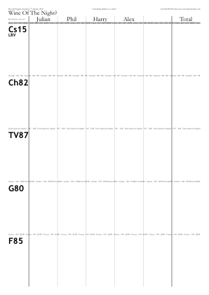
◊ Tue 17 Jan 2023 Something delicious to share Planning www.jdawiseman.com/2023/20230117.pdf
◊ Tue 03 Jan 2023 Blind, ≤1970s Planning www.jdawiseman.com/2023/20230103.pdf
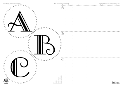
/SideBySideGlassesTastingNotes true def
/TitlesFont     /GalleryNormal      def
/CircletextFont /RobotoSlab-Regular def
/FontSizesRatioTitlesMin 999 def
/InlineTitles false def
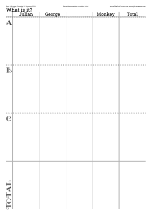
A = G70 (6 points);
B = F60 (1 point);
C = O70 (5 points).
◊ Thu 15 Dec 2022 The Traditional Unknown Shipper and His Peculiar Friends Planning www.jdawiseman.com/2022/20221215_White_Horse.pdf
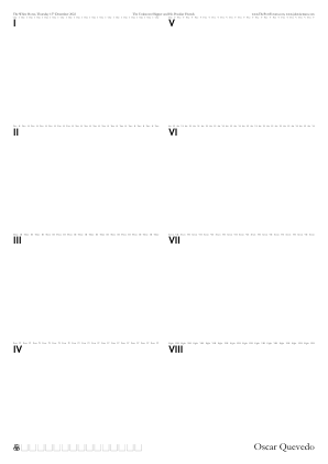
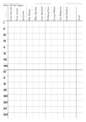
/NeckTagsNumCopies 0 def
/GlassesNumCopies  0 def

/GlassesOnSheetsMaxPerTNSheet 8 def
/TastingNotes_NumVerticalSections 2 def
First use of TastingNotes_NumVerticalSections, the idea having been discussed on 25 Nov 2022 during a tasting of 2002 Champagnes at a tight table in Seabeats, Weymouth; and then re-requested on 10 Dec 2022, the conversation continuing in the old software thread.
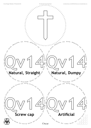
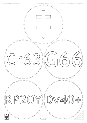
◊ Wed 14 Dec 2022 The Quevedo Closure Experiment Planning www.jdawiseman.com/2022/20221214_Quevedo.pdf
Oops: placemats say “13th”, but should have said “14th”.
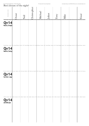
◊ Wed 30 Nov 2022 The Software’s 20th Anniversary Food Planning www.jdawiseman.com/2022/20221130_Sandemans_1970s.pdf
On 30 Nov 2002 placemats switched from being artisanal to being industrial. This design echoes the final attempt at hand-crafted non-industrial placemats.
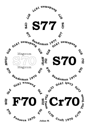
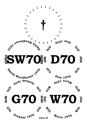
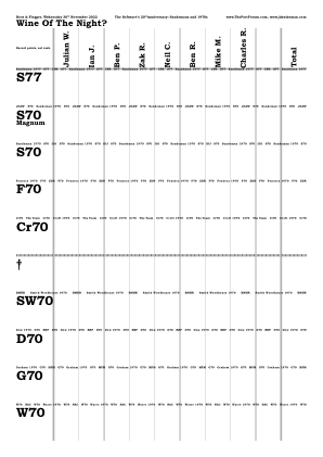
◊ 24–25 Nov 2022 Simon’s 50th Food Planning www.jdawiseman.com/2022/20221124_SCD_50th_ESW.pdf …/20221124_SCD_50th_1972s.pdf …/20221125_SCD_50th_FSW.pdf …/20221125_SCD_50th_Port.pdf
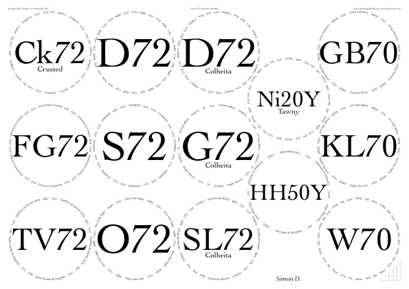
For the fiftieth birthday of Simon Doggett, most events being held at his Heritage Bed and Breakfast in Weymouth. Thursday: at lunch English Sparkling Wines; in the evening these 1972s (approx).
Friday: at lunch 2002 Champagnes; in the evening “Port worthy of a celebration”.
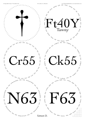
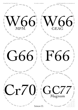
/TitlesFont /Cochin def /CircletextFont /Optima-Regular def, by request of the birthday boy echoing the look of the Sept 2015 E2>V tasting.
◊ Tue 20 Sep 2022 Crusteds Food Planning www.jdawiseman.com/2022/20220920_Crusted.pdf
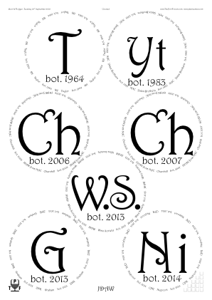
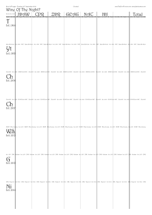
/TitlesFont /Harrington def
/CircletextFont TitlesFont def
/TitleMaxHeightProportionInnerRadius 1.25 def
/InlineTitles false def
/GlassesOnSheetsMaxPerSheet 7 def
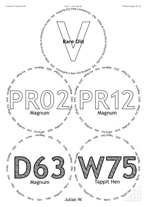
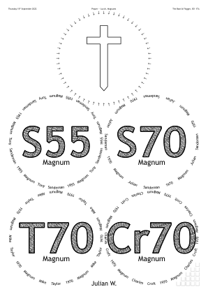
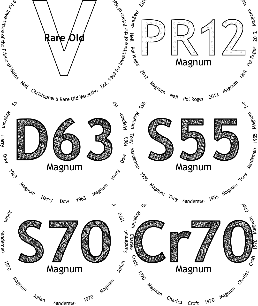
◊ Thu 15 Sep 2022 P—L: Magnums www.jdawiseman.com/2022/20220915_magnums.pdf
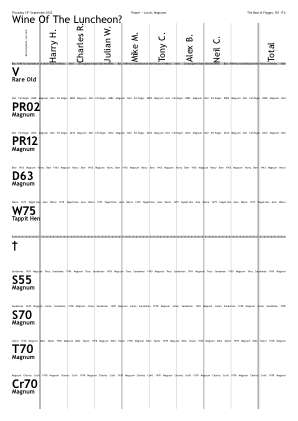
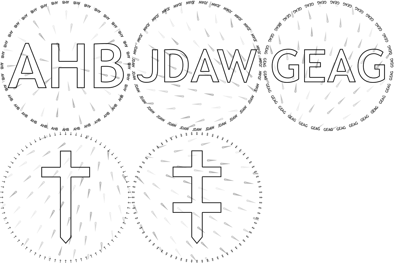
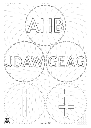
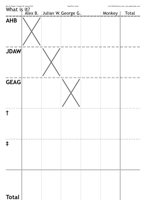
◊ Tue 30 Aug 2022 Good Port, Blind Planning www.jdawiseman.com/2022/20220830_emergency.pdf
/VoteRecorderCrossedBox {VoteRecorderShowTotalRow VoteRecorderSheetNum GetEU dup
	{pop WithinTitles NameNum eq  Titles WithinTitles get type /nametype ne and  ThisName length 0 gt and}
if} def  % /VoteRecorderCrossedBox

/CircletextFont /TrebuchetMS def

/DropletsPathLength 18 def
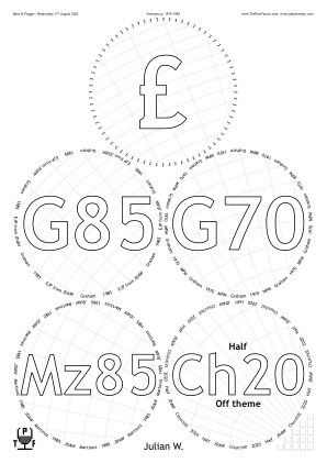
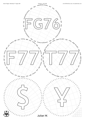
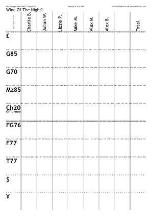
◊ Wed 17 Aug 2022 Emergency, 1970–1985 Planning www.jdawiseman.com/2022/20220817_emergency.pdf

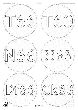
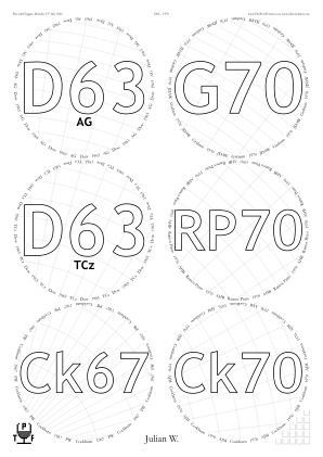
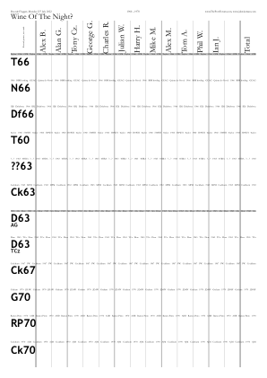
◊ Mon 25 July 2022 1960–’70 Planning www.jdawiseman.com/2022/20220725_60s_70.pdf
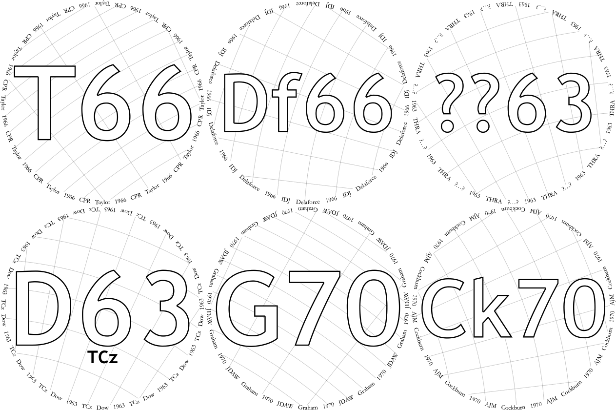
First use of the OneCircle page type (issue #162).
This doesn’t appear in the final PDF; it appears in a temporary PDF used to make the GIF animation.
The tasting-note sheets include a reminder of food choice, as requested by AHB and discussed in issue #163.
Recent changes in the default value of parameters: CrossHatchingNumRadialLines to 80 (⟹ the radial lines are 4½° apart, rather than the previous 2°); and CrossHatchingCellArea increased by a factor of ≈2.6× to 1296 pt² = (½″)² = (12.7mm)².
(Since its introduction in July 2016, and first use in Nov 2016, CrossHatchingCellArea has had several default values.)
The first use of ArcAccurate: explanation at issue #164 and comp.lang.postscript.
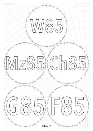
◊ Thu 16 June 2022 Ukraine Benefit, mostly 1985s www.jdawiseman.com/2022/20220616_ukraine.pdf
Held in the delightfully named Gracious Lane End, near Sevenoaks.
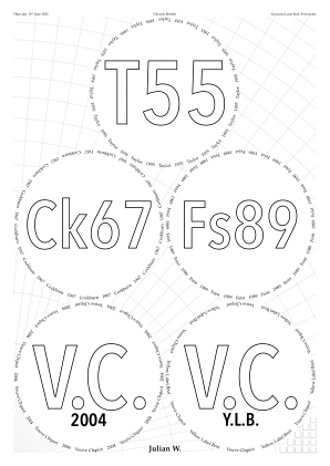
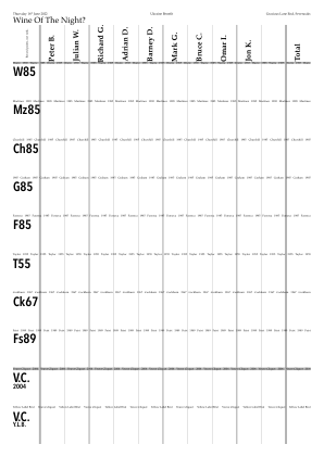
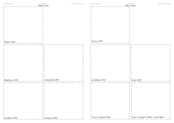
/NeckTagsNumCopies 0 def
/AccountsNumCopies 0 def
/DecantingNotesNumCopies 1 def
/PlaceNames true def

/CircletextFont /Palatino-Roman def
/NamesFont      /Palatino-Bold  def
/TitlesFont {
	TypeOfPagesBeingRendered dup
	/TastingNotes eq exch /CorkDisplay eq or
		{CircletextFont}
		{/AvenirNextCondensed-DemiBold}
	ifelse
} def  % /TitlesFont
/BelowtitleMaxFontSizeProportionTitles 0.2 def

/FontSizesRatioTitlesMin 1.33333333 def

/TitleMaxHeightProportionInnerRadius 1.5 def

/CrossHatchingInside  false def
/CrossHatchingOutside true  def
/CrossHatchingTitles {WithinTitles 7 le} def

/GlassesClusteredOnVoteRecorders [
	[
		[ 0 1 2 3 4 5 6 7 ]
		[ 8 9 ]
	]
] def
/GlassesClusteredOnDecantingNotes [
	[
		[ 0 1 2 3 4 5 6 7 ]
	]
] def
/GlassesClusteredOnCorkDisplay [
	[
		[ 0 -999 1 2 3 4 5 -999 6 7 8 9 ]
	]
] def  % negative => empty
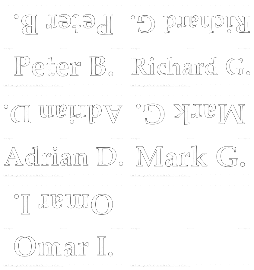
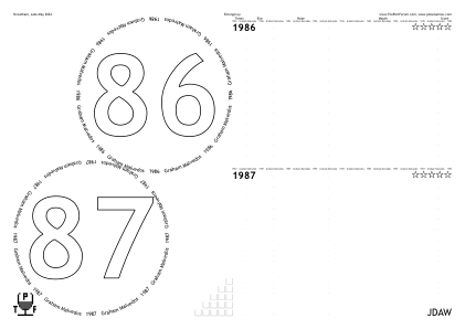
◊ Tue 31 May 2022 Emergency www.jdawiseman.com/2022/20220531_emergency.pdf Planning (GM86 GM87)
An Emergency was called. Nobody else wanted to play. So cancelled; almost-null placemats unused.
/VoteRecorders                false def
/CorkDisplayNumCopies          0    def
/NeckTagsNumCopies             0    def
/SideBySideGlassesTastingNotes true def
/CircletextFont     /TrebuchetMS    def
/CircletextFontSize            9    def
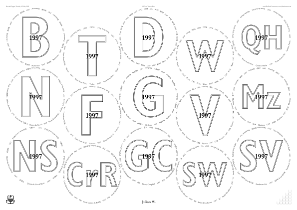
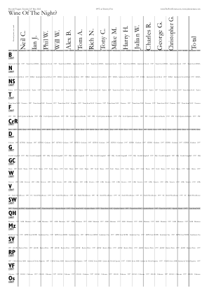
◊ Tue 24 May 2022 1997s www.jdawiseman.com/2022/20220524_1997s.pdf Review Planning
In the code the /RightSide variant within PackingStyles should have heeded the choice of /VerticalAlignment (one of /Top, /Bottom, /Middle, /Justify) since the beginning = Dec 2015, but didn’t. Made so, these placemats successfully specifying
[ /RightSide /GlassesNumMax 3 /OnlyIfOrientation /Portrait /VerticalAlignment /Bottom /SuppressNonRightOrnaments ].
Effective April 2024, /SuppressNonRightOrnaments replaced with /SuppressOrnamentsLeft /SuppressOrnamentsCentre, there also being /SuppressOrnamentsRight.
In October 2025 PackingStyles’s sub-parameter /GlassesNumMin was renamed to /OnlyIfGlassesNumMin, and likewise …Max.

/TitlesFont     /GillSans-CondensedBold def
/OvertitlesFont /Garamond-Bold          def
/FontSizesRatioTitlesMin 1.25 def
/OvertitleMaxFontSizeProportionTitles 0.2 def
/InlineTitlesMaxNumberContours 2 def
/TastingNotesTitlesFontSizeMax 15 def
/PrePourReverseOrder false def
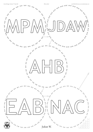
◊ Tue 17 May 2022 Whites, blind www.jdawiseman.com/2022/20220517_whites.pdf …/20220517_whites_BottleWrap.pdf Planning
First appearance of BottleWrap pages, as heralded by issue #161. The previous new page type was Accounts in Jan 2016.
/PackingStyles [ /Diamonds ] def

/PaintForegroundCode
{
	/Glasses TypeOfPagesBeingRendered eq
	{
		/AC2C {14 7 {stroke} false true {clip stroke} ArrowCircleToCircle} def
		SheetNum 0 eq
		{
			3  4  0  false  0  36  AC2C
			4 [GlassPositions 1 get 0 get aload pop exch PageWidth add exch]
			      0  true   0 999  AC2C
		} if  % SheetNum 0 eq
			0  1  0  true   0  36  AC2C
			1  2  0  true   0  36  AC2C
			2  3  0  false  0  36  AC2C
	} if  % /Glasses
} def  % /PaintForegroundCode
Also the first appearance of the arrows, drawn using new helper routine ArrowCircleToCircle, with parameters WithinPageFrom WithinPageTo GapFromCircles OffsetRightBool OffsetMin TargetLength HeadLength HeadWidth {PathCode} HeadFromBool HeadToBool {HeadCode} ArrowCircleToCircle - ⟹︎ in these placemats: GapFromCircles=0; OffsetMin=0; excepting the arrow pointing across pages TargetLength=36; HeadLength=14; HeadWidth=7; of each line arrows not at start yes at end.
◊ Tue 26 Apr 2022 Semi-sighted www.jdawiseman.com/2022/20220426_emergency_semi.pdf Food Planning
Originally planned to be a Poças tasting; but access to those bottles lost.
Instead attendees invited to reveal exactly one of shipper and year, as well as type and bottle size.
Fonts /Optima-Regular and /Didot-Bold.
Also /NeckTagsNumCopies {Belowtitles WithinTitles get ASCIIfy (JDAW) eq {0} {1} ifelse} def.
One consequent issue: #161 = BottleWrap: new page type.
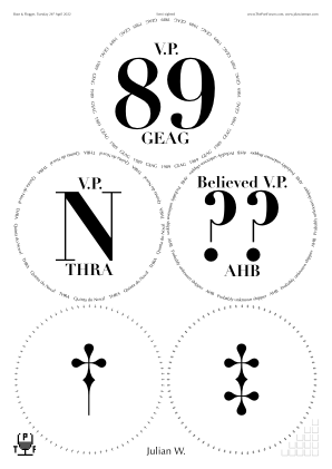
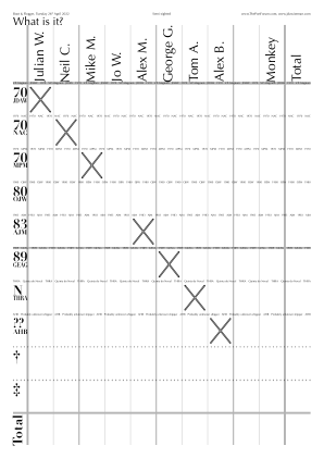
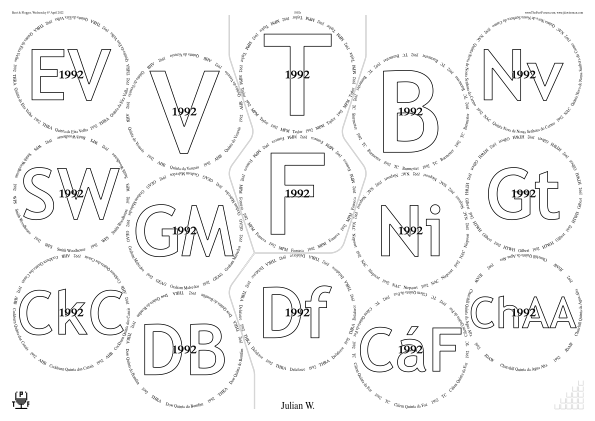
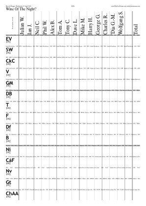
◊ Wed 06 Apr 2022 1992s www.jdawiseman.com/2022/20220406_1992s.pdf Food Planning
The tasting originally planned for 12 May 2020, which had been postponed because of covid.
◊ Thu 31 Mar 2022 Big Fortified Tasting, Masterclasses www.jdawiseman.com/2022/20220331_BFT_Pocas.pdf …/20220331_BFT_Madeira.pdf
The Big Fortified Tasting is an annual trade fair for fortified wine. The 2022 show (guide) was held on Thursday 31st March 2022 at Church House, Westminster SW1P 3NZ. Such trade fairs typically include some masterclasses: at BFT 2022 The Magic of Ageing masterclass was given by André Barbosa of Poças; and The Iconic Madeira Wine Varieties by Rubina Vieira of the Madeira trade association, the Instituto Do Vinho, Do Bordado E Do Artesanato Da Madeira.
For the Madeira placemat I had suggested five on A4, arranged 2‑2‑1 = ![]() as was used on 25 Sep 2013, so that the two ’96s were adjacent.
Much more elegant was Alex’s suggested pattern for A3, as used.
as was used on 25 Sep 2013, so that the two ’96s were adjacent.
Much more elegant was Alex’s suggested pattern for A3, as used.
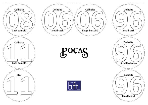
% ### Pocas Masterclass, BFT, 11:30 31 March 2022 ###

% Shipper: in Circlearrays, HeadersCenter, PDF_title
/Shipper [(Po) /ccedilla (as)] def

/WaterBoxes /None def

/TitlesFont     /Calibri-Bold def
/CircletextFont /Calibri      def
/FontSizesRatioTitlesMin 9999 def

/AbovetitleMaxFontSizeProportionTitles 0.1 def
/ExclusionAnnulusProportionInnerRadiusTitlesAboveBelow
	0.025 def

/PackingStyles [
	[
		/Array % [x y x' y'] => moves (x,y) to (x',y')
		/Positions
			[0 0]  [0 1]  [0 2]  % Left column
			[1 2 2 2] [2 2 1 2]  % Top:   O-->  <--O
			[3 2]  [3 1]  [3 0]  % Right column
	]
] def  % /PackingStyles

/PaintBackgroundCode {
	% Omitted here. For structure see bitmap_images.md
} def  % /PaintBackgroundCode
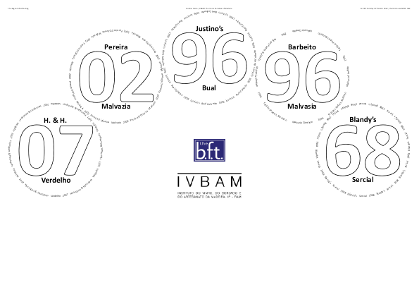
% ###   Madeira  Masterclass   ###
% ### BFT, 14:30 31 March 2022 ###

% Omitted, parts also in Pocas
% masterclass at same event.

/PackingStyles [ /Arch ] def

/MarginB {
	/Glasses TypeOfPagesBeingRendered eq
		{PageHeight 3 div}  % =99mm
		{MarginL}  % =24pt, ~= 8.5mm
	ifelse  % /Glasses
} def  % /MarginB
◊ Sat 26 Mar 2022 Taylor www.jdawiseman.com/2022/20220326_Taylor_Leverkusen.pdf
Taylor vertical, at the Kasino Hotel, Leverkusen, as arranged by WorldOfPort.de. Design based on that of Taylor vertical on 22 March 2013. Translations from github.com/jdaw1/placemat/blob/main/Documentation/translations.md.
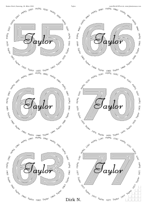
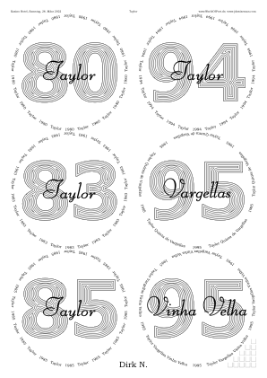
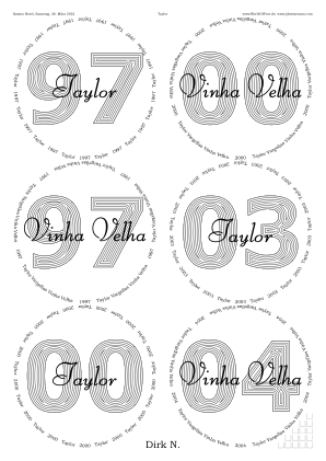
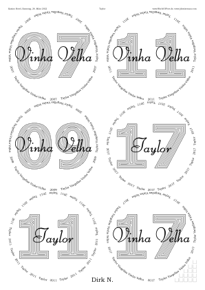
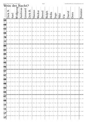
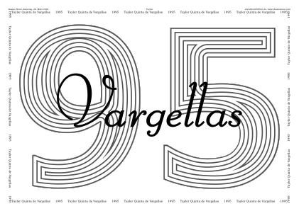
/PackingNestingColumnMajor true def

/TitlesFont     /Tahoma-Bold     def
/CircletextFont /BookmanOldStyle def
/OvertitlesFont /LiberateBold    def

/ColourSchemeTitles /MidGrey def

/OvertitleMaxFontSizeProportionTitles  0.3333333333 def
/CircletextMaxFontSizeAbsolute 8.4 def
/CircletextFontSize 8.4 def  % Renamed Apr 2022

/InlineTitlesMaxNumberContours 6 def
/InlineTitlesWhiteWidth {InlineTitlesBlackWidth 2.5 mul} def
◊ Wed 16 Mar 2022 1985s www.jdawiseman.com/2022/20220316_1985s.pdf Review Planning
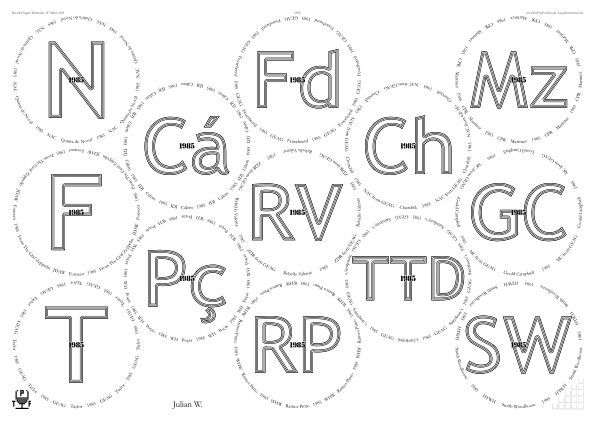
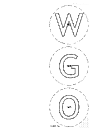
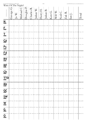
/PaperType {SheetNum 0 eq {/A3} {/A4} ifelse} def

/PackingStyles [
	[
		/DiamondsAndRectangular
		/GlassesNumMin 5
		/RectColsToLeftOrRowsBelow 3
	]
	[ RectangularDislocation /GlassesNumMin 5 ]
	[ /Diamonds              /GlassesNumMin 5 ]
	[ /RightSide   /SuppressNonRightOrnaments ]
] def  % /PackingStyles

/OvertitlesFont /PortBottleStencil-Regular def

/InlineTitlesMaxNumberContours 3 def
/InlineTitlesWhiteWidth 1.32 def
Also, after the tasting, an item was added to GlassesAnnotations, to explain that the Cálem was replaced late with a Dow Trafalgar.
Effective April 2024, /SuppressNonRightOrnaments replaced with /SuppressOrnamentsLeft /SuppressOrnamentsCentre, there also being /SuppressOrnamentsRight.
In October 2025 PackingStyles’s sub-parameter /GlassesNumMin was renamed to /OnlyIfGlassesNumMin, and likewise …Max.
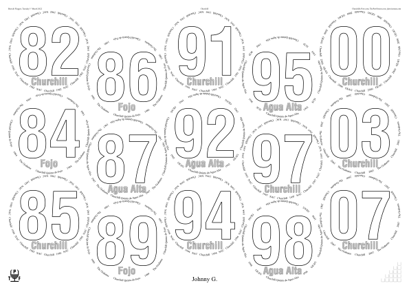
◊ Tue 01 Mar 2022 Churchill www.jdawiseman.com/2022/20220301_Churchill.pdf Planning
/TitlesFont /HelveticaLTStd-BoldCond def (because my /HelveticaNeue-CondensedBold has ceased to be available to PostScript—blocked by a macOS upgrade some years previously),
/CircletextFont /TimesNewRomanPSMT def,
/ColourSchemeBelowtitles /MidGrey def.
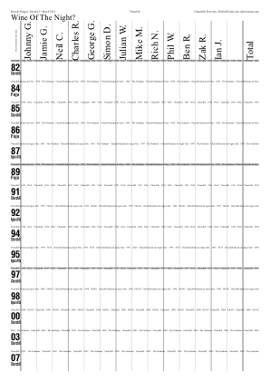
◊ Wed 16 Feb 2022 JDAW Cellar Reduction Party www.jdawiseman.com/2022/20220216_cellar_reduction.pdf Planning
Other Cellar Reduction Parties:
Alex on 26 Aug 2014;
Magnus on 17 Apr 2018.
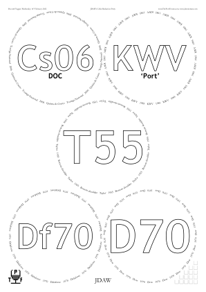
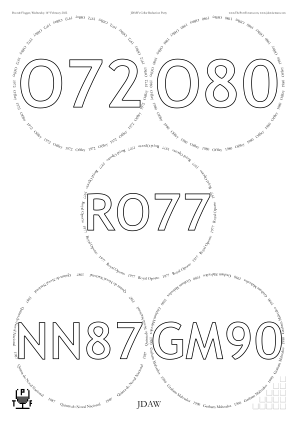
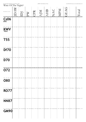
The 2‑1‑2 pattern by /PackingStyles [ /Diamonds ] def.
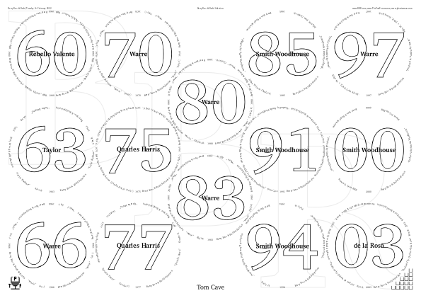
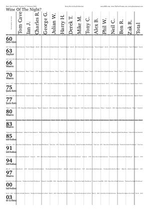
◊ Wed 02 Feb 2022 Berry Bros & Rudd Own Selection www.jdawiseman.com/2022/20220202_BBR.pdf Review Planning
◊ Thu 20 Jan 2022 Blind, replacing postponed 1997s www.jdawiseman.com/2022/20220120_blind.pdf Planning Postponed 1997s
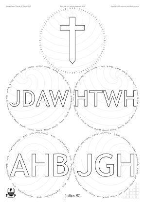
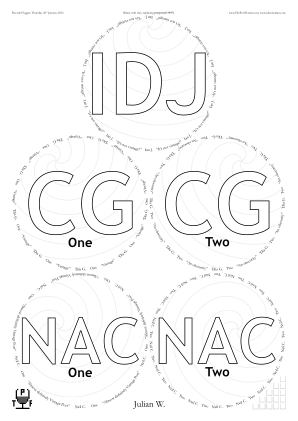
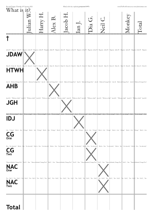
/HeadersCenter [
	0 [(Blind, with clue, replacing )  {ThroughlineBegin}  (postponed 1997s)  {ThroughlinePaint}]
] def  % /HeadersCenter

/NeckTagsNumCopies {Titles WithinTitles get ASCIIfy (JDAW) eq {0} {1} ifelse} def
/CorkDisplayNumCopies 0 def

/BelowtitleMaxFontSizeProportionTitles 0.2 def
/FontSizesTitlesEquivalences [ 3 0 0 1 1   2 2 2 1 1 ] def

/Spirals true def
/SpiralClockwise {SheetNum 0 eq} def
/SpiralRadiusBetweenArms 30 def
/SpiralCentreFromCentreProportionRadiiInside {[0.875 0.75 dup 0.375 dup] WithinPage get} def
/SpiralCentreFromCentreAngle {[0 -30 30 -60 60] WithinPage get} def
The spirals were too faint because too thin. Default doubled to 0.24 setlinewidth.
◊ Mon 10 Jan 2022 Chez Luke www.jdawiseman.com/2022/20220110_Luke.pdf
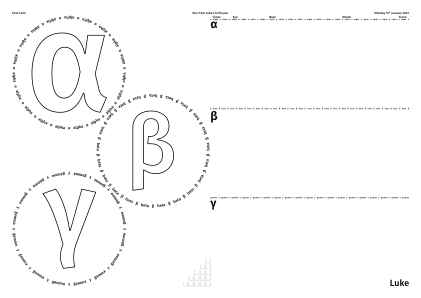
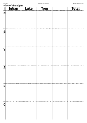
/CirclearraysVoteRecorder [
	[ /alpha   (alpha)   ]  % Alternative: [ (alpha)   dup cvn exch ]
	[ /beta    (beta)    ]
	[ /gamma   (gamma)   ]
	[ /delta   (delta)   ]
	[ /epsilon (epsilon) ]
	[ /zeta    (zeta)    ]
] def  % /CirclearraysVoteRecorder
/TitlesVoteRecorder [ CirclearraysVoteRecorder {0 get} forall ] def
/SubtitlesVoteRecorder [ TitlesVoteRecorder length {()} repeat ] def

/Circlearrays  CirclearraysVoteRecorder 0 3 getinterval  def
/Titles              TitlesVoteRecorder 0 3 getinterval  def
/Belowtitles      SubtitlesVoteRecorder 0 3 getinterval  def

/SideBySideGlassesTastingNotes true def
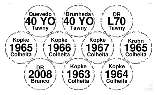
◊ Sat 11 Dec 2021 Sammamish Port Club Holiday Party www.jdawiseman.com/2021/20211211_GlennElliott_tawnies.pdf
Made by Glenn Elliott.
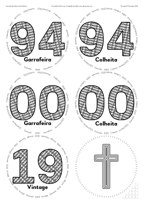
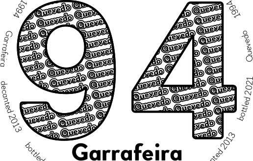
◊ Thu 09 Dec 2021 Quevedo Garrafeiras and Colheitas www.jdawiseman.com/2021/20211209_Quevedo_garrafeira.pdf Planning
Quevedo Garrafeiras and Colheitas, 1992s and 1994s, as arranged by Vintage Wine and Port.
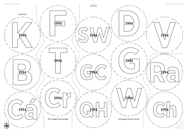
◊ Tue 16 Nov 2021 1994s www.jdawiseman.com/2021/20211116_1994s.pdf Review Planning
The FlightSeparations are softened with the new switch /Arc rather than the previously available /Curve.
And /Arc is neater (compare 30 Apr 2016, 26 Feb 2016, and 16 June 2014).
Indeed /Arc is so much more consistent across pieces of different lengths that /Curve and some other uglinesses have been removed (issue #87 = Simplifying FlightSeparations: removal of some possibilities).
/TitlesFont          /GothamNarrow-Bold def
/OvertitlesFont      /Garamond-Bold def
/OvertitleMaxFontSizeProportionTitles  0.2 def

/FontSizesRatioTitlesMin 1.3 def

/FlightSeparations true def
/FlightSeparationLines
[
	[  % + SheeNum = 0
	[  [/Bottom  5 -0.752159] /Arc [ 2  5] /Arc [ 1  5] /Arc [ 1  4] /Arc [ 0  4] /Arc [0 3] /Arc [/Top 0  0.752159]  ]
	[  [/Bottom  5  0.752159] /Arc [ 5  8] /Arc [ 5  7] /Arc [ 4  7] /Arc [ 4  6] /Arc [3 6] /Arc [/Top 6 -0.752159]  ]
	[  [/Bottom 11  0.752159] /Arc [11 14] /Arc [11 13] /Arc [10 13] /Arc [/Right 12 13]  ]
	]  % - SheeNum = 0
] def  % /FlightSeparationLines

/TestingMaxNumPagesToShow 2147483647 def  % Set to 1 when testing FlightSeparations and PaintForegroundCode

/PaintForegroundCode
{
	/Glasses TypeOfPagesBeingRendered eq
	{
	<< /FontSizeThis  MaxCircletextMaxFontSizes 1.5 mul >> begin
	/Garamond-Bold FontSizeThis selectfont
	(Symington Family Estates)  [(The Fladgate Partnership)]  (Sogevinus)
	GlassPositions SheetNum get  0 get aload pop moveto  0 Radii SheetNum get     FontSizeThis 0.9 mul add rmoveto  dup StringWidthRecursive -2 div 0 rmoveto ShowRecursive
	GlassPositions SheetNum get  5 get aload pop moveto  0 Radii SheetNum get neg FontSizeThis 1.5 mul sub rmoveto  dup StringWidthRecursive -2 div 0 rmoveto ShowRecursive
	GlassPositions SheetNum get 11 get aload pop moveto  0 Radii SheetNum get neg FontSizeThis 1.5 mul sub rmoveto  dup StringWidthRecursive -2 div 0 rmoveto ShowRecursive
	end  % /FontSizeThis
	} if  % /Glasses
} def  % /PaintForegroundCode
Whence came the “0.752159” in FlightSeparationLines?
Started with an estimate.
The log file then shows the radii offset of the corners and turning points in lines (in the final version as “FlightSeparations, SheetNum=0, /Top or /Bottom: possible elegant offsets from a centre: -1.14861; -0.752159; 0.752159; 1.14861”).
Use of one of these made the entry and exit points line up with the bounds of a curve — a small elegance of no more than slight value.
After the tasting a change was made to add an annotation visible when viewed on-screeen, but not affecting the printed page.
/GlassesAnnotations
	14  [(Replaced with Rs94 = Quinta de la Rosa 1994, at short notice provided by TC, as the Churchill was unavailable. ) /emdash ( 16 Nov 2021.)]
] def  % /GlassesAnnotations
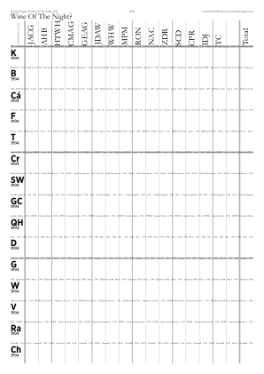
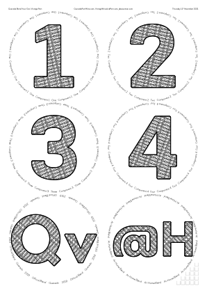
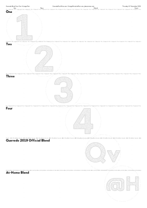
◊ Thu 11 Nov 2021 Quevedo Blend Your Own Vintage Port www.jdawiseman.com/2021/20211111_Quevedo_BlendVP.pdf Planning
Quevedo Blend Your Own Vintage Port, as arranged by Vintage Wine and Port.
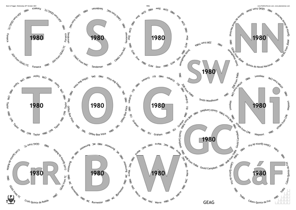
◊ Wed 20 Oct 2021 1980s www.jdawiseman.com/2021/20211020_1980s.pdf Review Planning
A revisit of the design for the 1980 tasting on 02 Mar 2012.
Mentioned, re layout of glasses, in issue #151, /Bespoke14 for /A3 and implicitly in issue #158, /DiamondsAndAlternate, for 14 on /A3.
Fonts: /TrebuchetMS-Bold and /TrebuchetMS.
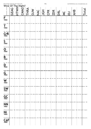
Alas, my attendance foiled by covid.
◊ Wed 06 Oct 2021 Warre www.jdawiseman.com/2021/20211006_Warre.pdf Planning
A revisit of the design for the Warre tasting on 02 Oct 2009.
This is the first set of placemats to use three different page sizes: for glasses /PaperType /A3 def; for the names of the people /PlaceNamesPaperType /A5 def; everything else on /A4 (from TastingNotesPaperType).
Fonts: /AnnualNormal and /Geo112ThinBold.
It was from these placemats that the names were (usually) sorted into length order (with exceptions). From April 2022 this was assisted by the log file.
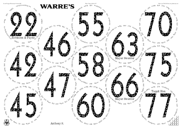
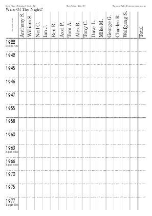
Alas, my attendance foiled by covid.
◊ Late Sep 2021 Portgual www.jdawiseman.com/2021/202109XX_Portugal.pdf …/20210928_Bomfim.pdf
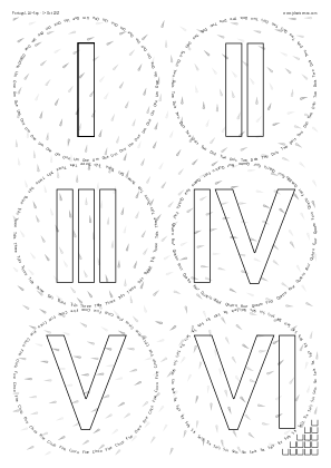
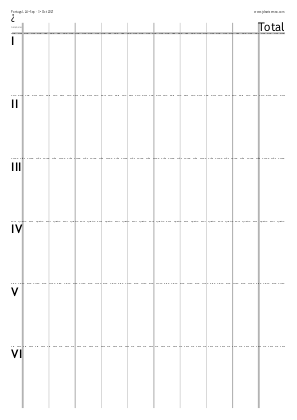
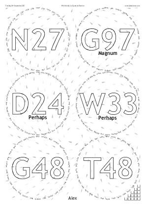
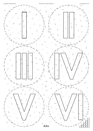
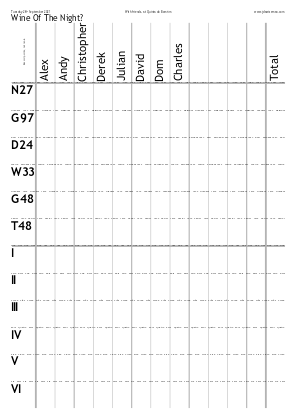
Alas, my attendance foiled by covid.
◊ Wed 08 Sep 2021 VE Day (Postponed) www.jdawiseman.com/2021/20210908_VE.pdf Review Planning
Two consequent issues: #154 = Boustrophedon flag in PackingStyles; and #155 = Printer test, following failure of default value of TastingNotesColumnStrokeCode.
Rare use of the empty-page feature.
Fonts: /Optima-Regular and /Cochin.
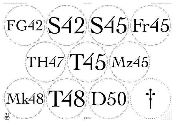

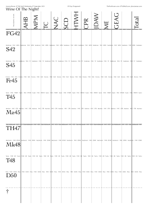
◊ Sat 04 Sep 2021 Port chez CMAG www.jdawiseman.com/2021/20210904_CMAG.pdf …/20210904_CMAG_PorkPies.pdf Param’s
/TitlesFont     /CentimeThinNormal def
/CircletextFont /CentimeWideNormal def
/NamesFont      TitlesFont         def
Use of /AccanthisADFStd-Regular was considered, as in a 2014 event chez CMAG, but its non-lining lowercase old-style figures don’t work for elements of Titles of the form ‘G85’.
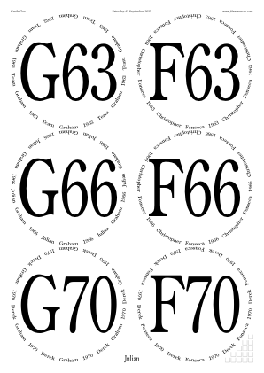
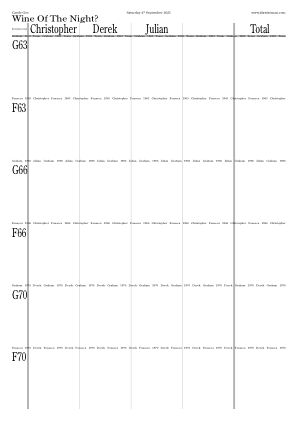
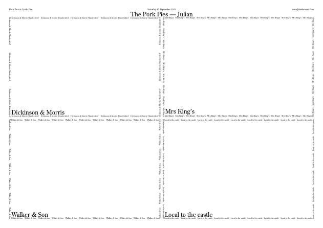
There was a separate tasting document for the pork pies. Parameters by which done, and discussion, are in issue #153.
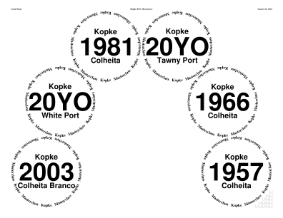
◊ Sat 16 Aug 2021 Kopke Port Masterclass www.jdawiseman.com/2021/20210816_GlennElliott_Kopke.pdf
Made by Glenn Elliott.
A rare use of the /Arch possibility within PackingStyles.
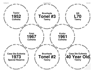
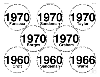
◊ Sat 24 July 2021 Sammamish Port Club www.jdawiseman.com/2021/20210724_GlennElliott_wood.pdf …/20210724_GlennElliott_bottle.pdf
Made by Glenn Elliott.
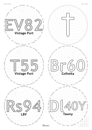
◊ Fri 09 July 2021 Delinquent in Utzigen www.jdawiseman.com/2021/20210709.pdf Planning
/Titles [
	(EV82)   (T55)   (Rs94)   /dagger   (Br60)
	[(Dl) {0 CurrentFontSize 0.1 mul rmoveto CurrentFontName CurrentFontSize 0.75 mul selectfont} (40Y)]
] def  %  /Titles

/TitleMaxHeightProportionInnerRadius 1.25 def
/FontSizesRatioTitlesMin 1.5 def

/InlineTitlesMaxNumberContours {WithinPage 2 le {2} {1} ifelse} def
/BelowtitleMaxFontSizeProportionTitles 0.2 def

/Spirals true def
/SpiralCentreFromCentreProportionRadiiInside 0.75 def
/SpiralCentreFromCentreAngle {[-7.5 -22.5 -37.5 7.5 22.5 37.5] WithinPage get} def
/SpiralClockwise {WithinPage 2 le} def
◊ Thu 08 July 2021 Quinta de la Rosa www.jdawiseman.com/2021/20210708_Rosa.pdf Planning
Alas postponed. Design inspired by the TSQ50 circle at the Taylor vertical of 22 Mar 2013. Nearly all bottles provided by Vintage Wine & Port Limited “in exchange for a donation to charity”.
/PaperType /A2 def  % 594mm by 420mm

/CircletextFont  /GoudyOldStyleT-Regular      def
/TitlesFont      /FiraSansExtraCondensed-Bold def
/AbovetitlesFont /BowNormal                   def
/OvertitlesFont  /BowBold                     def
/SubtitlesFont   AbovetitlesFont              def

/CircletextMaxFontSizeAbsolute 9 def
/CircletextFontSize 9 def  % Renamed Apr 2022

/ShapesInTitles      true def
/ShapesInAbovetitles false def
/ShapesInBelowtitles false def
/ShapesInOvertitles  false def
/ShapesToUse [ /Flower ] def
/ShapesFlowersNumPetalsMin {Circlearrays WithinTitles get 1 get (LBV) eq {5} {6} ifelse} def
/ShapesFlowersNumPetalsMax /ShapesFlowersNumPetalsMin load def
/ShapesAverageSeparation 24 def  % Fewer than usual, to be less cluttered
/ShapesEnclosingCircleRadiusMin  ShapesAverageSeparation 0.3 mul  def
/ShapesEnclosingCircleRadiusMax  ShapesAverageSeparation 0.5 mul  def

/OuterGlassesMarginT  % Cf. Vesuvio vertical of 24 February 2016
	420 360 mul 127 div  30 24 add sub   % Intra-margin page height
	3 sqrt 3 mul  2 add                  % Height of glasses, in radii
	594 360 mul 127 div  48 sub  13 div  % Radius
	mul  sub
def  % /OuterGlassesMarginT
/LogThisExtra [
	(Used height ~= ) 420 OuterGlassesMarginT 127 mul 360 div sub (mm )
	(~= A4 height + ) 2 index 297 sub (mm. )
	(Inspired by TSQ50 from Taylor vertical of 22 March 2013.)
] def  % /LogThisExtra
From log: Used height ~= 338.485mm ~= A4 height + 41.4854mm. Inspired by TSQ50 from Taylor vertical of 22 March 2013.
… Radii = [ 125.829 ] => diameters ~= 88.8mm~=3.50"
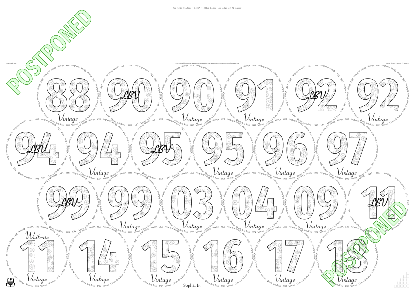
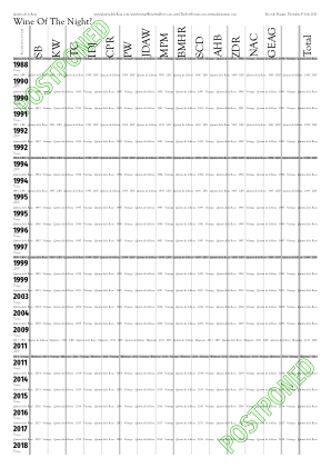
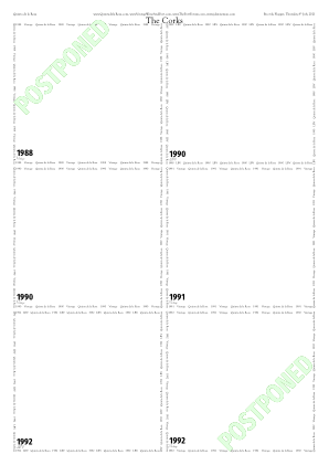

◊ Thu 17 June 2021 Quevedo Colheita Vertical www.jdawiseman.com/2021/20210617_Quevedo_colheita.pdf Planning
Quevedo Colheita Vertical, as arranged by Vintage Wine and Port. Official Quevedo font family is Woodford-Bourne; fonts used are /WoodfordBourne-Bold, /WoodfordBourne-Thin, and /WoodfordBourne-Regular.
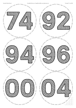
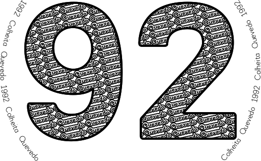
◊ Wed 26 May 2021 Hadge’s Blind Generosity www.jdawiseman.com/2021/20210526_Hadge.pdf Planning
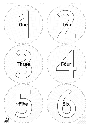
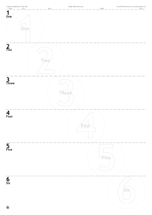
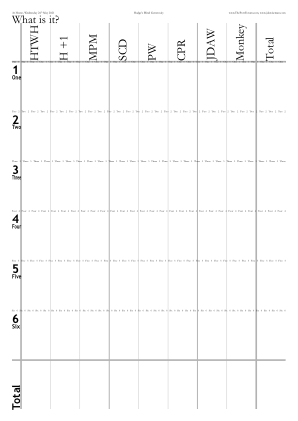
/Names [ () ] def
/NamesVoteRecorder [
	(HTWH)  (H +1)  (MPM)  (SCD)  (PW)  (CPR)
	[(JDA) {-0.06 Kern} (W)]
] def

/CrossHatchingInside true def
/OvertitleMaxFontSizeProportionTitles 0.125 def
◊ Thu 13 May 2021 Blend your own 20-year tawny with Oscar Quevedo www.jdawiseman.com/2021/20210513_Quevedo_tawny.pdf Review Planning
Quevedo tawnies, as arranged by Vintage Wine and Port. Official Quevedo font family is Woodford-Bourne; fonts used are /WoodfordBourne-Bold, /WoodfordBourne-Thin, and /WoodfordBourne-Regular.
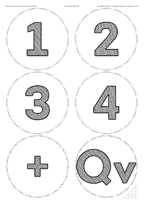
◊ Thu 15 Apr 2021 Graham Single Harvest Tawnies www.jdawiseman.com/2021/20210415_Graham_tawny.pdf Planning
Graham’s Single Harvest Tawnies, as arranged by Vintage Wine and Port. YouTube Symington presentation; and tasting notes of the 1994, 1990, 1982, 1974, and 1963.
Policy decision: henceforth VW&P’s official placemat style has FillTitles, with the FillTexts being the name of the shipper.
Where possible, fonts will be or echo those of the shipper.
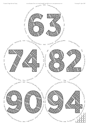
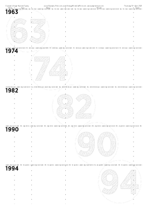
◊ Sun 21 Mar 2021 Sammamish Port Club www.jdawiseman.com/2021/20210321_GlennElliott.pdf
Made by Glenn Elliott.
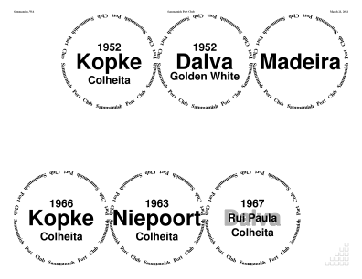
◊ Thu 14 Jan 2021 LBVs www.jdawiseman.com/2021/20210114_LBVs.pdf Planning
The first occasion that SideBySideGlassesTastingNotes has been true with more than one /Glasses page.
Gotham fonts liked, despite the ‘I’ lacking crossbars. Comment welcomed.
% Prevents there being two copies of the decanters labels for G15 and T15 LBVs.
/DecanterLabelsNumCopies {SheetNum 0 eq {1} {WithinPage 2 eq {1} {0} ifelse} ifelse} def

/GlassesOnSheets [
	[ 0 1 3 ]  % T15 G15 /dagger
	[ 0 1 2 ]  % T15 G15 QH14
] def  % /GlassesOnSheets
/GlassesOnTastingNotePages GlassesOnSheets def

/SideBySideGlassesTastingNotes true def

/TitlesFont      /GothamNarrow-Bold def
/CircletextFont  /Gotham-Light      def
/BelowtitlesFont /Gotham-Black      def
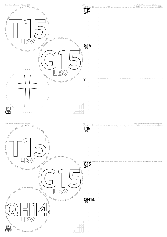
◊ Thu 10 December 2020 The Unknown Shipper and his Peculiar Friends www.jdawiseman.com/2020/20201210_NavalMilitary.pdf
“Портвейн
Красньій
Ливадия”: only previous use of Cyrillic on the placemats was in June 2009.
Note for PostScript programmers: some fonts have glyph names starting “/uni…”; some “/u…”.
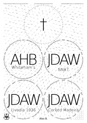
/Circlearrays [
	% [Omitted items]
	[
	(Livadia Red Port 1936)
	[
		/quotedblleft
		/uni041F /uni043E /uni0440 /uni0442 /uni0432 /uni0435 /uni0439 /uni043D ( )
		/uni041A /uni0440 /uni0430 /uni0441 /uni043D /uni044C /uni0456 /uni0439 ( )
		/uni041B /uni0438 /uni0432 /uni0430 /uni0434 /uni0438 /uni044F
		/quotedblright
	]
	[(JDA) {-0.04 Kern} (W)]
	]
	% [Omitted items]
] def  % /Circlearrays

/TitlesFont     /DejaVuSans-ExtraLight def
/CircletextFont /DejaVuSans            def
/NamesFont      /DejaVuSansCondensed   def
/HeaderFont     NamesFont def
/FontSizesRatioTitlesMin 999 def  % Font sizes closer than this ratio (i.e., always) are collapsed to smaller.

/Droplets true def
/DropletsCharges [  % Length a multiple of 4:  SheetNum;  WithinPage or [x y];  Charge;  Spin
	/All [{1   SheetNum       sub PageWidth mul} {Radii 0 get 2 mul MgnB add}      ]    2   {Radii 0 get 4 mul}
	/All [{1.5 SheetNum 2 mul sub PageWidth mul} {GlassPositions 0 get 0 get 1 get}]   -1   0
	/All  0                                                                            -1   0
] def  % DropletsCharges
◊ Tue 24 November 2020 Quinta de la Rosa Planning www.jdawiseman.com/2020/20201124_de_la_Rosa.pdf
◊ Thu 19 November 2020 Blandy’s Madeiras Planning www.jdawiseman.com/2020/20201119_Madeira_Blandys.pdf
Blandy’s Madeiras, arranged by Vintage Wine and Port.
Seven glasses on an /A4 is rare (26 Apr 2017, 25 Nov 2015).
Small error: Duke of Sussex, not of Clarence (happily, the fault not mine).
‘Spin’ a new feature, necessitating that DropletsCharges have length a multiple of 4.
/TitlesFont     /Cochin def
/CircletextFont /Optima-Regular def
/InlineTitles false def

/GlassesOnSheetsMaxPerSheet 7 def

/Droplets true def
/DropletsCharges [  % Length a multiple of 4
	/All  0  -1  0  % SheetNum Location Charge Spin. SheetNum can be /All; position can be circle number.
	/All  {[PageWidth 2 div  Radii SheetNum get MgnB add]}  +1  {Radii SheetNum get 2 mul}
] def  % DropletsCharges

/OutputLogToPage false def
◊ Mon 28 September 2020 Not The (Much-Delayed) VE-Day Tasting Planning www.jdawiseman.com/2020/20200928_Not_VE.pdf
◊ Tue 25 August 2020 Emergency at 67 Pall Mall Planning www.jdawiseman.com/2020/20200825_Emergency.pdf
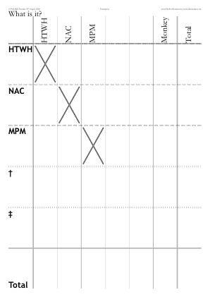
◊ Thu 30 July 2020 Quevedo Whites Planning www.jdawiseman.com/2020/20200730_Quevedo.pdf
Quevedo whites, arranged by Vintage Wine and Port.
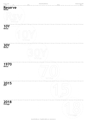
◊ Thu 23 July 2020 Fortified Wines from Andalusia www.jdawiseman.com/2020/20200723_Extenda.pdf
Arranged by The Big Fortified Tasting and by Extenda, The Trade Promotion Agency of Andalusia; presented by Sarah Jane Evans MW on YouTube. The sherries presented were from La Guita, Bodegas Barbadillo, Bodegas Alvear, Toro Albalá, Emilio Lustau, and Bodegas Williams & Humbert.
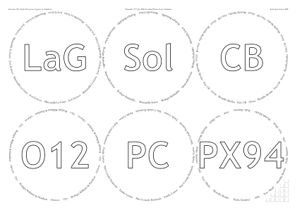
/Orientation /Landscape def

/ExternalLinks [
	% Eleven rows omitted. Links in PDF's Table of Contents.
] def  % /ExternalLinks

% If font sizes closer than this ratio, then collapsed to smaller.
% Prevents aesthetic unpleasantness of slightly different font sizes.
% Setting to large, say >=4, forces all to equal smallest.
% Setting to <=1 deactivates this constraint.
/FontSizesRatioTitlesMin 999 def

/OutputLogToPage false def
◊ Tue 02 June 2020 Tom’s Birthday 1960 Horizontal Planning No placemats yet made
Cancelled: a lesser casualty of the COVID19 lockdowns.
The design of the placemats might echo the design used for the 1960 Horizontal at The Bowler in May 2010.
◊ Tue 12 May 2020 Horizontal of 1992s Planning www.jdawiseman.com/2020/20200512_1992s.pdf
Cancelled: a lesser casualty of the COVID19 lockdowns.
Fonts: /DejaVuSerifCondensed, /GillSansMT-Condensed (as used, for example, on 22 Dec 2014), /DejaVuSerif-Bold, /DejaVuSerif.
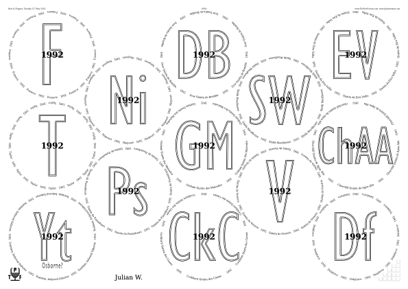
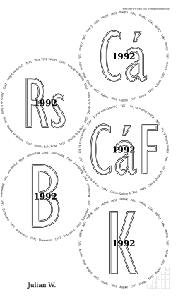
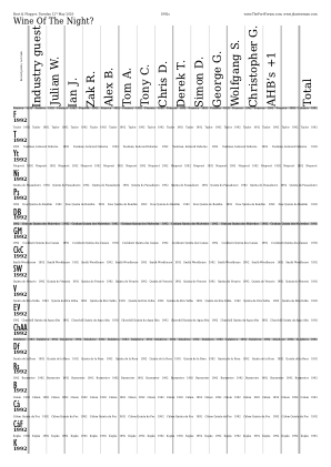
/PackingStyles [
	[ /Diamonds   /GlassesNumMin 6 ]
	[
		/Array
		/GlassesNumMax 5
		/SuppressNonRightOrnaments
		/Positions
			[0 3  1 3]
			[0 1  1 1]
			[1 4]
			[1 2]
			[1 0]
	]
] def  % /PackingStyles
Effective April 2024, /SuppressNonRightOrnaments replaced with /SuppressOrnamentsLeft /SuppressOrnamentsCentre, there also being /SuppressOrnamentsRight.
In October 2025 PackingStyles’s sub-parameter /GlassesNumMin was renamed to /OnlyIfGlassesNumMin, and likewise …Max.
◊ 07–08 May 2020 Quevedo, Live at Home Quevedo Vintage Wine and Port ThePortForum TheBFT www.jdawiseman.com/2020/20200507_Quevedo.pdf and also at VintageWineAndPort.co.uk
/PDF_title (#TasteAtHomeWithOscar) def  % Appears as tab name in browser

/HeadersRight [
	0  [(Thursday 7) {SuperscriptOn} (th) {SuperscriptOff} ( May 2020)]
	1  [  (Friday 8) {SuperscriptOn} (th) {SuperscriptOff} ( May 2020)]
	2  [
		(7) {SuperscriptOn} (th) {SuperscriptOff} /endash {+0.12 Kern}
		(8) {SuperscriptOn} (th) {SuperscriptOff} ( May 2020)
	]  % 2, end of
] def  % /HeadersRight

/PageOrderingGlasses [ 0 1 ] def
/PageOrderingTastingNotePages [ 2 ] def

/VoteRecorders false def
/CorkDisplayNumCopies 0 def
/NeckTagsNumCopies 0 def
/PrePourNumCopies 0 def
/DecantingNotesNumCopies 0 def
/AccountsNumCopies 0 def

/GlassesOnSheets [
	[ 0 1 2 ]
	[ 3 4 5 ]
] def  % /GlassesOnSheets
/GlassesOnTastingNotePages [
	[ 0 1 2 3 4 5 ]
] def  % /GlassesOnTastingNotePages

/PackingNestingColumnMajor true def
/PackingStyles [
	[ /LeftSide   /OnlyIfSheetNumMin 0  /OnlyIfSheetNumMax 0 ]
	[ /RightSide  /OnlyIfSheetNumMin 1  /OnlyIfSheetNumMax 1 ]
] def  % /PackingStyles

/InlineTitlesMaxNumberContours {WithinTitles 3 ge {2} {1} ifelse} def

/WaterBoxes /None def  % /Glasses /TastingNotes /Both, any other value being none

/OutputLogToPage false def
Some ordinary PostScript fiddliness — but observe the interaction between HeadersRight and PageOrdering… — and then the messiness of including images.
But it would be much easier to make the placemats without images, and then add them using Adobe Illustrator or another PDF editor, if you have such software.
◊ Thu 30 Apr 2020 Virtual tasting #4 Planning www.jdawiseman.com/2020/20200430_virtual.pdf
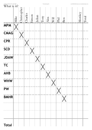
◊ Tue 07 Apr 2020 Virtual tasting Planning www.jdawiseman.com/2020/20200407_virtual.pdf
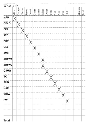
◊ Tue 17 Mar 2020 Vintage 2000 Port in the Time of Coronavirus Planning www.jdawiseman.com/2020/20200317_2000s.pdf
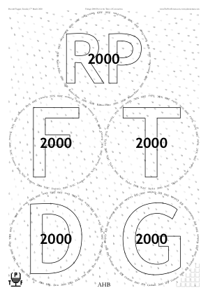
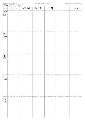
◊ Tue 08 Feb 2020 1970s in Leverkusen arranged by WorldOfPort.de www.jdawiseman.com/2020/20200208_1970s_Leverkusen.pdf

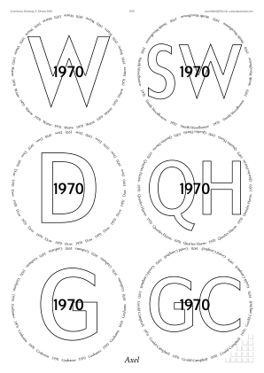
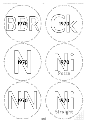
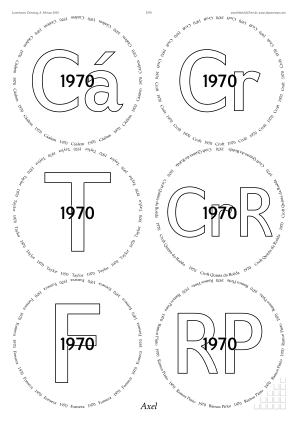
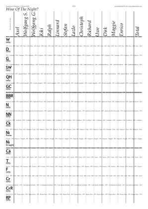
/CircletextFont  /Palatino-Roman         def  % 02 Oct 2018 was previous use
/TitlesFont      /GilliusADFNo2-BoldCond def  % 08 Oct 2013 was only previous use
/BelowtitlesFont /GilliusADFNo2-Bold     def  % 20 Sep 2016 was previous use
/OvertitlesFont  BelowtitlesFont         def
/NamesFont       /Palatino-Italic        def  % 02 Oct 2018 was previous use
/HeaderFont      NamesFont               def
Documentation re code injection has code for dot below last character of “Bros”.
◊ Tue 28 Jan 2020 A Trio Planning www.planetmeehan.com/dlfiles/200128/20200127_Trio.pdf …/20200128_Trio.pdf
Made by Mike Meehan. Two bugs: one his; one mine.
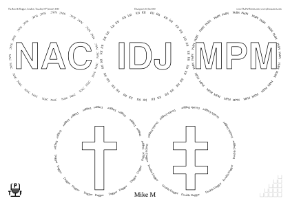
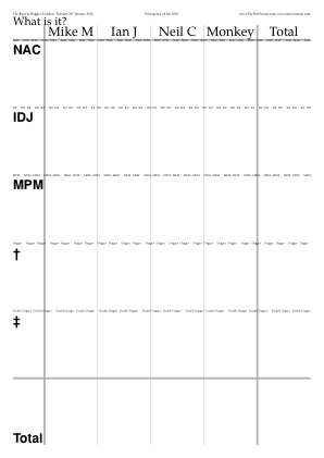
◊ Sat 11 Jan 2020 Port at the Glendora Country Club www.jdawiseman.com/2020/20200111_Glendora.pdf
Made for Andy Velebil.
Page sizes:
/USLegal = 14″×8½″; and /USL = 8½″×11″.
Not known who was to attend: /Names [ 15 {()} repeat ] def
◊ Thu 09 Jan 2020 Blinded bottle of fortified wine Planning www.jdawiseman.com/2020/20200109_blind.pdf
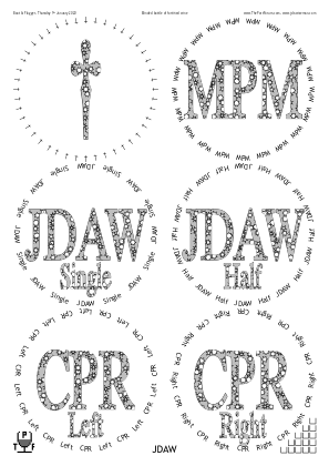
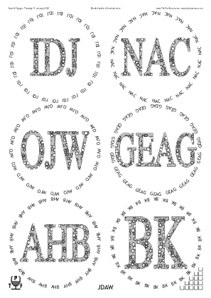
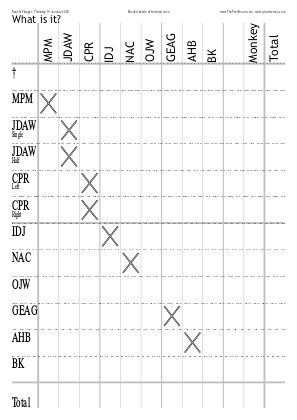
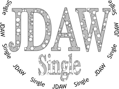
/VoteRecorderTopTexts [
	[ (Wine Of The Night?)  /questiondown ]
	[ (What is it?) ]
] def
/VoteRecorderShowTotalRow [ false true ] def  % Same length as VoteRecorderTopTexts
/VoteRecorderCrossedBox
{
	VoteRecorderShowTotalRow VoteRecorderSheetNum GetEU dup
	{
	pop Titles WithinTitles get ASCIIfy ThisName ASCIIfy eq ThisName length 0 gt and
	ThisName ASCIIfy (BK) ne and
	ThisName ASCIIfy (OJW) ne and
	} if  % VoteRecorderShowTotalRow ...
} def  % /VoteRecorderCrossedBox

/CircletextFont /TrebuchetMS  def  % Non-bold TrebuchetMS most recently used 18 Sep 2012
/TitlesFont     /DukeThinBold def  % DukeThinBold most recently used 09 Mar 2010

/ColourSchemeTitles /MidGrey def  % /MidGrey /Black
/ColourSchemeBelowtitles ColourSchemeTitles def  % /MidGrey /Black

/BelowtitleMaxFontSizeProportionTitles 0.5 def
/FontSizesRatioTitlesMin 1 def  % In effect disables this

/CircletextMaxFontSizeAbsolute 16 def
/CircletextFontSize 16 def  % Renamed Apr 2022

/ShapesInTitles true def
/ShapesToUse [/Star] def  % At least one of: /Flower /Star /Heart
/ShapesAverageSeparation 12.5 def
/ShapesEnclosingCircleRadiusMin 5 def
/ShapesEnclosingCircleRadiusMax 6 def
/ShapesAverageMaxTweakPlusMinus 4 def

/InlineTitles false def
◊ Thu 19 Dec 2019 Unknown Shipper and Peculiar Friends Planning www.jdawiseman.com/2019/20191219_White_Horse.pdf
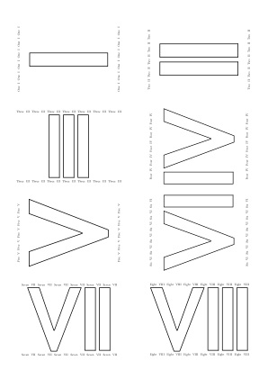
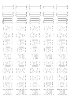
Sticky labels, not glasses sheets: /GlassesNumCopies 0 def .
◊ Wed 18 Dec 2019 1934s and 1935s at Otto’s www.jdawiseman.com/2019/20191218_thirties.pdf
/GlassesNumCopies 0 def
◊ Tue 17 Dec 2019 A port that cost you less than £25 Review Planning www.jdawiseman.com/2019/20191217_GBP25.pdf
Fonts: /GillSans-Light, /GillSans-CondensedBold, /Harrington, /GillSans-Italic.

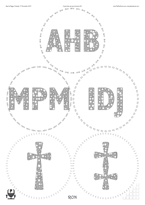
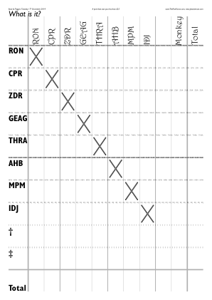
◊ Mon 09 Dec 2019 1991s Review Planning www.jdawiseman.com/2019/20191209_1991s.pdf
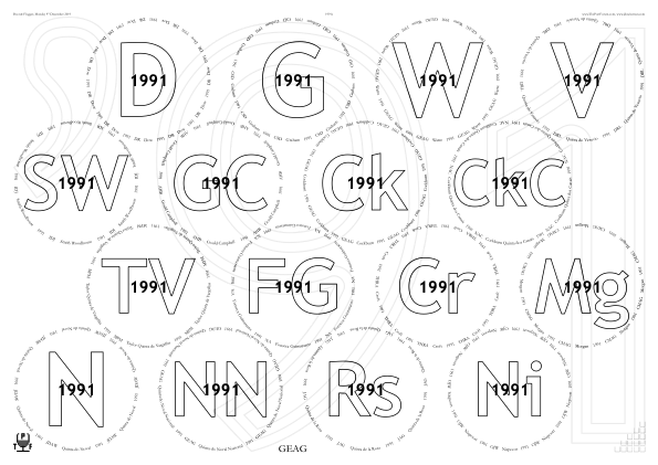
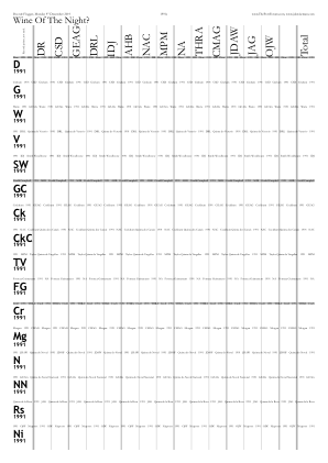

/Names [
	% Non-duplicate non-nametypes from last items of Circlearrays' sub-arrays
	Circlearrays {dup length 1 sub get dup type /nametype ne
	{counttomark 1 sub -1 1 {index 1 index eq {pop exit} if} for}
	{pop} ifelse} forall
	()
] def  % /Names

/PDF_title (1991s on 2019Dec09) def  % Appears as tab name in browser

/FontSizesRatioTitlesMin 1 def  % I.e., unconstrained

/BackgroundTextsGlasses true def
/BackgroundTextsGlassesTexts [  [/quoteright  {-0.09102 Kern}  (9)  1 index  (1)]  ] def
/BackgroundTextsTNsTexts     [  [/quoteright  {-0.09493 Kern}  (9)  1 index  (1)]  dup dup  ] def
/BackgroundTextsGlassesPaintCode
{
	clipsave clip
	/TastingNotes TypeOfPagesBeingRendered eq {1} {2} ifelse  -1  0
	{
	35.36 mul dup 4.32 add gsave setlinewidth 0.9375 setgray stroke grestore
	dup 0 gt {gsave setlinewidth 1 setgray stroke grestore} {pop} ifelse
	} for
	cliprestore newpath
} def  % /BackgroundTextsGlassesPaintCode

/PrePourReverseOrder false def
The constructions of Names is explained in the documentaton on GitHub.
◊ 21 Nov 2019 Rebello Valente Review Param’s Food Planning www.jdawiseman.com/2019/20191121_Rebello_Valente.pdf
Re the use of Droplets, see the discussion on ThePortForum.com.
Code to make the two-line effect is on GitHub, or see all used parameters. I think this can look acceptable if the two words are of similar length and lack descenders (‘Rebello Valente’, perhaps ‘Ramos Pinto’), but not if they are of very different lengths or have descenders (‘Smith Woodhouse’, ‘Tuke Holdsworth’; ‘Butler Nephew’, ‘Gonzalez Byass’, ‘Gould Campbell’, ‘Quarles Harris’, ‘Royal Oporto’).
◊ Mon 11 Nov 2019 The March Porters www.jdawiseman.com/2019/20191111_MarchPorters.pdf
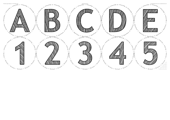
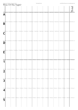

/TastingNotesCirclesBehind false def

/FillTitles true def
/FillTexts [ (March Porters) dup dup dup dup  (Guests) dup dup dup dup ] def
/FillTextPrintQuickerDistillSlower true def
/FillTextAngle /LowerCenter def

/MarginB
{
	/Glasses TypeOfPagesBeingRendered eq
	{
		297 360 mul 127 div  30 sub
		420 360 mul 127 div 48 sub 5 div 2 mul  sub
		% = 225342 635 div ~= 354.869291338582677
	} {24} ifelse  % Glasses
} def  % /MarginB
Other than some decanter labels, the first use of FillTitles since January 2014.
But parts of this could have been differently.
E.g., the placement of the circles (but not of the water boxes) could have been set with something like the following.
/PackingStyles
[
	[ /Array  /Positions [0 1] [1 1] [2 1] [3 1] [4 1] [0 0 0 1] [1 0 1 1] [2 0 2 1] [3 0 3 1] [4 0 4 1] ]
] def  % /PackingStyles
◊ Sat 02 Nov 2019 Stewart Todd www.jdawiseman.com/2019/20191102_GlennElliott_Stewart_1.pdf …/20191102_GlennElliott_Stewart_2.pdf
Made by Glenn Elliott.
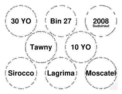
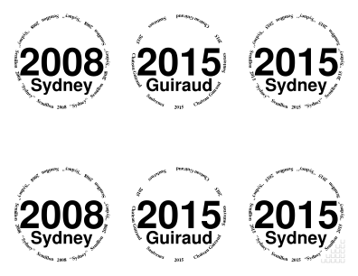
◊ Tue 29 Oct 2019 Phil Wakely’s 50th Birthday Review Food Planning www.jdawiseman.com/2019/20191029_PhilWakely.pdf
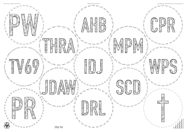
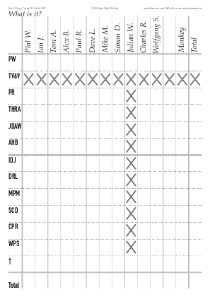

◊ Wed 23 Oct 2019 Messias Review Planning www.jdawiseman.com/2019/20191023_Messias.pdf
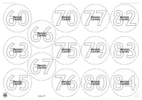
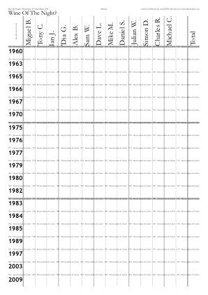
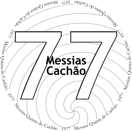
/GlassesOnSheets [
	[ 0  1  PortData length 6 sub {} for ]
	[ PortData length 5 sub  1  PortData length 1 sub {} for ]
] def  % /GlassesOnSheets

/PackingNestingColumnMajor true def
/PackingStyles [
	[ /RectangularDislocation  /GlassesNumMin 6 ]
	[ /Diamonds                /GlassesNumMin 6 ]
	[
		/DiamondsAndRectangular
		/GlassesNumMin 6  /RectColsToLeftOrRowsBelow 0
	]
	[
		/Array  /GlassesNumMax 5  /SuppressNonRightOrnaments
		/Positions [0 3  1 3]  [0 1  1 1]  [1 4]  [1 2]  [1 0]
	]
] def  % /PackingStyles

/OvertitleMaxFontSizeProportionTitles 0.125 def

/Spirals true def
/SpiralCentreFromCentreProportionRadiiInside 0.75 def
/SpiralCentreFromCentreAngle {
	360 WithinTitles 1 add mul PortData length div
} def  % /SpiralCentreFromCentreAngle
Effective April 2024, /SuppressNonRightOrnaments replaced with /SuppressOrnamentsLeft /SuppressOrnamentsCentre, there also being /SuppressOrnamentsRight.
In October 2025 PackingStyles’s sub-parameter /GlassesNumMin was renamed to /OnlyIfGlassesNumMin, and likewise …Max.
◊ Mon 07 Oct 2019 Bring a bottle, blind Review Planning www.jdawiseman.com/2019/20191007_blind.pdf
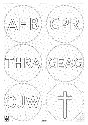
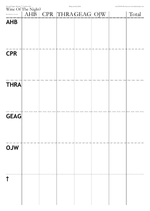
◊ Sat 23 Sep 2019 FTLoP’s Porto Prova: DR vs S. Leonardo TWAIOA www.jdawiseman.com/2019/20190923_GlennElliott_PHT.pdf
Made by Glenn Elliott.
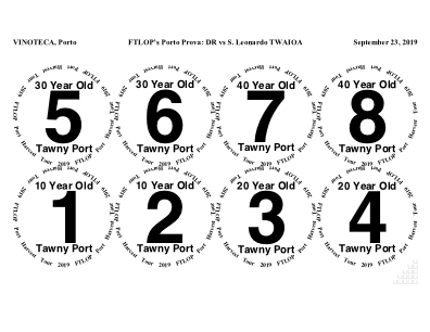
◊ 20→29 Sep 2019 In Portugal www.jdawiseman.com/2019/201909XX_Portugal.pdf
/Names [ () ] def
/NamesVoteRecorder [ 9 {()} repeat ] def

/GlassesNumCopies 60 def
/TastingNotePagesNumCopies 30 def
/AccountsNumCopies 0 def
/NeckTagsNumCopies 0 def

/GlassesClusteredOnVoteRecorders [
	{GlassesOnTastingNotePages}  9 {dup} repeat
] def
/VoteRecorderTopTexts [
	[ /questiondown ]
	GlassesClusteredOnVoteRecorders length 1 sub {dup} repeat
] def
/VoteRecorderShowTotalRow
	[ GlassesClusteredOnVoteRecorders length {false} repeat ]
def
/GlassesClusteredOnCorkDisplay GlassesClusteredOnVoteRecorders def
◊ Tue 10 Sep 2019 1966s Review Param’s Food Planning www.jdawiseman.com/2019/20190910_1966s.pdf
As requested some design inspiration, such as use of fonts /TimesNewRomanPS-BoldMT and /TimesNewRomanPSMT, from placemats of ‘Deeper Underground’ tasting of 28 Jan 2008.
First use of droplets (general discussion, specific discussion). At this stage still experimenting with the various settings.
◊ Sat 27 July 2019 FTLoP 14th Anniversary Party www.jdawiseman.com/2019/20190727_GlennElliott.pdf
Made by Glenn Elliott.
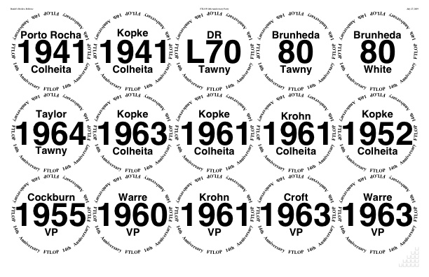
◊ Tue 25 June 2019 2017s Review Planning www.jdawiseman.com/2019/20190625_2017s.pdf
No glasses pages; instead sticky labels, 5×13 per /A4.
Unusual to set /StickyLabelsOrientation /Landscape def, being the orientation of each label rather than of pages.
Also non-standard was /VoteRecorders false def.
And the very long ExternalLinks might have been gratuitous (lots of links to threads, and to
Bs,
B,
Ch,
ChG,
Ck,
Cs,
Cr,
CrS,
Dl,
D,
F,
G,
GST,
Jv,
K,
Lm,
Mt,
My,
Ni,
N,
Pi,
Pç,
Pt,
Qv,
RP,
Ra,
Rs,
Sq,
Sk,
T,
TVVV,
Vl,
V,
VS,
W).
Font for the Names was /AmericanTypewriter-Condensed, and for everything else /AmericanTypewriter-Semibold.
Good or bad?
◊ Tue 11 June 2019 1994s Review Planning www.jdawiseman.com/2019/20190611_1994s.pdf
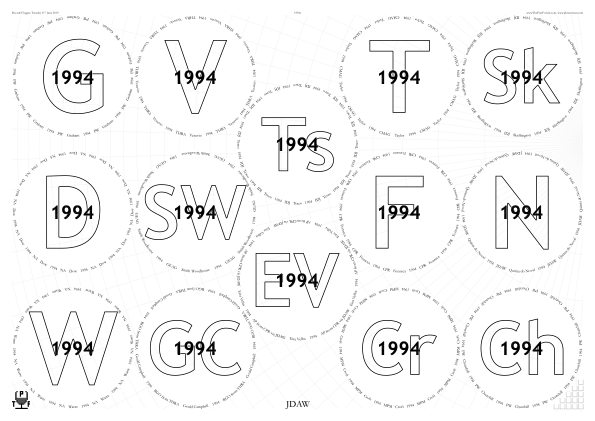
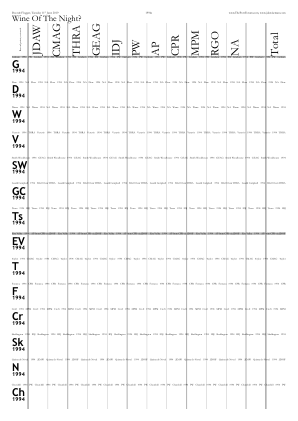
/CrossHatchingOutside true def
/CrossHatchingTitles true def
/CrossHatchingCellArea 1296 def
/CrossHatchingCentreX /Right def
/CrossHatchingCentreY {
	PageHeight MgnT sub 3 mul MgnB add 4 div
	Radii SheetNum get 2 div  sub
} def
◊ Thu 23 May 2019 Victoria’s 200th Review Food Planning www.jdawiseman.com/2019/20190523_Victoria200.pdf
◊ Tue 21 May 2019 Blind and Informal Review Planning www.jdawiseman.com/2019/20190521_blind.pdf
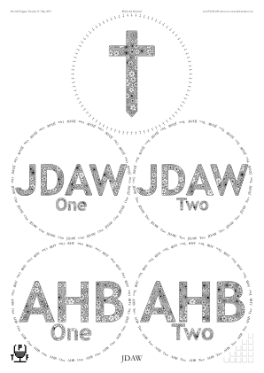
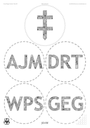
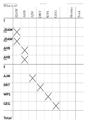

/ColourSchemeTitles /MidGrey def
/ColourSchemeBelowtitles ColourSchemeTitles def

/InlineTitles false def

/ShapesInTitles true def
/ShapesInBelowtitles ShapesInTitles def
/ShapesToUse [/Flower] def
◊ Wed 01 May 2019 Broadbent Port Review Food Planning www.jdawiseman.com/2019/20190501_Broadbent.pdf
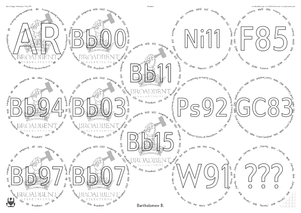
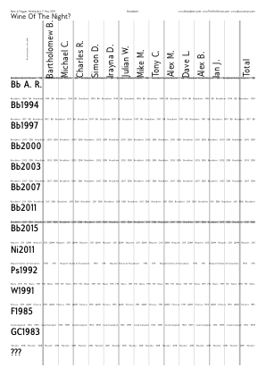
◊ Tue 16 Apr 2019 The Big Fortified Tasting, masterclasses www.jdawiseman.com/2019/20190416_BFT_Kopke.pdf …/20190416_BFT_Sandeman.pdf …/20190416_BFT_Madeira.pdf …/20190416_BFT_Sherry.pdf
Masterclasses at The Big Fortified Tasting, as given by Kopke; by Sandeman; by Vinos de Jerez; and by IVBAM.
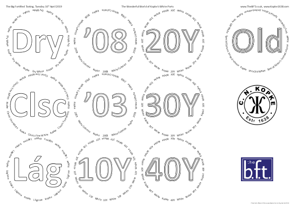
From Kopke:
/PackingStyles [
	[ /Array /Positions [0 2] [0 1] [0 0]  [1 2] [1 1] [1 0]  [2 2] [2 1] [2 0]  [3.25 2] [3.25 1] [3.25 0] ]
] def  % /PackingStyles

/InlineTitlesMaxNumberContours {WithinTitles 3 idiv 1 add} def
/InlineTitlesBlackWidth {1.44 InlineTitlesMaxNumberContours sqrt div} def

/FootersLeft [0
	{
	TypeOfPagesBeingRendered dup /Glasses ne exch /TastingNotes ne and
		{[(www) {-0.04 Kern} (.jdawiseman.com/2019/20190416_BFT_Kopke.pdf)]}
		{()}
	ifelse
	}
] def  % /FootersLeft

/OutputLogToPage false def
From the other three:
/PackingStyles [
	[ /PostsAndLintel  /CentralGlasses 0  /GlassesNumMin 8  /OnlyIfOrientation /Landscape ]
	[ /Arch            /CentralGlasses 0  /GlassesNumMax 7  /OnlyIfOrientation /Landscape ]
] def  % /PackingStyles
The printout of the Kopke placemats had a printer artefact, perhaps noticed only by me. The ideal solution requires a difficult algorithm: help requested in issue #18.
Other BFT masterclasses: 2025, 2024, 2023, 2022, 2018.
In October 2025 PackingStyles’s sub-parameter /GlassesNumMin was renamed to /OnlyIfGlassesNumMin, and likewise …Max.
◊ Tue 26 Mar 2019 DRT’s Annual Elixir Tasting www.jdawiseman.com/2019/20190326_DRT_elixir.pdf Review Planning
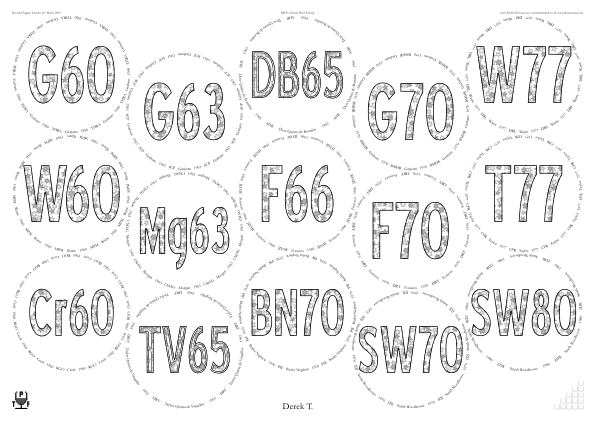
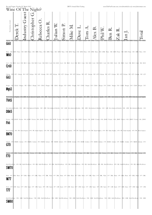

/PackingNestingColumnMajor true def

/TitlesFont /BlueHighwayFreeCondensed def

/Rotate180AlternateNames {TypeOfPagesBeingRendered /TastingNotes eq} def

/ShapesInTitles true def
/ShapesToUse [/Star] def
/ShapesStarsPointsAndStepsArray [ [6 2] [5 2] ] def
/ShapesTitlesFill { ShapesIntY ShapesIntX add 2 mod 0 eq {0.75} {0.9375} ifelse setgray fill} def
/ShapesTitlesStroke {0 setgray stroke} def

/InlineTitlesMaxNumberContours {Circlearrays WithinTitles get 1 get ASCIIfy (1965) eq {2} {1} ifelse} def

/PDF_title HeadersCenter 1 get def
The alternate setgraying with 0.75 and 0.9375 worked perfectly, fixing the problem described in the tasting of 5 March 2019.
◊ Tue 05 Mar 2019 Fonseca 1970 Magnum, and Some Youngsters www.jdawiseman.com/2019/20190305_F70_Youngsters.pdf
A very elegant design.
The one imperfection was that the filling of the stars was done with two grays, 0.875 and 0.9375, which were too similar.
Of course, on a different printer it might have been perfect.
Note to self: next time test 0.75 and 0.9375.
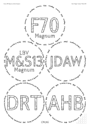
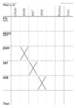

/CircletextFont /GilliusADF-BoldCond def
/TitlesFont     CircletextFont def
/NamesFont      /Harrington def

/AbovetitleMaxFontSizeProportionTitles 0.4 def
/BelowtitleMaxFontSizeProportionTitles 0.4 def

/CircletextMaxFontSizeAbsolute 11 def
/CircletextFontSize 11 def  % Renamed Apr 2022

/ShapesInTitles true def
/ShapesToUse [/Star] def
/ShapesStarsPointsAndStepsArray [ [5 2] ] def
/ShapesTitlesFill {
	ShapesIntY ShapesIntX add 2 mod 0 eq {0.875} {0.9375} ifelse
	setgray fill
} def
/ShapesTitlesStroke {0 setgray stroke} def
◊ Wed 13 Feb 2019 A Box of Vesuvio Review Planning www.jdawiseman.com/2019/20190213_Vesuvio_box.pdf
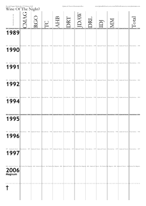
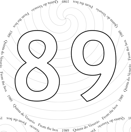
/Spirals true def
/SpiralCentreFromCentreProportionRadiiInside 0.75 def
◊ Thu 03 Jan 2019 Blind Emergency Review Food Planning www.jdawiseman.com/2019/20190103_blind.pdf
First appearance of Spirals.
Drawing these with few Bézier curves uses the function ApproximatingCurve, as ‘discussed’ on comp.lang.postscript, later echoed to math.stackexchange.com.
◊ Thu 13 Dec 2018 Unknown Shipper and Peculiar Friends Planning www.jdawiseman.com/2018/20181213_White_Horse.pdf
◊ Wed 12 Dec 2018 1948s at Otto’s Review www.jdawiseman.com/2018/20181212_1948s.pdf
◊ Tue 11 Dec 2018 Offley Review Param’s Food Planning www.jdawiseman.com/2018/20181211_Offley.pdf
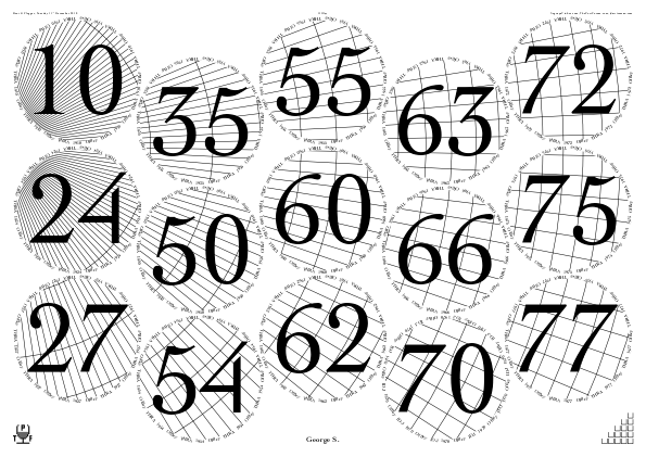
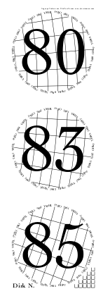
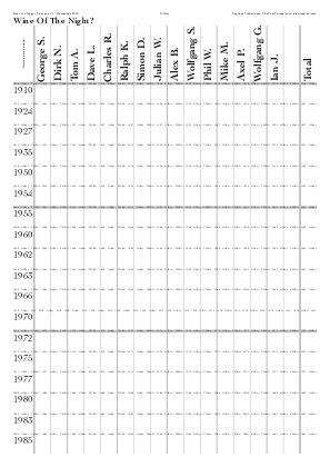
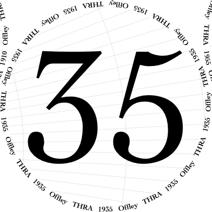
% Extracts from parameters; some omitted

/GlassesOnSheets [
	[ 0 1 Titles length 4 sub {} for ]
	[ Titles length 3 sub 1 Titles length 1 sub {} for ]
] def  % /GlassesOnSheets

/PackingStyles [
	[ /RectangularDislocation     /GlassesNumMin 4 ]
	[ /Diamonds                   /GlassesNumMin 4 ]
	[ /DiamondsAndRectangular     /GlassesNumMin 4 ]
	[ /RectangularAlternateNudge  /GlassesNumMin 4  /ImprovementPointsMin 2 ]
	[ /RightSide  /GlassesNumMax 3  /OnlyIfOrientation /Portrait  /SuppressNonRightOrnaments ]
] def  % /PackingStyles
/PackingNestingColumnMajor true def

/TitlesFont     /Cochin      def
/CircletextFont /Cochin-Bold def

/CrossHatchingInside true def
/CrossHatchingCellArea 56 12 mul 2 mul def  % Two pipes
/CrossHatchingNumRadialLines 120 def
/CrossHatchingCentreX {SheetNum 0 eq {0} {PageWidth 2 div 420 360 mul 127 div sub} ifelse} def
/CrossHatchingCentreY {PageHeight MarginT sub Radii 0 get 2 mul sub} def
/NeckTagsShowCrossHatchingInside true def
First use of /SuppressNonRightOrnaments (which should have been coded ages before—saves so much awkwardness with the headers).
Effective April 2024, /SuppressNonRightOrnaments replaced with /SuppressOrnamentsLeft /SuppressOrnamentsCentre, there also being /SuppressOrnamentsRight.
In October 2025 PackingStyles’s sub-parameter /GlassesNumMin was renamed to /OnlyIfGlassesNumMin, and likewise …Max.
◊ Fri 01 Dec 2018 Niepoort Garrafeiras, arranged by WorldOfPort.de www.jdawiseman.com/2018/20181201_Niepoort_Garrafeira.pdf
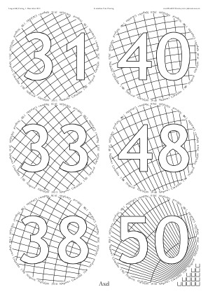
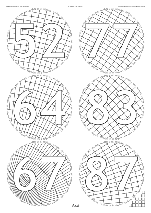
/CrossHatchingTitles  false def
/CrossHatchingInside  true  def
/CrossHatchingOutside false def
Because CrossHatchingNumRadialLines = 180 the radial lines are 2° apart.
And each of the curved ‘rectangles’ has area CrossHatchingCellArea, being about 491pt² ≈ 61.1mm² ≈ (7.8mm)² ≈ (0.3″)².
◊ Tue 13 Nov 2018 Blind Emergency Review Planning www.jdawiseman.com/2018/20181113_Blind.pdf
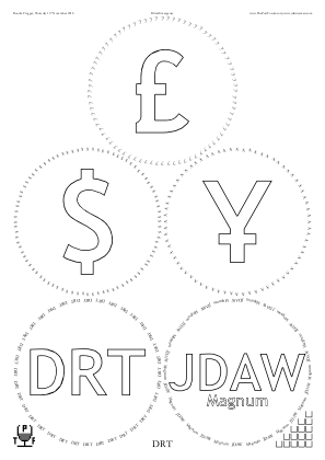
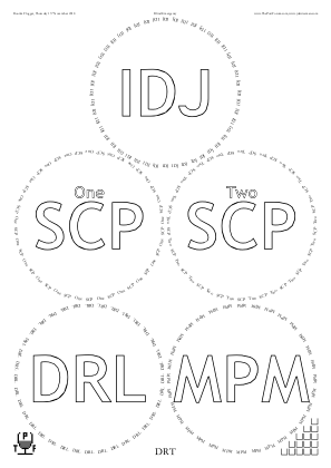
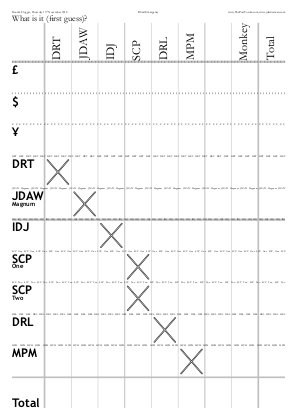
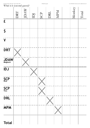

◊ Tue 30 Oct 2018 Mature Single Quinta (or Second Label) Ports Planning www.jdawiseman.com/2018/20181030_SQVP.pdf
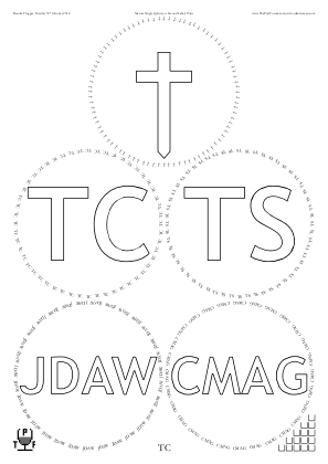
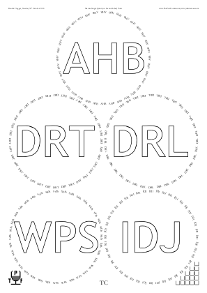
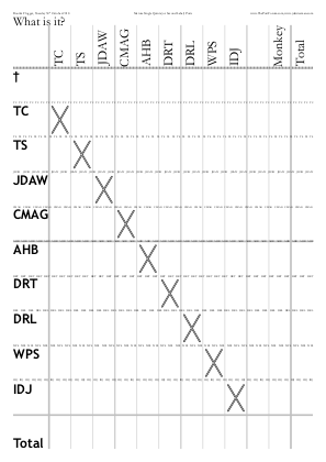

◊ Sat 13 Oct 2018 Sammamish Port Club www.jdawiseman.com/2018/20181013_GlennElliott_SPC.pdf
Made by Glenn Elliott.
◊ Tue 02 Oct 2018 Cockburn Vertical Review Food Planning www.jdawiseman.com/2018/20181002_Cockburn.pdf
Ten years after ThePortForum’s first vertical, it is repeated.
◊ Wed 12 Sep 2018 2016s Review Planning www.jdawiseman.com/2018/20180912_2016s.pdf
No glass circles, instead sticky labels.
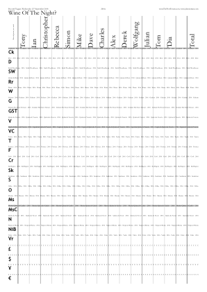
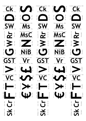
◊ Sat 28 July 2018 Sammamish Port Club www.jdawiseman.com/2018/20180728_GlennElliott.pdf
Made by Glenn Elliott.
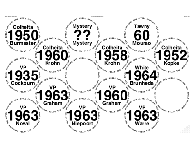
◊ Tue 24 July 2018 Bring a bottle to share Review Planning www.jdawiseman.com/2018/20180724_Glorious.pdf
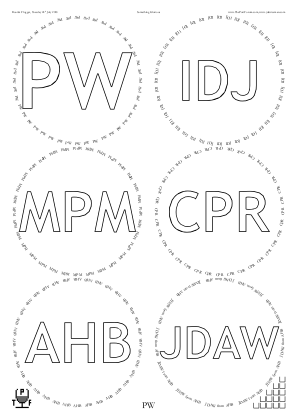
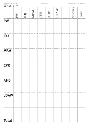

◊ Fri 13 July 2018 Sammamish Port Club www.jdawiseman.com/2018/20180713_GlennElliott.pdf
Made by Glenn Elliott.
A rare use of the /Arch possibility within PackingStyles.
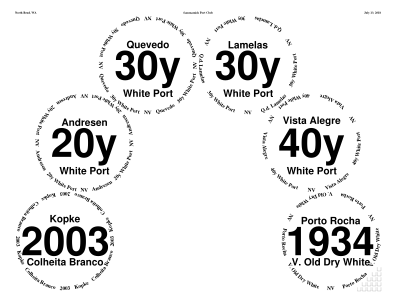
◊ Tue 03 July 2018 Bring a bottle to share Review Planning www.jdawiseman.com/2018/20180703_SCP.pdf
◊ Tue 12 June 2018 Bring a bottle to share Review Param’s Planning www.jdawiseman.com/2018/20180512_BarDouro.pdf
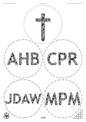
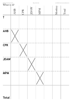

◊ Tue 05 June 2018 8s: Second or Fourth Digit, an ‘8’ Review Param’s Food Planning www.jdawiseman.com/2018/20180605_Eights.pdf
The theme being ‘8’s, the placemats were laden with eight-pointed stars, octagons, and ±8° from horizontal. Upon reflection, maybe it was a bit childish.
Rotation algorithm: 8°; take the WithinTitles element of Titles; ASCIIfy to remove kerning instructions and other non-text; extract decade digit; iff even then neg the 8°.
/RotationTitlesAboveBelowOverCirclearray {08 Titles WithinTitles get ASCIIfy dup length 2 sub 1 getinterval cvi 2 mod 0 eq {neg} if} def
Background pattern:
/ShapesInTitles true def
/ShapesToUse [/Star] def
/ShapesStarsPointsAndStepsArray [ [8 1] [8 2] dup [8 3] dup dup dup ] def

% Updated to work with code of February 2019.
/PaintBackgroundCode {
	/Glasses TypeOfPagesBeingRendered eq
	{
	<< /ShapesAverageSeparation 48 >> begin

	% Clipping path
	MgnL MgnB moveto  MgnL PageHeight MgnT sub lineto
	PageWidth MgnR sub PageHeight MgnT sub lineto
	PageWidth MgnR sub MgnB lineto  closepath
	GlassPositions SheetNum get
		{aload pop Radii SheetNum get 3 copy add moveto 90 450 arc closepath}
	forall

	MgnL  MgnB  PageWidth MgnR sub  PageHeight MgnT sub  % Bounding box
	{ShapesIntX ShapesIntY add 2 mod 0 eq {1} {0.9375} ifelse setgray fill}  % Fill code
	{0.24 setlinewidth 0 setgray stroke}  % Stroke code
	true  % DoActuallyClip
	ShapesClippedToPath  newpath
	end
	} if  % Glasses page
} def  % Executed once, just before painting pages
◊ Sun 03 June 2018 Sammamish Port Club www.jdawiseman.com/2018/20180603_GlennElliott_SPC_Sandy.pdf
Made by Glenn Elliott.
◊ Tue 15 May 2018 Royal Wedding: Port Fit for a (New) Duchess Review Param’s Food Planning www.jdawiseman.com/2018/20180515_RoyalWedding.pdf
An echo of the “Port Fit For a Queen” theme of the E2>V tasting.
Code to paint such hearts is on GitHub. There is a spreadsheet which shows that each side of the heart is a single Bézier cubic.
◊ Wed 09 May 2018 The Big Fortified Tasting: Masterclasses www.jdawiseman.com/2018/20180509_BFT_ColheitaMadeira.pdf …/20180509_BFT_Barbeito.pdf …/20180509_BFT_Sandeman.pdf
Details in the BFT 2018 Show Catalogue. On the day Sandeman brought their own placemats; the same might and might not have been true for the others.
◊ Tue 08 May 2018 Something nice from the sixties Review Param’s Planning www.jdawiseman.com/2018/20180508_Sixties.pdf
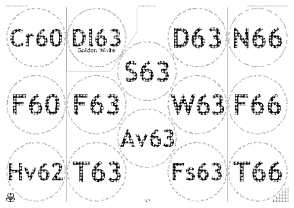
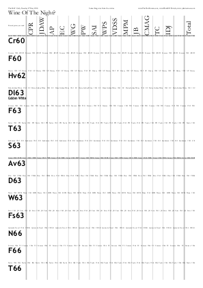

/FlightSeparationLines
[
	[  % +SheetNum 0
	[  [/Top 0  3] [/Bottom  2  5]  ]  % <= 1962
	[  [/Top 8 11] [/Bottom 10 13]  ]  % 1966s
	[  [/Top 3 6 0.5] [3 6] [3 4] [0 3] [/Top 0 3]  ]  % Golden White 1963
	]  % -SheetNum 0
] def  % /FlightSeparationLines
In the printouts was a slight bleed, a very thin line of filled black showing outside the clipped white stars at the edge of the Titles.
Henceforth this can be prevented by setting to false the new parameters ShapesTitlesClip, ShapesAbovetitlesClip, ShapesBelowtitlesClip, ShapesOvertitlesClip, and ShapesPlaceNamesClip.
◊ Tue 17 Apr 2018 Magnus: Cellar reduction and health check Review Food Planning www.jdawiseman.com/2018/20180417_Magnus.pdf
Other Cellar Reduction Parties: Alex on 26 Aug 2014; Julian on 16 Feb 2022.
◊ Fri 14 Apr 2018 A Matter of Place www.jdawiseman.com/2018/20180414_GlennElliott_Roy.pdf
Made by Glenn Elliott.
◊ Tue 10 Apr 2018 1963s: A Second Wind? Review Param’s Food Planning www.jdawiseman.com/2018/20180410_1963s.pdf
Several errors — I hope that my usual standard is better than this.
SCD had withdrawn but was still on the placemats; DRT was on twice; and WG who replaced SCD wasn’t at all.
And, after the event, comment was made about there being different values of OvertitleFontSizes.
All of which was sloppy.
◊ Thu 05 Apr 2018 Tom’s Mystery 1922 Review Planning www.jdawiseman.com/2018/20180405_Mystery1922.pdf
The fonts /Didot and /Didot-Bold echoed the 1922 bottle.
◊ Mon 26 Mar 2018 DRT’s Protective Potion www.jdawiseman.com/2018/20180326_Protective_Potion.pdf
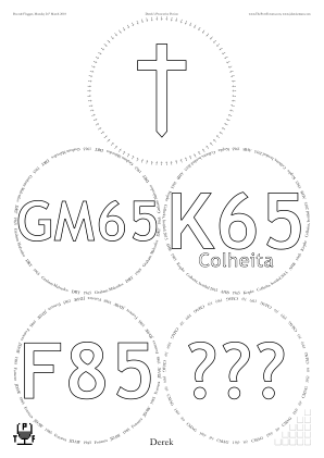
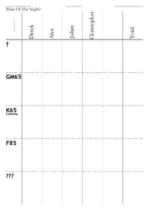
◊ Wed 14 Mar 2018 SQVP and mature LBV, blind Review Param’s Food Planning www.jdawiseman.com/2018/20180314_LBV_SQVP_blind.pdf
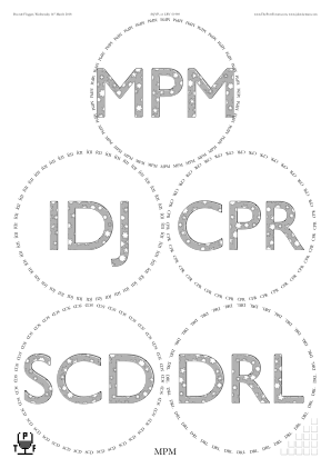
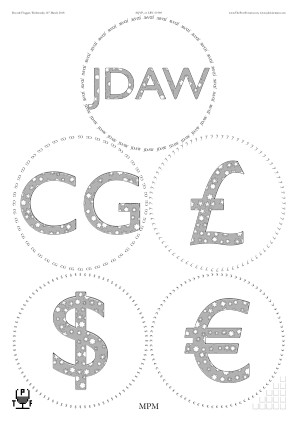

◊ Sat 17 Feb 2018 Quinta do Noval in Leverkusen Review Planning www.jdawiseman.com/2018/20180217_Noval_Leverkusen.pdf
Documentation re code injection has code for dot below last character of “Bros”.
◊ Thu 15 Feb 2018 A New Subject of Her Majesty: Mr Wolfgang Starz Review Param’s Food Planning www.jdawiseman.com/2018/20180215_Mr_Wolfgang_Starz.pdf
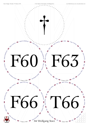
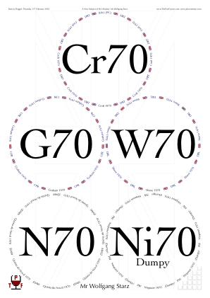
Zoom-in on some of the many Union Jacks (in foreground filled in colour; in background stroked thin):
◊ Fri 26 Jan 2018 Sammamish Port Club www.jdawiseman.com/2018/20180126_GlennElliott_SPC.pdf
Made by Glenn Elliott.
◊ Thu 18 Jan 2018 Port, Mostly 1982 Review Planning www.jdawiseman.com/2018/20180118_BarDouro.pdf
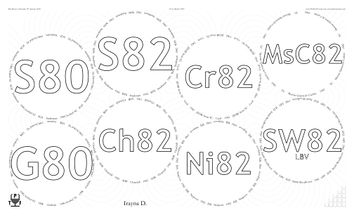
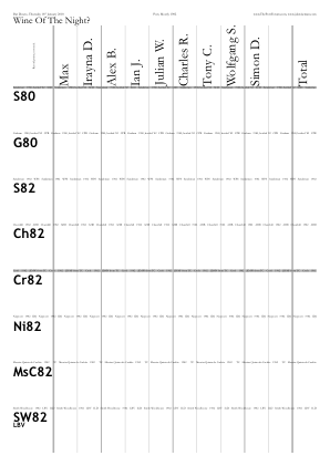
This might have been the last placemats in which /Rays true def. Rays never worked perfectly, and in July 2019 was removed from the code, a related effect being done with Droplets.
◊ Tue 02 Jan 2018 Blind (Ideally 1878) Review Food Planning www.jdawiseman.com/2018/20180102_Ideally1878.pdf
DejaVu fonts are open-source, free, and include a large subset of unicode characters.
So tested here were /DejaVuSansCondensed-Bold (TitlesFont), DejaVuSerifCondensed (CircletextFont, HeaderFont) and /DejaVuSerif (NamesFont).
The sans wasn’t liked.
First use of VoteRecorderMonkeyWhenShowTotalRow and VoteRecorderMonkeyName.
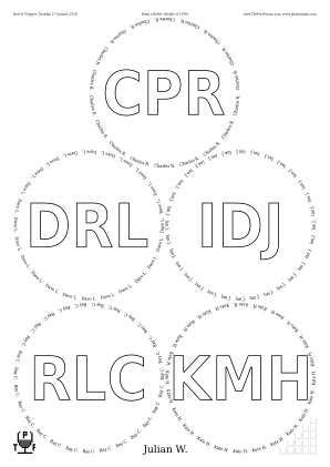
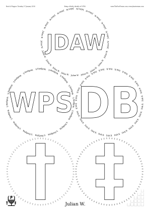
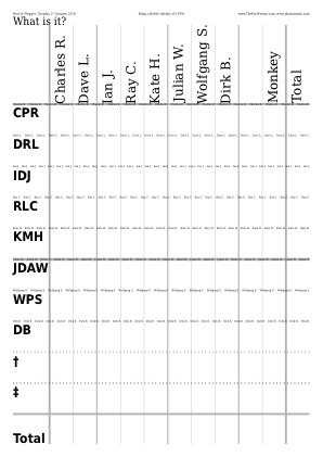
◊ Wed 20 Dec 2017 Luncheon, Otto’s, 1927s Review No placemats
1927 Cockburn, Constantino, Croft, Dow, Fonseca, Martinez, Taylor, and Warre.
◊ Tue 19 Dec 2017 1977s Review Food Planning www.jdawiseman.com/2017/20171219_1977s.pdf
These might have been the first placemats in which the names were mostly sorted into length order (with exceptions). From April 2022 this was assisted by the log file.
There are twelve n/m stars with n, m coprime; and inner radius, and angle at point, between that of a 7/2 and 7/3. These are 5/2, 7/2, 7/3, 8/3, 11/4, 12/5, 13/5, 17/7, 18/7, 19/8, 22/9, and 26/11. But the output wasn’t elegant: the high‑n stars looked too similar.
Also, the spelling error is regretted.
◊ 30 Nov 2017 Sandemans and 1970s (for the Placemat Software’s 15th anniversary) Planning www.jdawiseman.com/2017/20171130_Sandemans_1970s.pdf
Cancelled (venue booking failure)
On 30 Nov 2002 placemats switched from being artisanal to being industrial. These placemats—more accurately, the glasses pages of these placemats—are very similar to the not-used last of the artisanals. The twentieth anniversary was commemorated on 30 Nov 2022.
◊ Wed 29 Nov 2017 Cálem Review Planning Food www.jdawiseman.com/2017/20171129_Calem.pdf
Extracts from these placemats appeared on pp607–8 of Port Vintages (2018).
◊ Sat 18 Nov 2017 Extraordinary Port Tasting www.jdawiseman.com/2017/20171118_GlennElliott_HT.pdf
Made by Glenn Elliott.
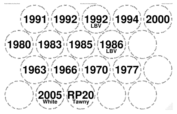
◊ Thu 02 Nov 2017 1970 Sighted, no duplicates Review Planning www.jdawiseman.com/2017/20171102_1970s.pdf
◊ Thu 19 Oct 2017 Mature V.P. or L.B.V., blind, ideally in decanters Review Planning www.jdawiseman.com/2017/20171019_mature.pdf
The first placemats to have in the ExternalLinks a link to What3Words.
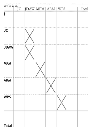

◊ Tue 10 Oct 2017 Gould Campbell, 1924 to 1997 Review Food Planning www.jdawiseman.com/2017/20171010_Gould_Campbell.pdf
◊ Thu 28 Sep 2017 “Bring a container of port, or something a bit like port, to share with port-lovers” Review Planning www.jdawiseman.com/2017/20170928_Bring.pdf
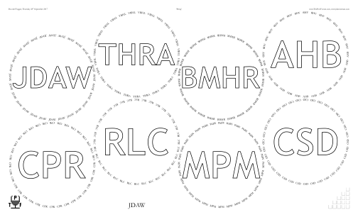


◊ Thu 07 Sep 2017 SQVP Blind Review Planning www.jdawiseman.com/2017/20170907_SQVP_Blind.pdf
Two of the fonts were not the most splendid victory:
/CircletextFont /Estelle def,
/NamesFont /DobkinScript def .
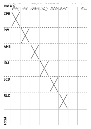
◊ Wed 09 Aug 2017 Summer Thirst, Blind Review Food Planning www.jdawiseman.com/2017/20170809_Blind.pdf
The parameter VoteRecorderCrossedBox is not intuitive to use.
Perhaps the parameter could be somehow reorganised, as not much discussed in issue #80.
/JDAW (JDA) {-0.04 Kern} (W)] def …
/VoteRecorderCrossedBox {VoteRecorderShowTotalRow VoteRecorderSheetNum GetEU dup {pop Titles WithinTitles get ASCIIfy ThisName ASCIIfy eq ThisName length 0 gt ThisName JDAW ne and and Titles WithinTitles get JDAW eq ThisName (IDJ) eq and or} if} def
◊ Tue 01 Aug 2017 Bring a Bottle of Port, or of Something Else, Blind or Not Review Planning www.jdawiseman.com/2017/20170801_Emergency.pdf
◊ 21–23 May 2017 FTLoP 12th Anniversary Extravaganza www.jdawiseman.com/2017/20170721_GlennElliott.pdf …/20170722_GlennElliott_1.pdf …/20170722_GlennElliott_2.pdf …/20170723_GlennElliott.pdf
Made by Glenn Elliott.
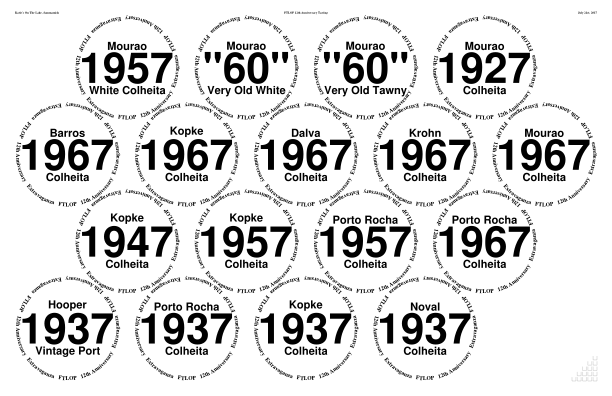
◊ Thu 13 July 2017 La nuit avant le jour de Bastille Review Planning www.jdawiseman.com/2017/20170713_Blind.pdf
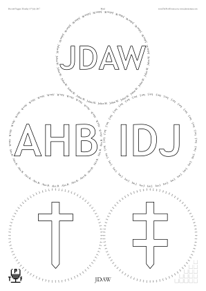
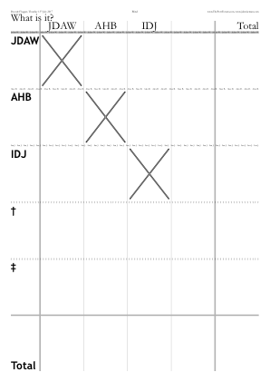
◊ Wed 21 June 2017 Portugal, including The Factory House Review Planning www.jdawiseman.com/2017/20170621_FactoryHouse.pdf …/20170600_Portugal.pdf
◊ Thu 08 June 2017 1967s Review Planning www.jdawiseman.com/2017/20170608_1967s.pdf
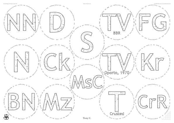
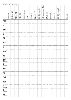
/ShapesInTitles true def
/ShapesToUse [/Flower /Star /Heart] def
/ShapesTitlesFill {1 setgray fill} def
/ShapesTitlesStroke
	{0 setgray 0.18 setlinewidth stroke}
def
◊ Wed 24 May 2017 Anything But Vintage IV, Blind, and Optionally for Somebody Review Planning www.jdawiseman.com/2017/20170524_Blind_for_Somebody.pdf
◊ Wed 10 May 2017 Bring a bottle blind Review Planning www.jdawiseman.com/2017/20170510_help_required.pdf
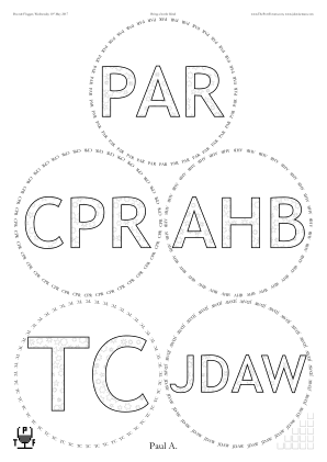
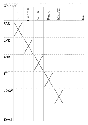

◊ Fri 05 May 2017 Nineties www.jdawiseman.com/2017/20170505_GlennElliott_SPC.pdf
Made by Glenn Elliott.
◊ Wed 26 Apr 2017 Charity tasting at DFW in the Cheesegrater, arranged by AHB www.jdawiseman.com/2017/20170426_DFW.pdf
It is rare to have seven glasses on a single /A4.
◊ Sat 22 Apr 2017 Dueling Bastardo vs. Moscatel www.jdawiseman.com/2017/20170422_GlennElliott_Bastardo_NY.pdf
Made by Glenn Elliott.
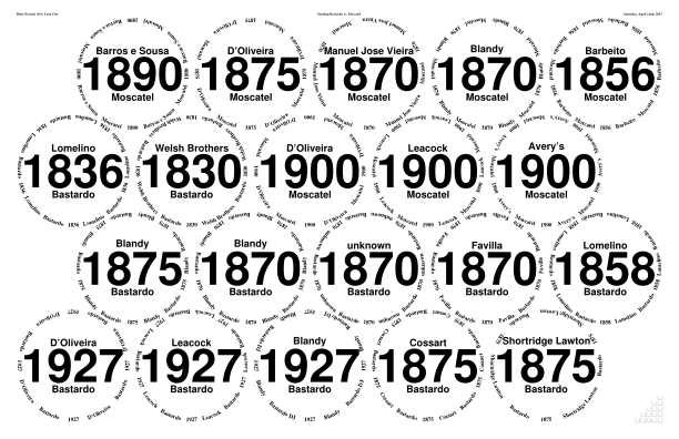
◊ Wed 19 Apr 2017 Bring a bottle of port to share Review Planning www.jdawiseman.com/2017/20170419_emergency.pdf
First use of /Harrington font since 20th September 2016;
first use of /MidGrey since the Dow magnums on 17th January 2013 (4¼ years before);
and the first use of /MidGrey with a serif font since 22nd March 2012 (5 years before);
and the first use of /MidGrey with /Harrington since 20th November 2008 (8½ years before),
the previous occasion having been 26th December 2007 (shortly before that, 9⅓ years before this).
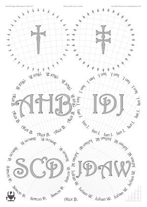
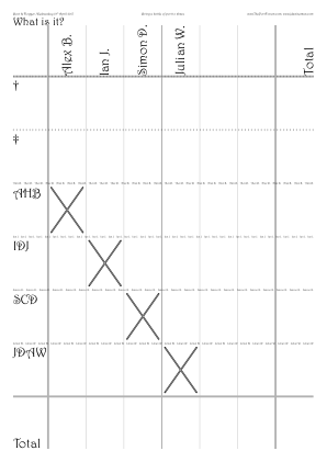
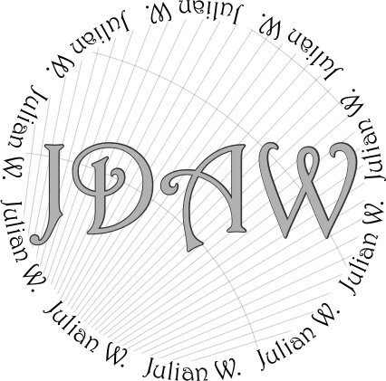
/CircletextFont /Harrington    def
/TitlesFont     CircletextFont def
/ColourSchemeTitles /MidGrey def
/ExclusionAnnulusProportionInnerRadiusTitlesAboveBelow 0.005 def
/CircletextMaxFontSizeAbsolute 18 def
/CircletextFontSize 18 def  % Renamed Apr 2022

/InlineTitles false def
/CrossHatchingInside true def
/CrossHatchingTitles false def
◊ Thu 06 Apr 2017 1955s Review Food Planning www.jdawiseman.com/2017/20170406_1955s.pdf
◊ Wed 22 Mar 2017 Bring a Blind Bottle Review Planning www.jdawiseman.com/2017/20170322_blind.pdf
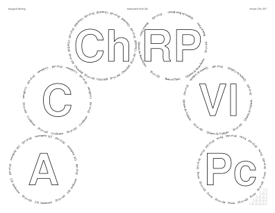
A rare use of the /Arch possibility within PackingStyles.
(Rays never worked perfectly, and in July 2019 was removed from the code, a related effect being done with Droplets.)
◊ Thu 09 Mar 2017 {Dow,Graham,Fonseca,Taylor,Warre} × {1980,1983,1985} Review Param’s Food Planning www.jdawiseman.com/2017/20170309_Eighties_Rectangle.pdf
Several images of this set of placemats were posted on JancisRobinson.com, and a review entitled Vintage ports of call was in the weekend edition of the Financial Times, posted online late on 31 March 2017.
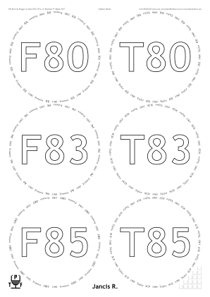
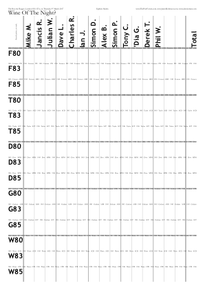

/GlassesOnSheets [
	[ 0 1 2  3  4  5 ]
	[ 6 7 8  9 10 11 ]
	[ 12 13 14 ]
] def
% Omitting some less interesting parameters
/PackingNestingColumnMajor true def
/PackingStyles [
	[ /RectangularDislocation /GlassesNumMin 5 ]
	/RightSide
] def
In October 2025 PackingStyles’s sub-parameter /GlassesNumMin was renamed to /OnlyIfGlassesNumMin, and likewise …Max.
◊ Wed 01 Mar 2017 An Introductory Port Tasting www.jdawiseman.com/2017/20170301_Introductory.pdf
◊ Sat 04 Feb 2017 CUTwC’s 62nd Annual Dinner www.jdawiseman.com/2017/20170204_CUTwC.pdf
◊ Sat 04 Feb 2017 1977s in Leverkusen Planning www.jdawiseman.com/2017/20170204_1977s_Leverkusen.pdf
Stars made as for tasting on 01 Feb 2017. Documentation re code injection has code for dot below last character of “Bros”.

◊ Wed 01 Feb 2017 1977 from Magnum and Tappit Hen Review Food Planning www.jdawiseman.com/2017/20170201_1977_magnum_tappit_hen.pdf
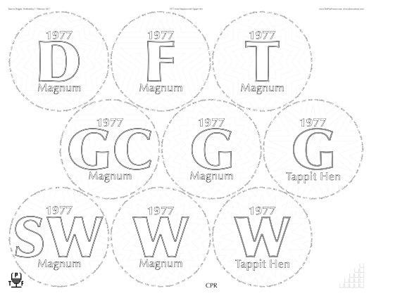
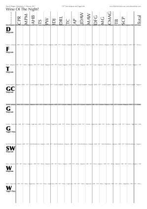
/Magnum (Magnum) def
/TappitHenSans [(T) {-0.08 Kern} (appit Hen)] def
/DecanterLabelsNumCopies {Belowtitles WithinTitles get dup TappitHenSans eq
	{pop 3} {Magnum eq {2} {1} ifelse}
ifelse} def
Also a very complicated PrologueCode, which creates [n,m] data and forms for the stars, then execformed by PaintBackgroundInsideGlassCircles (with /InlinePrefillWhite true def).
That allowed the stars’ parameters to be computed together, to maximise resonance with CirclearraysN.
◊ Sat 27 Jan 2017 Inaugural Meeting, Sammamish Port Club www.jdawiseman.com/2017/20170127_GlennElliott_SPC_a.pdf …/20170127_GlennElliott_SPC_b.pdf
Made by Glenn Elliott.
◊ Wed 04 Jan 2017 Bring a Blind Bottle Review Planning www.jdawiseman.com/2017/20170104_Bring_a_Blind_Bottle.pdf
First use of PaintBackgroundInsideGlassCircles.
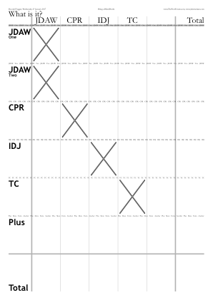
◊ Thu 15 Dec 2016 The Traditional Unknown Shipper and His Peculiar Friends Review Planning www.jdawiseman.com/2016/20161215_White_Horse.pdf
/GlassesNumCopies 0 def
◊ Wed 14 Dec 2016 Luncheon at Otto’s www.jdawiseman.com/2016/20161214_Ottos_luncheon.pdf
/GlassesNumCopies 0 def
◊ Tue 13 Dec 2016 Quinta do Noval Review Food Planning www.jdawiseman.com/2016/20161213_Noval.pdf
◊ Wed 23 Nov 2016 Bring a Bottle, Sighted Review Planning www.jdawiseman.com/2016/20161123_sighted.pdf
/LogThisExtra (Glasses on these sheets might be the cover photograph of The Book. Hence: Names omitted from Circlearrays, though not from CirclearraysTastingNotes etc; and three copies of JDAW glasses sheets, to allow post-spillage retakes.) def
For which purpose:
/JDAW [(JDA) {-0.05 Kern} (W)] def

/Circlearrays [ CirclearraysTastingNotes
	{dup length 2 ge {dup length 1 sub 0 exch getinterval} if}
forall ] def

/GlassesOnSheets [
	[ 0 1 2 3 4 5 ]
	[ 0   2 3 4 5 ]  % AHB and his SW63 are expected to be late,
	             % meaning presumably post-photographs
] def  % /GlassesOnSheets

/GlassesNumCopies {ThisName JDAW eq {3} {1 SheetNum sub} ifelse} def
The branding of its cork revealed the purported SW63 to be a SW66.
◊ Sat 19 Nov 2016 Cálem vertical in Leverkusen Planning www.jdawiseman.com/2016/20161119_Calem_Leverkusen.pdf
◊ Tue 15 Nov 2016 Dinner with Johnny Symington at the Naval & Military Club Review www.jdawiseman.com/2016/20161115_Naval_Military.pdf
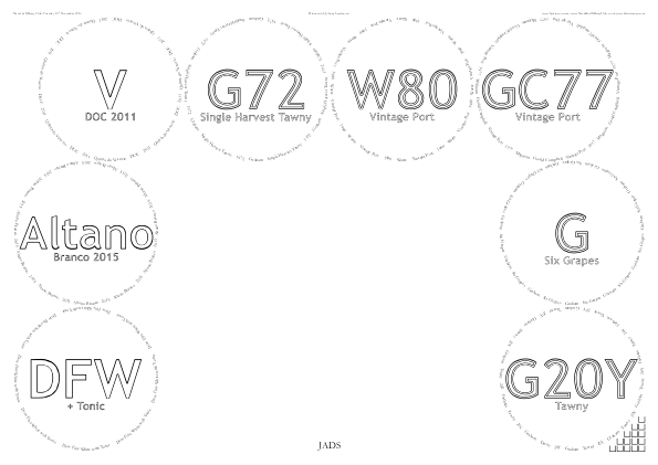
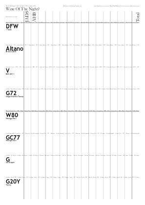
/PackingStyles [
	[ /PostsAndLintel  /CentralGlasses 0 ]
] def  % /PackingStyles

/InlineTitlesMaxNumberContours {WithinTitles 2 le {1} {2} ifelse} def
Fonts at defaults of /Garamond and /TrebuchetMS-Bold.
◊ Wed 12 Oct 2016 Seventy or Seventy-Seven Review Planning www.planetmeehan.com/dlfiles/161012/20161011_70or77v2.pdf
Placemats made by Mike Meehan.
◊ Mon 03 Oct 2016 DrDirk in London Review Planning
No placemats
Blind: Dow 1970; Graham 1980; Churchill 1985.
◊ Tue 20 Sep 2016 Port and Steak Param’s Planning www.jdawiseman.com/2016/20160920_Port_Steak.pdf
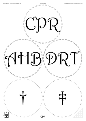
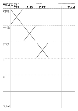
/CircletextFont /Harrington         def
/TitlesFont     CircletextFont      def
/NamesFont      /GilliusADFNo2-Bold def
/HeaderFont     NamesFont           def
◊ Tue 16 Aug 2016 An Alex Emergency: Bring a blind bottle to share Review Planning www.jdawiseman.com/2016/20160816_emergency.pdf
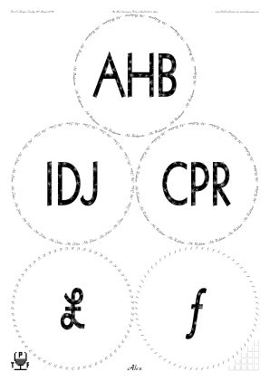
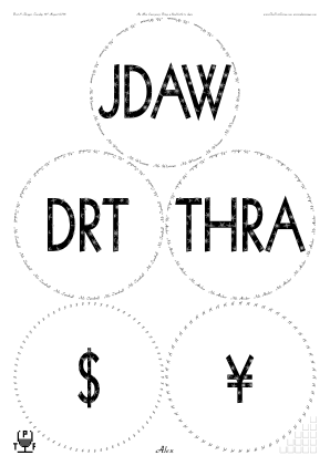
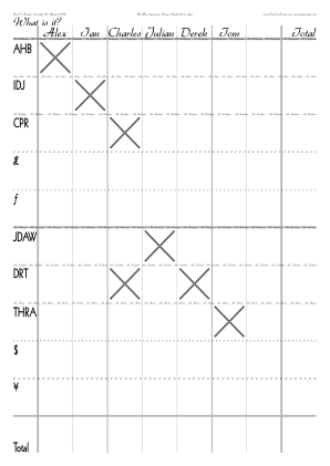
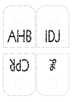
/Circlearrays [
	[ (Mr. Bridgeman) ]
	[ (Mr. Johns) ]
	[ (Mr. Redshaw) ]
	[ /sterling ]
	[ /florin ]

	[ (Mr. Wiseman) ]
	[ (Mr. Turnbull) ]
	[ (Mr. Archer) ]
	[ /dollar ]
	[ /yen ]
] def

/CircletextFont /Gabrielle def
/TitlesFont     /Geo112ThinBold /def
/ShapesInTitles true def
/ShapesToUse [/Star] def
/ShapesStarsPointsAndStepsArray
[
	[3 1.31844]
	[4 1.79214]
	[5 2.27823]
	[6 2.77012]
	[7 3.26502]
	[8 3.76162]
	[9 4.25925]
] def  % /ShapesStarsPointsAndStepsArray
(The “Mr.”s
should have
been Kerned.)

◊ 23–24 July 2016 FTLoP 11th Anniversary Extravaganza www.jdawiseman.com/2016/20160723_GlennElliott.pdf …/20160724_GlennElliott.pdf
Made by Glenn Elliott.
◊ Wed 20 July 2016 Anything But Vintage III Review Planning www.jdawiseman.com/2016/20160720.pdf
Quinta do Infantado’s standard abbreviation is now “In”.
Fonts: /Garamond and /Harrington.
◊ June 2016 Drinks on becoming a ‘Cavaleiro’ of the Confraria do Vinho do Porto Review www.jdawiseman.com/2016/20160600_Knights_of_the_Round_Table.pdf
Font: /LucidaSansUnicode.
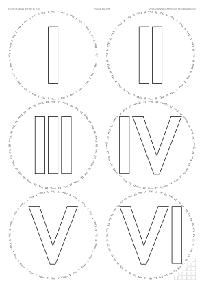
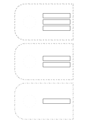
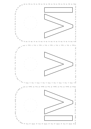
◊ Wed 15 June 2016 A trial of Fonseca 1963 Review Food Planning www.jdawiseman.com/2016/20160615_Fonseca1963.pdf
After the placemats were printed it was discovered that the “proposed GC70 is actually Oporto-bottled”, so it was replaced by a Warre 1963; and “a small issue with the BN55 — in that I could not find it! Can I respectfully offer another 55 — A Mackenzie bottled by J Harvey and Sons Bristol.”
Documentation re code injection has code for dot below last character of “Bros”.
Font = /LucidaSansUnicode.
◊ Thu 19 May 2016 66@50 Review Planning www.planetmeehan.com/dlfiles/160519/160519_1966_Horizontal.pdf
Placemats made by Mike Meehan.
◊ Sat 30 Apr 2016 “Sensational Sercial” www.jdawiseman.com/2016/20160430_Sercial_NY.pdf
/FlightSeparations true def, with much use of /Curve, which has since been replaced with /Arc. It would have been better if the three-way junctions had not been softened with /Curve//Arc, and instead left as hard corners.
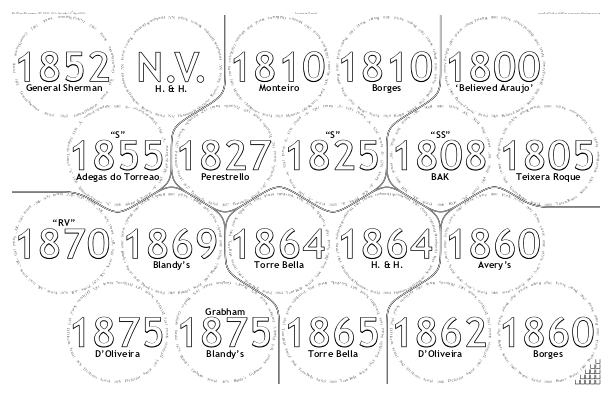
These placemats caused re-observation, and this time understanding, of a bug in Adobe Distiller.
If FlightSeparationPaintSeparately is false and there are multiple lines on one page, and a line ends where the next starts, then that ‘end’ is erroneously controlled by setlinejoin rather than setlinecap
(see manual).
◊ Thu 21 Apr 2016 Her Majesty is Ninety: A Double-Vertical of Dow and Graham (with Oscar, before the BFT) Review Food Planning www.jdawiseman.com/2016/20160421_Dow_Graham.pdf
◊ 16–17 Apr 2016 FTLoP Madeirathon Planning www.jdawiseman.com/2016/20160416_Maderia_RoyHersh.pdf
First appearance of neck tags.
Fonts at defaults of /Garamond and /TrebuchetMS-Bold.
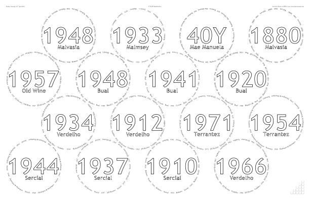
◊ Mon 04 Apr 2016 A Life or Death Emergency — bring a bottle of VP, blind or sighted Review Food Planning www.jdawiseman.com/2016/20160404_DRT_1965.pdf
◊ Fri 01 Apr 2016 A small vertical of Graham, in New York Review Planning www.jdawiseman.com/2016/20160401_NYC.pdf
First use of CrossHatchingOutside.
◊ Fri 17 Mar 2016 The Fourth Annual Doty Cup Review Planning www.jdawiseman.com/2016/20160317_DotyCup.pdf
First use of ShapesPrintQuickerDistillSlower,
and of BackgroundTextsDecanterLabels (both of which were added to the software for these placemats).
Zodiac characters, ♈ ♉ ♊ ♋ ♌ ♍ ♎ ♏ ♐ ♑ ♒ ♓, in fonts /Menlo-Regular and /Menlo-Bold (seemingly with identical zodiac glyphs), made as follows.

/Zodiac [
	[ /uni2648 (Aries) ]
	[ /uni2649 [(T) {-0.04 Kern} (aurus)] ]
	[ /uni264A (Gemini) ]
	[ /uni264B (Cancer) ]
	[ /uni264C (Leo) ]
	[ /uni264D (Virgo) ]
	[ /uni264E (Libra) ]
	[ /uni264F (Scorpius) ]
	[ /uni2650 (Sagittarius) ]
	[ /uni2651 (Capricorn) ]
	[ /uni2652 (Aquarius) ]
	[ /uni2653 (Pisces) ]
] def  % /Zodiac

/Circlearrays [ Zodiac {
	[ exch dup
		1 get exch
		[
			exch {/Menlo-Regular CurrentFontSize selectfont} exch
			0 get {CircletextFont CurrentFontSize selectfont}
		]
	]
} forall ] def  % /Circlearrays

/Titles [ Zodiac {0 get} forall ] def

/SubtitlesTastingNotes [ Zodiac {1 get} forall ] def

/TitlesFont /Menlo-Bold def
The zodiac was too confusing for the sommelier. It would have been better with Titles being ‘1’, ‘2’, etc.
Also, use of both BackgroundTextsGlasses and ShapesInTitles was too busy.
◊ Fri 26 Feb 2016 1985 Horizontal at the Columbia Yacht Club in Chicago Review Planning Planning Planning www.jdawiseman.com/2016/20160226_Chicago_1985s.pdf
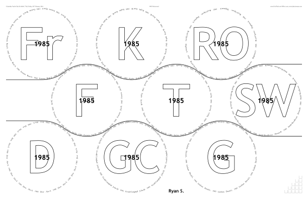
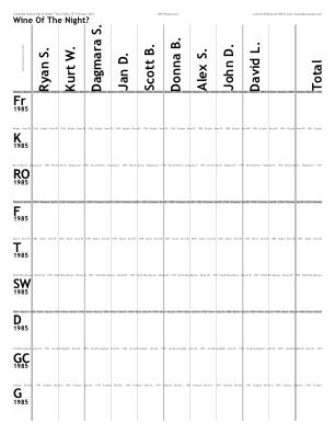
The /Widdershins and /Clockwise possiblities were removed from FlightSeparationLines in April 2021, following ‘discussion’ in issue #87.
A similar effect can still be reached via /FlightSeparationsArcProportionRadius 1 def, and repeated use of /Arc deep inside FlightSeparationLines.
◊ Wed 24 Feb 2016 Vesuvio Review Param’s Food Planning www.jdawiseman.com/2016/20160224_vesuvio.pdf
/PaperType /A2 def, then trimmed in accordance with /OuterGlassesMarginB 3924887 1696576 3 sqrt mul sub 6 mul 18161 div def.
Purposeless accuracy; simpler would have been just as good: /OuterGlassesMarginB 325.86 def % ~= 115mm.
Anyway, computed in Mathematica:
r = (594*360/127 − 48)/(2 + 7 √3) // FullSimplify;
outerGlassesMarginB = Simplify[420*360/127 − 54 − 7 r];
Print[
	"r = ", r, " ≈ ", N[r], "pt; diam ≈ ",
	N[2 r 127/360], "mm\n",
	"OuterGlassesMarginB = ",
	outerGlassesMarginB, " ≈ ",
	N[outerGlassesMarginB], "pt ≈ ",
	N[outerGlassesMarginB 127/360], "mm"
];

Fonts: /TimesNewRomanPS-BoldMT, /TrebuchetMS-Bold, /TimesNewRomanPSMT.
◊ Mon 15 Feb 2016 Bring a blind bottle to share Review Planning www.jdawiseman.com/2016/20160215_blind_emergency.pdf
Activation of CrossHatchingBackground (renamed to CrossHatchingInside) and CrossHatchingTitles has become rare.
Which is fortunate, given the clash with TastingNotesCirclesBehind.
Bug fixed as of version dated 16:00 Monday 15th February 2016—too late for this tasting.
◊ Sat 13 Feb 2016 1966 Horizontal, in Leverkusen, arranged by WorldOfPort.de www.jdawiseman.com/2016/20160213_Leverkusen_1966s.pdf

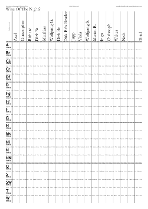
AP’s translations into German are in github.com/jdaw1/placemat/blob/main/Documentation/translations.md#german--deutsche. Help with translations wanted: into German, into other Germanic languages, into other languages. See that page.
◊ Mon 08 Feb 2016 Bring A Bottle, Sighted Review Param’s Food Planning www.jdawiseman.com/2016/20160208_BKS.pdf
First use of PagesToBeInserted: insertion of the food order into the PDF doesn’t break the page numbering, and that inserted page has an entry in the Table of Contents.
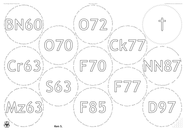
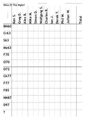
◊ Sat 30 Jan 2016 Home Drinking: testing a recent delivery (GM86, GM87, DB92, 2×WC92) Review www.jdawiseman.com/2016/20160130_recent_delivery.pdf
Fonts at defaults of /Garamond and /TrebuchetMS-Bold.
◊ Mon 18 Jan 2016 The ‘We Must Drink More Port’ Tasting www.jdawiseman.com/2016/20160118_Drink_More_Port.pdf
Made by Ben Read.
◊ Mon 04 Jan 2016 Beer, then Young Port Review Planning www.jdawiseman.com/2016/20160104_emergency.pdf
Test inclusion of the new Accounts page type, in not-quite final form. ∃ discussion.
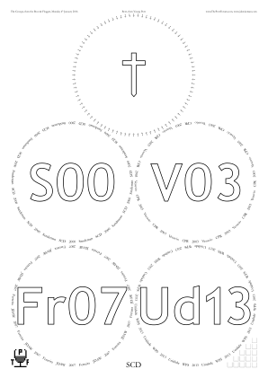
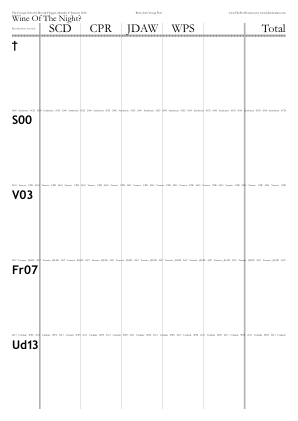


◊ Thu 17 Dec 2015 The Traditional Unknown Shipper and His Peculiar Friends Review Planning www.jdawiseman.com/2015/20151217_WhiteHorse.pdf
Traditionally in The Bell, Wendens Ambo; in 2015 in The White Horse, Newport.
There are sticky labels, seemingly without glasses sheets.
But the sticky labels are merely copies of what is on the glasses sheets.
So there are glasses sheets, zero copies of which are shown:
/GlassesNumCopies 0 def.
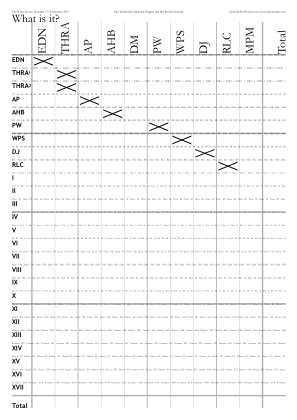
◊ Tue 15 Dec 2015 Seventy-Five at Forty Review Param’s Food Planning www.jdawiseman.com/2015/20151215_1975s.pdf
Font /Albertus-Medium, as used for street signs in Lambeth.
And precision kerning, both vertical and horizontal, in BackgroundTextsTNsTexts.
◊ Sat 28 Nov 2015 Fonseca, in Leverkusen, arranged by WorldOfPort.de Review F48 F48 www.jdawiseman.com/2015/20151128_Leverkusen_Fonseca.pdf
Manual setting of FontSizesTitlesEquivalences, necessitating /FontSizesRatioTitlesMin 1 def.
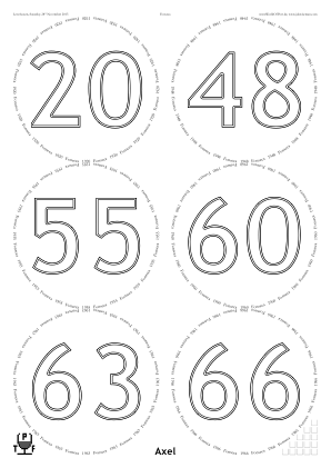
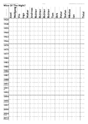
◊ Wed 25 Nov 2015 Horizontal of 1985s Review Param’s Food Planning www.jdawiseman.com/2015/20151125_1985s.pdf
Complicated default value of new parameter BackgroundTextsAlignmentVertical worked well.
Change in default fonts, Titles in /TrebuchetMS-Bold (sans-serif, pleasingly weighted, with bright negative spaces); Circlearrays in /Garamond (which I now prefer to /Garamond-Bold).
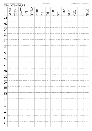
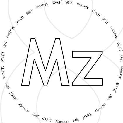
/GlassesOnSheets [
	[  0  1   6 {} for ]
	[  7  1  12 {} for ]
	[ 13  1 Titles length 1 sub {} for ]
] def  % /GlassesOnSheets
/ShrinkRadii [0 1 1] def
It is rare to have seven glasses on a single /A4, for which the packing style /DiamondsPlus exists.
Packomania has this pattern as optimal for seven circles in a 1×0.7 rectangle.
It would have been better with 14 on /A3 and 5 on /A4, as was done for the Messias tasting on 23 Oct 2019.
◊ Tue 4 Nov 2015 With George Sandeman at Otto’s Review www.jdawiseman.com/2015/20151124_GeorgeSandeman.pdf
Prior to November 2015, I had believed, erroneously, that A4 was 250mm·(2^±¼) ≈ 210.2241mm by 297.3018mm. Actually, ISO 216 uses integer numbers of millimetres: A4 is 210mm by 297mm. Corrected in the code as of 31 Oct 2015. Happily, the prior errors were comfortably within ISO 216’s allowed tolerance of ±2mm.
Naturally enough, the small reduction in the page size caused a reduction in the size of the circles. Compare 27Oct2015’s radius of 136.978pt with 04Jan2016’s radius of 136.819pt, a change in the diameter of half the change in the page width ≈ −0.11mm ≈ −0.12%.
Usually GlassesClusteredOnVoteRecorders is derived from GlassesOnTastingNotePages.
But here it was more natural for the gray lines to separate types of wine, hence:
/GlassesClusteredOnVoteRecorders
[
	[  % + 1st & only page of VRs
		[ 0 1 ]
		[ 2 ]
		[ 3 4 5 6 7 ]
		[ 8 9 10 11 ]
	]  % - 1st & only page of VRs
] def  % /GlassesClusteredOnVoteRecorders
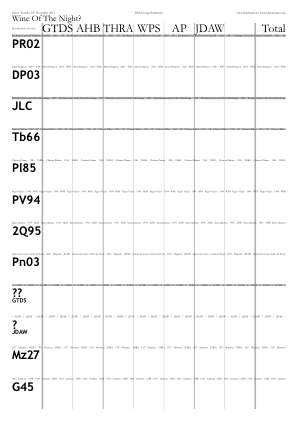
◊ Tue 27 Oct 2015 A relatively long-notice ‘emergency’ Review Planning www.jdawiseman.com/2015/20151027_emergency.pdf
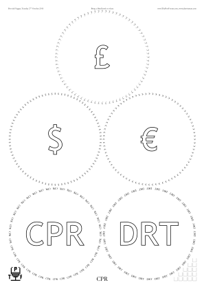
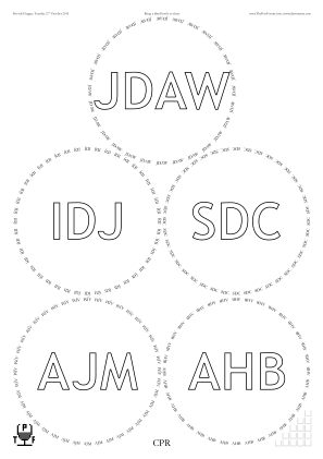
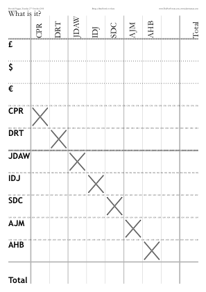
◊ Wed 14 Oct 2015 Woo-Woo not in Bangalore Review Planning www.jdawiseman.com/2015/20151014_pseudo-placemats.png
It has been said that “You can take the man out of the ghetto, but you can’t take the ghetto out of the man”, and equivalently that “You can take the girl out of the trailer park but you can’t take the trailer park out of the girl”. (Yes yes, man/girl thing: I’m quoting; find something important about which to have a bee in your bonnet. This isn’t it.) The same is true of the placemats: even without placemats, there will be placemats.
◊ Mon 21 Sep 2015 An Emergency Review Param’s Planning www.jdawiseman.com/2015/20150921_emergency.pdf
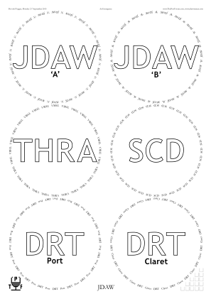
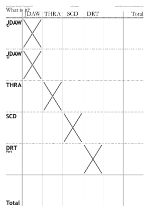
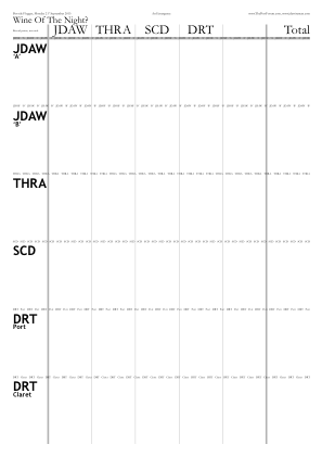
◊ Wed 09 Sep 2015 Her Majesty Queen Elizabeth II becomes the longest-reigning Monarch of the United Kingdom Review Param’s Food Planning www.jdawiseman.com/2015/20150909_Elizabeth2_Victoria.pdf
First use of software with BackgroundTextsOrientation.
BackgroundTextsGlassesPaintCode very faint, 127⁄128, because my printer prints grays dark.
The /Cochin font looks good, as does the /Optima-Regular.
Also see the letter from Buckingham Palace.
◊ Fri 14 Aug 2015 The Elliotts in London: Bring a Bottle, Perhaps of Tawny Review Param’s Food Planning www.jdawiseman.com/2015/20150814_The_Elliotts.pdf
Parameters GlassesCirclesFadingFactor and GlassesCrossedOut added to the software for this tasting.
Comment welcomed, ideally as a GitHub issue.
◊ Mon 27 July 2015 Bring a bottle to share Review Param’s Food Planning www.jdawiseman.com/2015/20150727.pdf
Fonts: /Cardinal-Alternate (not worth repeating), and for the Names, /AbadiMT-CondensedLight.
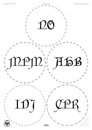
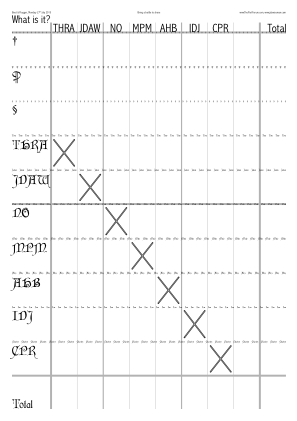
◊ 25–26 July 2015 FTLoP 10th Anniversary Extravaganza www.jdawiseman.com/2015/20150725_GlennElliott.pdf …/20150726_GlennElliott.pdf
Made by Glenn Elliott.

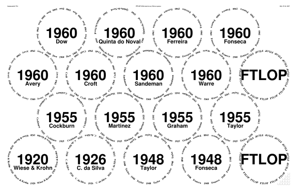
◊ Tue 21 July 2015 “[S]ome kind of emergency”, “Blind” Review Param’s Food Planning www.jdawiseman.com/2015/20150721_emergency.pdf
Fonts: /Cochin and /Cochin-Bold.
Also /Rays true def.
(Rays never worked perfectly, and in July 2019 was removed from the code, a related effect being done with Droplets.)
◊ Tue 07 July 2015 iVin @ Quevedo www.jdawiseman.com/2015/20150707_quevedo.pdf
Made, at short notice, for Oscar. Happy to have helped. (But I forgot to remove the TPF logos.)
Font: /TitlesFont /AvenirNextCondensed-DemiBold def .
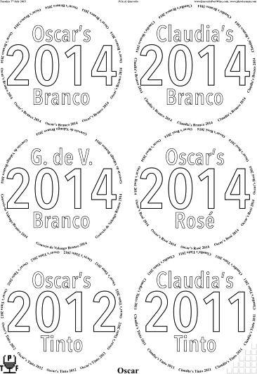
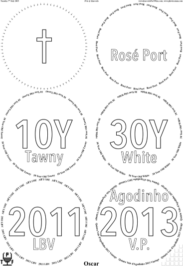
◊ Wed 17 June 2015 The Sweet-Spot Vintages ({’66, ’70, ’77}×{D, G, T, W}), blind Review Param’s Food Planning www.jdawiseman.com/2015/20150617_sweet-spot_vintages.pdf
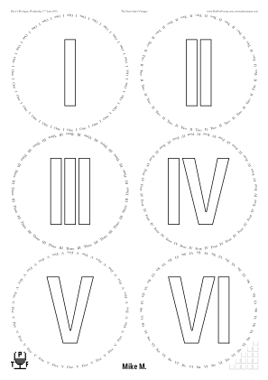
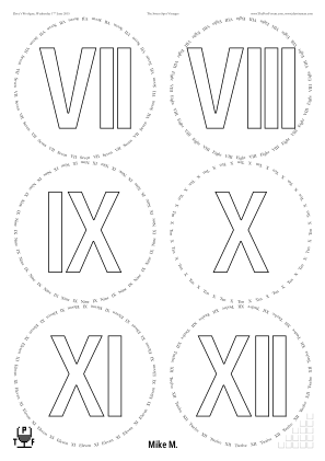
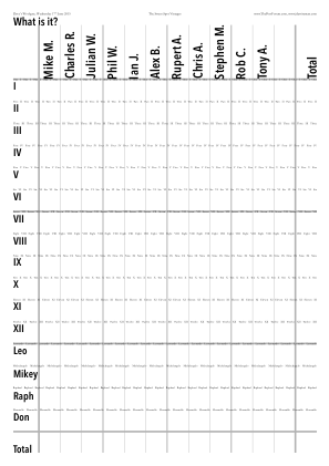
◊ Wed 03 June 2015 “Doty in London — Get it while it’s hot” Review Planning www.jdawiseman.com/2015/20150603_doty.pdf
Fonts: /Helvetica-Bold and /TimesNewRomanPS-BoldMT.
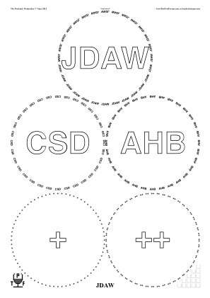
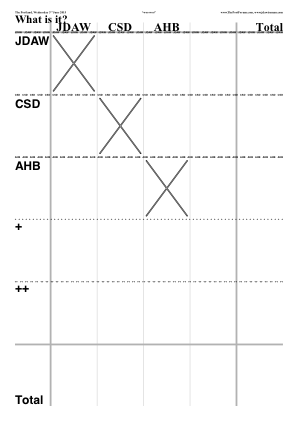
◊ Sun 17 May 2015 Blind and atonal at Left Bank New York Review Param’s Planning www.jdawiseman.com/2015/20150517_NewYork_blind.pdf
Though I dislike the numerals in /GillSans, the letters are very elegant, and nicely different to /Harrington.

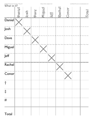
◊ Sat 09 May 2015 1945 Horizontal at The RAF Club (WoP) Review Param’s Planning www.jdawiseman.com/2015/20150509_1945.pdf
Review in The World of Fine Wine, issue 50, 2015.
Fonts: /Garamond and /TrebuchetMS-Bold.
◊ Tue 05 May 2015 Fonseca’s Bicentenary Review Param’s Food Planning www.jdawiseman.com/2015/20150505_fonseca.pdf
Unusually, Titles, TitlesTastingNotes and TitlesVoteRecorder all different; and SubtitlesTastingNotes different from all of Abovetitles, Belowtitles, and Overtitles.
Also, /TitlesFont /GilliusADF-BoldCond def.
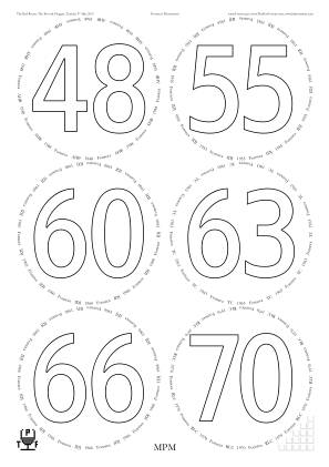
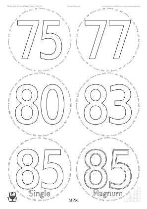
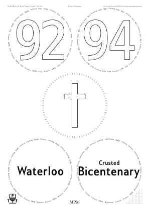
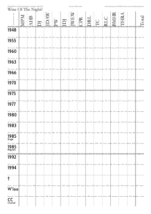
◊ Sat 02 May 2015 Kari’s 50th Birthday Rum Party www.jdawiseman.com/2015/20150502_GlennElliott_rum.pdf
Made by Glenn Elliott.
◊ Wed 15 Apr 2015 Old Claret at Otto’s Review www.jdawiseman.com/2015/20150415_claret.pdf
◊ Sat 11 Apr 2015 The Majesty of Malvasia www.jdawiseman.com/2015/20150411_GlennElliott.pdf
Made by Glenn Elliott.
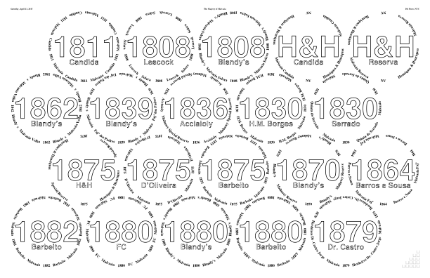
◊ Fri 10 Apr 2015 The Doty Cup, Elemental Planning www.jdawiseman.com/2015/20150410_doty_cup.pdf
It would have been better if the parameter since renamed to PackingNestingColumnMajor had been true.
Fonts: /Garamond-Bold and /GillSansMT-Condensed.
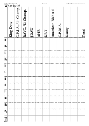
/Circlearrays [
	[ (Hydrogen)   (H)  ]
	[ (Helium)     (He) ]
	[ (Lithium)    (Li) ]
	[ (Beryllium)  (Be) ]
	[ (Boron)      (B)  ]
	[ (Carbon)     (C)  ]
	[ (Nitrogen)   (N)  ]
	[ (Oxygen)     (O)  ]
	[ (Fluorine)   (F)  ]
	[ (Neon)       (Ne) ]
	[ (Sodium)     (Na) ]
	[ (Magnesium)  (Mg) ]
] def

/Titles [
	Circlearrays {1 get} forall
] def

/Belowtitles [
	Circlearrays length {()} repeat
] def
◊ Tue 31 Mar 2015 Blint och informellt farväl till Magnus (och Dereks fem från ’65) Review Food Planning www.jdawiseman.com/2015/20150331_blind_informal.pdf
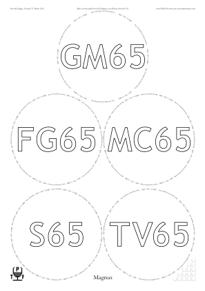
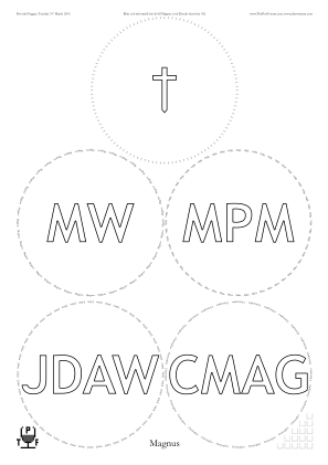
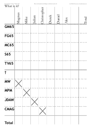
◊ Thu 26 Mar 2015 Blind with a clue Review Param’s Food Planning www.jdawiseman.com/2015/20150326_blind_with_clue.pdf
Having just devised the parameters to reproduce the pre-software placemats used on 12 May 2001, similar was used here.
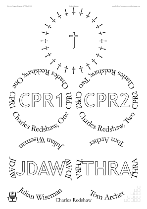
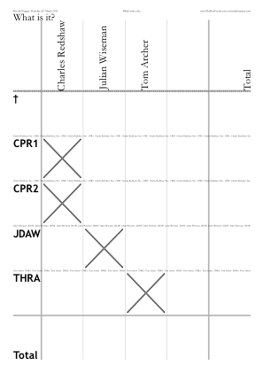
◊ Mon 02 Mar 2015 Henry Shotton in London Review Param’s Food Planning www.jdawiseman.com/2015/20150302_shotton.pdf
Fonts: mostly /Harrington, the Names being in /LucidaSans.
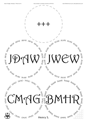
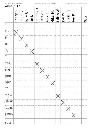
◊ Sun 15 Feb 2015 Lunch with Chris Doty Review Planning www.jdawiseman.com/2015/20150215_doty_lunch.pdf
Fonts: /Garamond-Bold and /Helvetica-Bold.
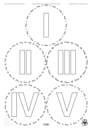
◊ Mon 09 Feb 2015 Port from the 1970s Review Food Planning www.jdawiseman.com/2015/20150209_seventies.pdf
Fonts: /Garamond-Bold and /PTSans-NarrowBold.
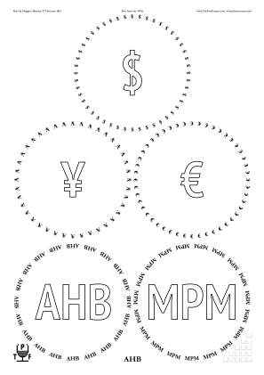
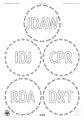
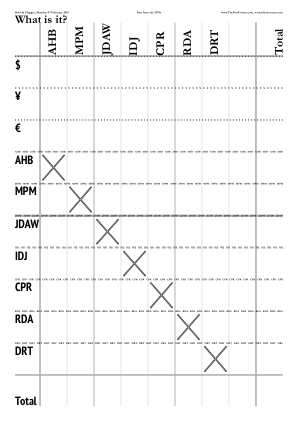
◊ Mon 24 Jan 2015 1985 Horizontal www.jdawiseman.com/2015/20150124_GlennElliott.pdf
Made by Glenn Elliott.
◊ Mon 19 Jan 2015 Fonseca, incl. a bottle from an imperial Review Food Planning www.jdawiseman.com/2015/20150119_fonseca.pdf
Fonts = /Garamond-Bold and /GillSansMT-Condensed.
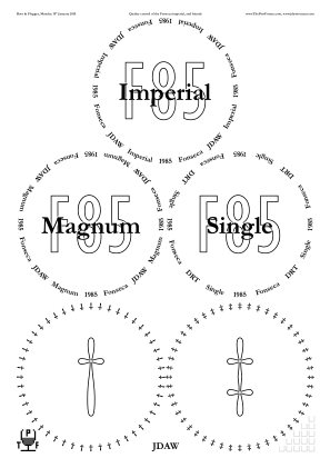
◊ Sat 17 Jan 2015 The 60th Anniversary of the C.U.Tw.C.: Fonseca 1985 in Imperial and Magnums (how it happened), and some Quinta do Noval 1955 www.jdawiseman.com/2015/20150117_CUTwC.pdf
Decanter labels without glasses sheets, by /GlassesNumCopies 0 def.
◊ Tue 30 Dec 2014 Dr Dirk in London (blind ’60s and ’70s) Review Planning www.jdawiseman.com/2014/20141230_bung_hole.pdf
Font: /AccanthisADFStdNo3-Italic.
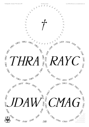
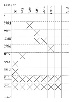
◊ Thu 25 Dec 2014 Three tawnies, and two Warre LBVs www.jdawiseman.com/2014/20141225.pdf Review ‘A’
Fonts: /Garamond-Bold and /GillSansMT-Condensed.
◊ Wed 24 Dec 2014 A Few Tawnies www.jdawiseman.com/2014/20141224_tawnies.pdf
◊ Mon 22 Dec 2014 Available and thirsty for 1970s Review Planning www.jdawiseman.com/2014/20141222_chez_cmag.pdf
Fonts: /Garamond-Bold and /GillSansMT-Condensed.
◊ Thu 18 Dec 2014 Unknown Shipper, Peculiar Friends, again Review Planning www.jdawiseman.com/2014/20141218_bell.pdf
Decanter labels without glasses sheets, by /GlassesNumCopies 0 def.
On the small sticky labels (5×13 on A4) the CircletextFont is an element of Names; everywhere else it is part of the wine description.
Hence /CircletextFont {TypeOfPagesBeingRendered /StickyLabels ne {//true} {StickyLabelsTypeThis 0 eq} ifelse {TitlesFont} {NamesFont} ifelse} def
Also the wrong date: this error is regretted.
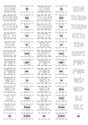
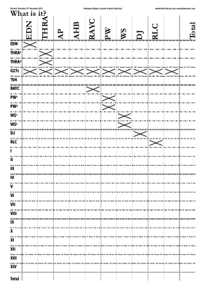
◊ Tue 16 Dec 2014 Off The List at the Boot and Flogger Review Planning www.jdawiseman.com/2014/20141216_boot_flogger.pdf
◊ Wed 26 Nov 2014 75 Years of Martinez Review Planning hallarn.com/placemats/141126_Martinez_placemats_141121a.pdf
Made by Phil Wakely.
Fonts: /TimesNewRomanPS-BoldMT and /Helvetica-Bold.
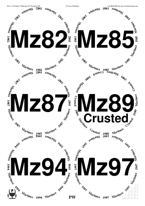
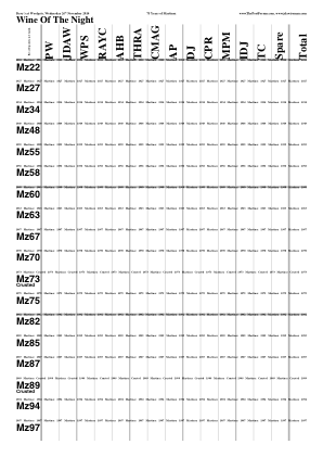
◊ Thu 20 Nov 2014 Doty’s Thirsty Third Thursdays, blind www.jdawiseman.com/2014/20141120_ttt.pdf
◊ Wed 29 Oct 2014 Post-Refurbishment Bung Hole: Croft Review Param’s Planning www.jdawiseman.com/2014/20141029_croft.pdf
Echoing the formatting of the placemats of 16th January 2012. Also, decanter labels reparameterised and recoded.
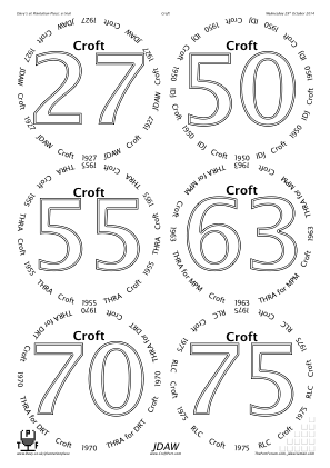
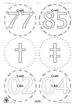
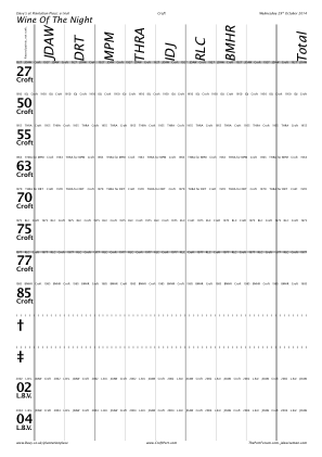
/CircletextFont /LucidaSans        def
/TitlesFont     /LucidaSans-Demi   def
/NamesFont      /LucidaSans-Italic def
/HeaderFont     NamesFont          def
◊ Tue 21 Oct 2014 Ramos Pinto: A Vertical Review Param’s Planning www.jdawiseman.com/2014/20141021_ramos_pinto.pdf
/InlineTitlesMaxNumberContours {Belowtitles WithinTitles get length 0 eq {2} {1} ifelse} def
First use of the functionality controlled by BackgroundTextsPrePourRefit, StickyLabelsShowBackgroundTexts, and StickyLabelsShowCirclearraysInCircle.
Fonts: /Garamond and /AvenirNextCondensed-DemiBold.
◊ Tue 23 Sep 2014 Glenn — Variety is the spice of life Review Planning www.hallarn.com/…
Made by PhilW.
Fonts: /TimesNewRomanPS-BoldMT and /Helvetica-Bold.
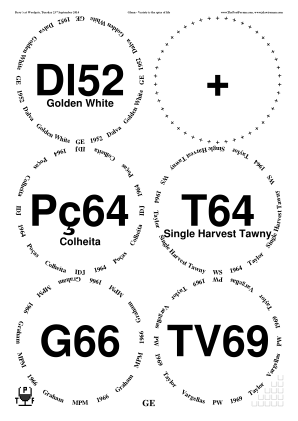
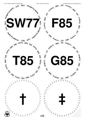
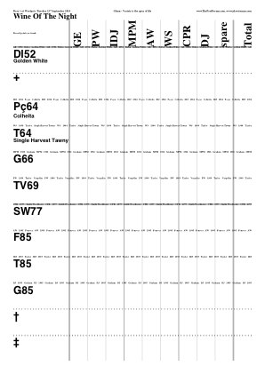
◊ Late Sep 2014 Portugal, Sept 2014 www.jdawiseman.com/2014/20140922_dinner.pdf …/20140923_barbecue.pdf …/20140924_lunch.pdf …/20140924_dinner.pdf …/20140925_lunch.pdf …/20140925_dinner.pdf …/201409_clubs.pdf …/201409_diamonds.pdf …/201409_hearts.pdf …/201409_spades.pdf
Fonts: /TimesNewRomanPS-BoldMT and /AvenirNextCondensed-DemiBold.
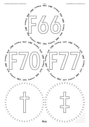
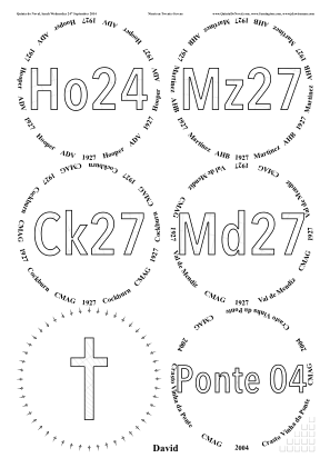
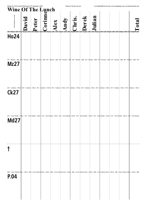
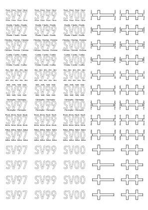
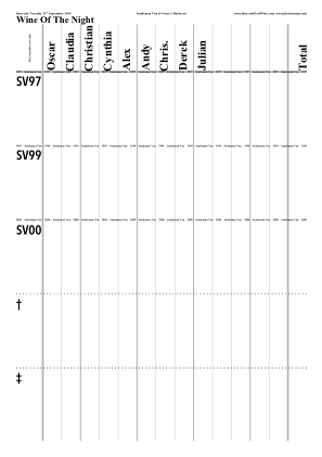
◊ Thu 18 Sep 2014 The Scottish Independence Referendum, 18th Sept 2014 Planning www.danieljewesbury.org/assorted/scottish/Independencereferendum.pdf
Made by Daniel Jewesbury.
◊ Thu 18 Sep 2014 Thirsty Third Thursdays: ΦΣΚ Review www.jdawiseman.com/2014/20140918_TTT.pdf
Another for Thirsty Third Thursdays.
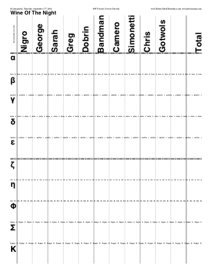
◊ Mon 15 Sep 2014 Port and Steak on the Barbie chez Christopher www.jdawiseman.com/2014/20140915_neals_yard.pdf
CMAG brought Ni83; DRT brought F85; and I can’t recall what I brought.
Fonts are /AccanthisADFStd-Regular and a mite of /AccanthisADFStd-Italic.
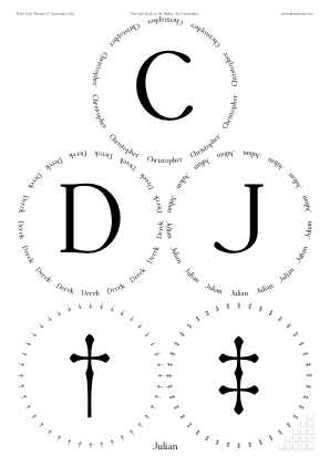
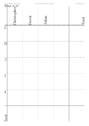
◊ Thu 28 Aug 2014 One Bottler (Hedges & Butler) Review Param’s Planning www.jdawiseman.com/2014/20140827_one_bottler.pdf
Wrong date: 28th August, not 27th August. This error is regretted.
◊ Tue 26 Aug 2014 AHB’s Cellar Reduction Party Review Param’s Planning www.jdawiseman.com/2014/20140826_cellar_reduction.pdf
Format chosen to match the bottle bags (Arabic numbers in Times Roman font), which is why not that agreed in the ![]() thread entitled Naming blinded bottles.
thread entitled Naming blinded bottles.
Other Cellar Reduction Parties: Magnus on 17 Apr 2018; Julian on 16 Feb 2022.
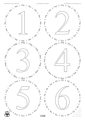
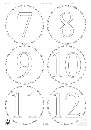
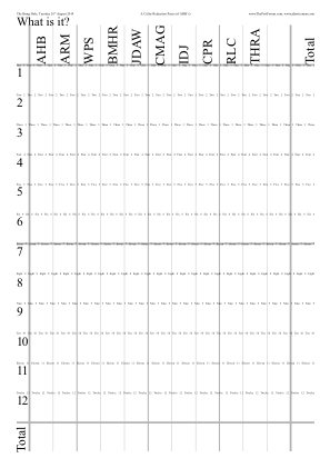
◊ August 2014 House Decanter Labels ‘A’ Param’s www.jdawiseman.com/2014/201408_house_decanter_labels.pdf
Decanter labels only.
Two months later the parameterisation of decanter labels was complete reworked (29 Oct ’14).
Fonts: /CentimeThinNormal and /AmazeNormal.
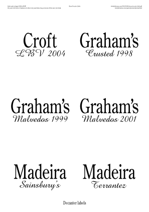
◊ Thu 16 July 2014 Doty’s Thirsty Third Thursdays’s Mature Sauternes, blind www.jdawiseman.com/2014/20140717_thirsty_third_thursday.pdf
◊ Mon 16 June 2014 1997 Maturity Evaluation Review Param’s Planning www.jdawiseman.com/2014/20140616_1997s.pdf
Lots of complicated parameters, available in full from the Param’s post.
Much faffing with margins, so that those on the glasses sheet are different, MarginB being large (less fussy since Feb 2016 when the parameters resembling OuterGlassesMarginB were added).
/FlightSeparations true def, and, even more unusually, with /FlightSeparationPaintSeparately true def.
The first three items of FlightSeparationLines define /Closed paths, used by FlightSeparationPaintCode (“FlightSeparationLineNum 0 eq”, then 1, then 2) as clipping regions. Decorative lines, very thin, are painted.
The remainder of FlightSeparationLines defines the boundary paths.
FlightSeparationPaintCode does nothing with these until the last one, so these are in effect not …PaintSeparately’d.
And that last item paints a thick black line inside a gsave … grestore, and then a less thick white line.
The setlinecaps avoid bleed.
There is a broader lesson from these complicated parameters.
The program is written in PostScript, and is structured to allow, perhaps even encourage, code injection.
In almost all parameters the user has full access to the whole of PostScript, and to the values of the variables maintained by the code.
E.g., FlightSeparationLineNum is there to be used.
That gives great power, but full access to that power requires being able to use PostScript.
◊ Tue 03 June 2014 Blind 1958s for Oscar Quevedo Review Param’s Planning www.jdawiseman.com/2014/20140603_1958_OJMQ.pdf
The most useful lesson from this tasting might be the explanation of the blinding technique.
In October 2014 the decanter labels were reparameterised and recoded: this layout of decanter labels is no longer achievable.
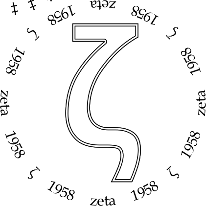
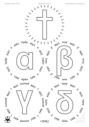
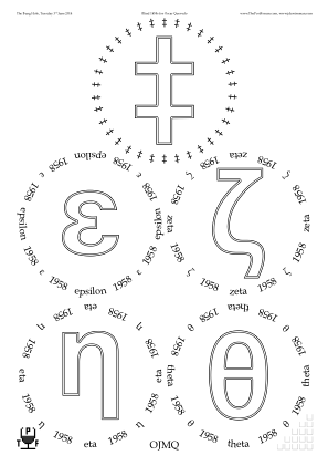
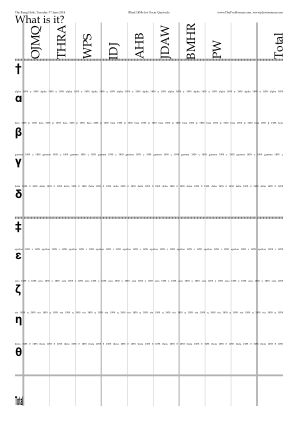
◊ Wed 14 May 2014 Requested by Oscar Quevedo Param’s www.jdawiseman.com/2014/20140514_quevedo.pdf
/ShrinkRadii [ 0 0 1 ] def and /MaxRadius 180 def to have larger table-wine glasses.
/InlineTitles {WithinTitles 9 le} def for the differential patterning.
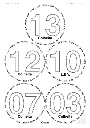
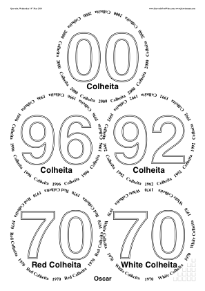
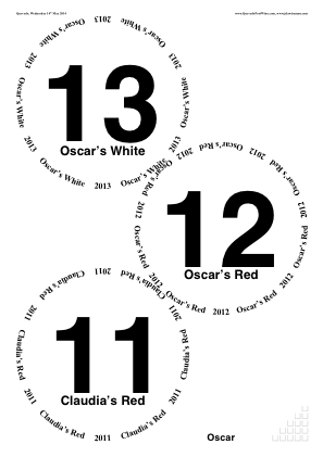
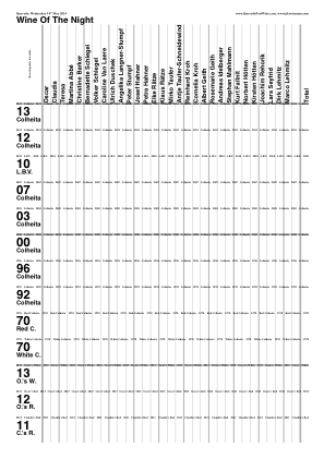
◊ Wed 30 Apr 2014 ‘Crazy 8s’ Review Param’s Planning www.jdawiseman.com/2014/20140430_Crazy8s.pdf
Example element of Titles:
[(Ch) {UnderlineBegin} (8) {UnderlinePaint} (5)].
Fonts: /CoffeeMilkCrazy and /Optima-Bold.
Temporarily, /EmptyGlassesPageAtStart true def,
just to make this image which was used here.
Image having been made, EmptyGlassesPageAtStart was reverted to false to make the printed and retained PDF.
Also, after the tasting, the first use of GlassesAnnotations.
◊ Wed 23 Apr 2014 1960 versus 1963 Review Param’s Planning www.jdawiseman.com/2014/20140423_1960_1963.pdf
Fonts: /NewBostonCondensedNormal and /AvenirNextCondensed-DemiBold;
/NewBostonCondensedItalic and /AvenirNextCondensed-DemiBoldItalic.
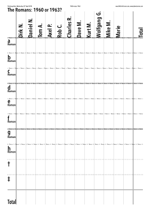
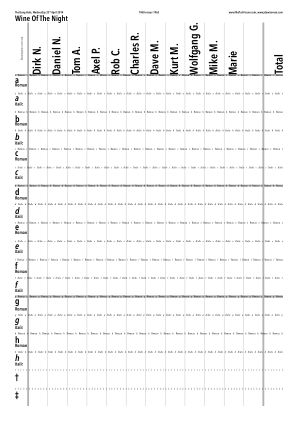
◊ Tue 22 Apr 2014 1966: a small horizontal Review Param’s Planning www.jdawiseman.com/2014/20140422_1966.pdf
New version of code in which an upper bound for InlineTitlesMaxNumberContours is computed automatically (as asked on 02 Apr 2014), and in which CircletextsTweakSize causes Circlearrays to be tight packed (as asked on 21 Mar 2014).
Font = /Optima-Bold.
◊ Sat 05 Apr 2014 DRT and his astronomy chums at the “SGL9 Star Party Tasting”. Planning Param’s www.jdawiseman.com/2014/20140405_star_party.pdf
Some planets: ♂ ♃ ♄ ♅ ♆ ♇.
Fonts: /Optima-Regular, /AppleSymbols, and /Optima-Bold.
Example element of Circlearrays:
[ (Neptune) [{TitlesFont CurrentFontSize selectfont} /uni2646 {CircletextFont CurrentFontSize selectfont}] ]
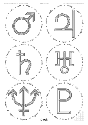
◊ Wed 02 Apr 2014 Graham 1980: a trial Review Param’s Planning www.jdawiseman.com/2014/20140402_g80.pdf
Can InlineTitlesMaxNumberContours be computed automatically?
An algorithm question has been asked on comp.lang.postscript.
(Edit: done as InlineTitlesAttemptMinimiseNumContours.)
/TitlesFont /Helvetica-Bold def /CircletextFont /TimesNewRomanPS-BoldMT def
◊ Fri 21 Mar 2014 The Doty Cup 2014 Review Param’s Planning www.jdawiseman.com/2014/20140321_doty_cup.pdf
/CircletextsMinCopies {WithinTitles 3 eq {5} {1} ifelse} def
This gave the tightest packing.
Does it suggest a need for a new parameter that automatically does a tight-packing optimisation?
Hmm. Maybe.
(Edit: done, as CircletextsTweakSize.)
Also, the first use of FontSizesTitlesEquivalences.
Fonts: /Garamond-Bold and /GillSansMT-Condensed.
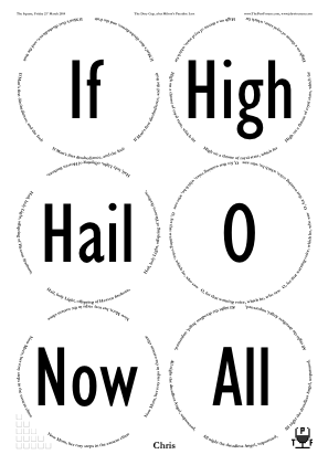
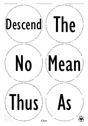
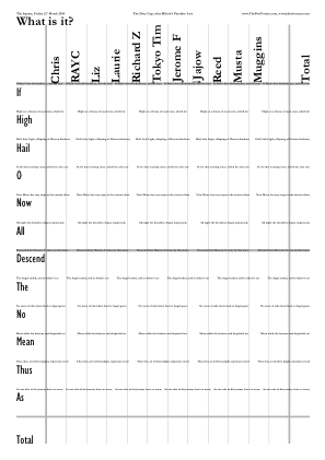
(Opening words of the twelve books of Milton’s Paradise Lost.)
◊ Wed 26 Feb 2014 Not Drinking TV64 Review Planning www.jdawiseman.com/2014/20140226.pdf
Fonts: /TimesNewRomanPS-BoldMT and /Helvetica-Bold.
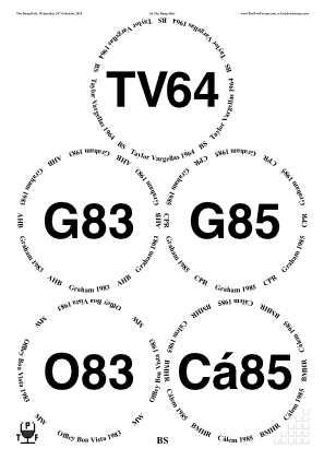
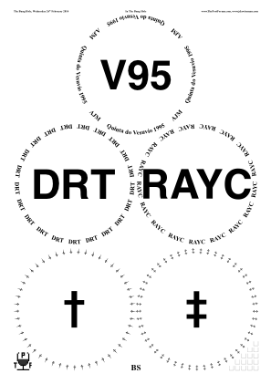
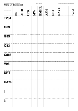
◊ Tue 18 Feb 2014 Thirsty at Half Term Review Param’s Planning www.jdawiseman.com/2014/20140218_half_term.pdf
Crosses (✠ ☩ ♰ ♱ ☨ ☦),
in font /Menlo-Regular,
glyphs /uni2720, /uni2629, /uni2670, /uni2671, /uni2628, /uni2626.

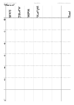
◊ Sat 01 Feb 2014 The 59th Annual Dinner of the Cambridge University Tiddlywinks Club Cr55 SV97 SV99 SV00 Param’s www.jdawiseman.com/2014/20140201_cutwc_decanter_labels.pdf
Decanter labels only, by /Names [ ] def.
◊ Mon 27 Jan 2014 Taylor 1985: a trial Review Param’s Planning www.jdawiseman.com/2014/20140127_Taylor1985.pdf
/VerticalMiddlingTitles /MatchNone def looked more elegant with the single Greek letters.
(In April 2016 this behaviour become the default, via VerticalMiddlingTitlesAlwaysMatchNone.)
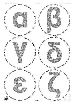
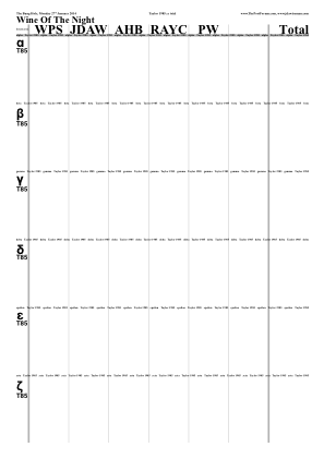

Other than some decanter labels, the only use of FillTitles between July 2012 and November 2019.
◊ Wed 08 Jan 2014 Blind in the Bung Hole ∵ Ronnie Visits London Review Param’s Planning www.jdawiseman.com/2014/20140108_RMW.pdf
Vanilla, except /TitleMaxHeightProportionInnerRadius 1 def to constrain the size of the asterisk.
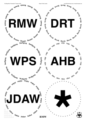
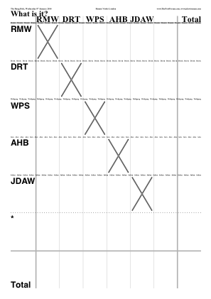
◊ Thu 02 Jan 2014 Bring a Bottle to Share, ∵ Dr. Dirk in London Review Param’s Planning www.jdawiseman.com/2014/20140102_blind.pdf
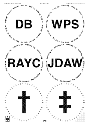
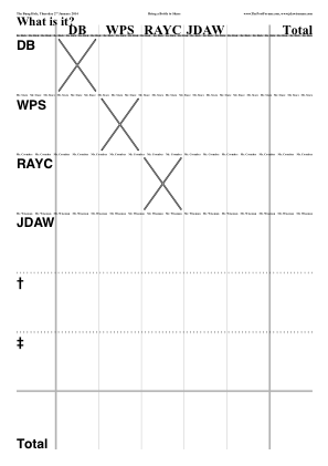
◊ Thu 19 Dec 2013 Unknown Shipper, Peculiar Friends, Revisited Review Param’s Planning www.jdawiseman.com/2013/20131219_bell.pdf
The previous use of the font /SnowtopCaps was ghastly.
This use was better.
◊ Sat 07 Dec 2013 1955 Horizontal for Pilsen Homeless Health Services Review Planning www.jdawiseman.com/2013/20131207_1955_GlennElliott.pdf
Made by Glenn Elliott. These appeared in the Huffington Post of 20 Dec 2013 (link to archive.org as original has lost its picture: tut tut). Separately, the standard abbreviation for Cockburn has become ‘Ck’.
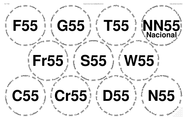
◊ Thu 28 Nov 2013 ‘What?’, after the Berry Bros & Rudd Port Walk Review Planning www.jdawiseman.com/2013/20131128_post-bbr.pdf
Fonts: /TimesNewRomanPS-BoldMT and /Helvetica-Bold.
◊ Wed 27 Nov 2013 83@30 Review Planning danieljewesbury.org/…
Made by Daniel Jewesbury. The ZX Spectrum font was very ’80s.
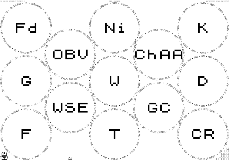
◊ Thu 31 Oct 2013 All Hallows’ Eve: Remember the Dead (Blinded and Decorated) Review Param’s Planning www.jdawiseman.com/2013/20131031_all_hallows_eve.pdf
Fonts: /Firecat-Medium, /LucidaBlackletter, and /AmericanTypewriter-Light.
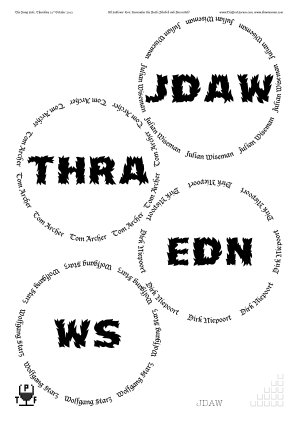
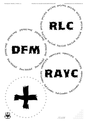
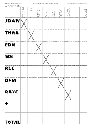
◊ 11–12 Oct 2013 1963s, for AHB’s Quinquagenary (with Champagne for the better halves) Review Param’s www.jdawiseman.com/2013/20131011_1963_ahb.pdf …/20131011_champagne_ahb.pdf
At 433 pages for a tasting over three sessions and two locations, much use of the PageOrdering… parameters.
Fonts: /BookmanOldStyle and /GillSansMT-ExtCondensedBold.
Would have been better with InlineTitles: lesson learnt.
Documentation re code injection has code for dot below last character of “Bros”.
◊ Tue 08 Oct 2013 Andy Velebil in London Review Param’s Planning www.jdawiseman.com/2013/20131008.pdf (Unused: www.jdawiseman.com/2013/20131008_calem.pdf)
Fonts: /BookmanOldStyle and /GilliusADFNo2-BoldCond (the latter being an error for several reasons, including its Q’s descender).
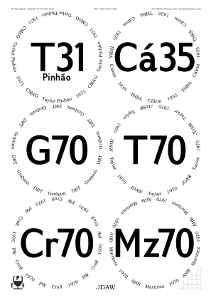
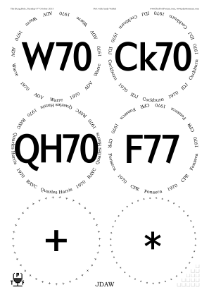
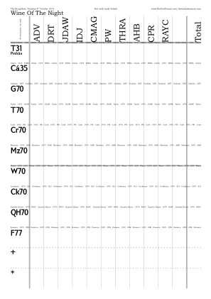
◊ Wed 02 Oct 2013 Port Review Planning Param’s www.jdawiseman.com/2013/20131003.pdf
Oops: wrong date on the placemats. Wednesday 2nd, not 3rd. Anyway, another airing for the /Harrington font.
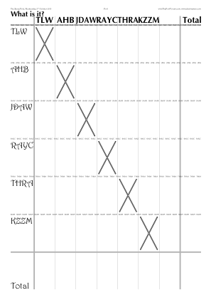
◊ Wed 25 Sep 2013 Bring A Bottle of Vintage Port (G70 magnum, GB70, T70, N66, W77, G??) Review Param’s Planning www.jdawiseman.com/2013/20130925.pdf
Fonts: /BookmanOldStyle and /GillSansMT-Condensed.
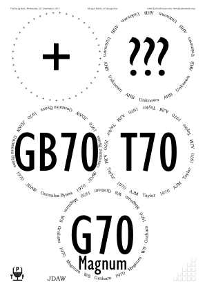
◊ Tue 10 Sep 2013 “Bring a bottle wrapped in foil” Review Param’s Planning www.jdawiseman.com/2013/20130910.pdf
Fonts: /BookmanOldStyle and /GillSansMT-Condensed.
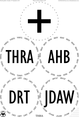
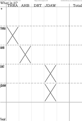
◊ Sat 10 Aug 2013 FTLoP 8th Anniversary Planning www.jdawiseman.com/2013/20130810_ftlop_8th_GlennElliott.pdf
Made by Glenn Elliott.
◊ Thu 18 July 2013 Doty’s Thirsty Third Thursdays’s Champagne www.jdawiseman.com/2013/20130718_ttt_champagne.pdf
(Rays never worked perfectly, and in July 2019 was removed from the code, a related effect being done with Droplets.)
◊ Wed 10 July 2013 DRT’s Emergency, but cancelled and replaced with beer. Planning www.jdawiseman.com/2013/20130710_emergency.pdf
◊ Thu 27 June 2013 Doty in London for Wimbledon and 1966s Review Planning www.jdawiseman.com/2013/20130627_1966_doty.pdf
The /Cochin-Bold font has gravitas.
The interesting element of Titles was [(D) {-0.09 Kern} (,) {-0.26 Kern} (W)].
Also, it was from this tasting that I started posting PNGs of the placemats in the organisation threads.
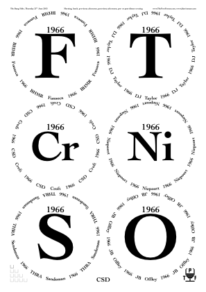
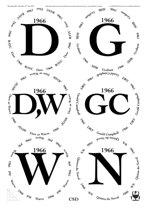
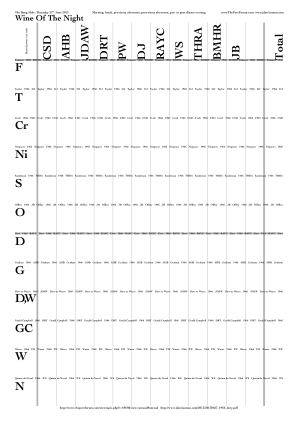
◊ Tue 04 June 2013 Griff Returns Down Under Review Planning www.jdawiseman.com/2013/20130604_crs.pdf
First use of RotationTitlesAboveBelowOverCirclearray: /RotationTitlesAboveBelowOverCirclearray {180 WithinTitles mul 1 Circlearrays length sub div} def.
Fonts: /TimesNewRomanPS-BoldMT and /Helvetica-Bold.
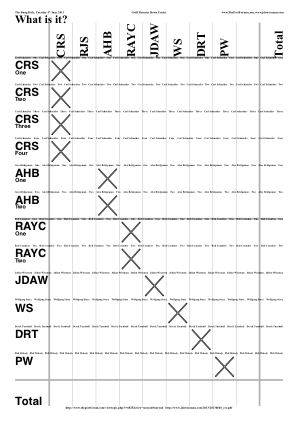
◊ 18–19 May 2013 Madeirathon Review Planning www.jdawiseman.com/2013/20130519_Madeirathon_GlennElliott.pdf …/20130518_Madeirathon_GlennElliott.pdf
Made by Glenn Elliott.
◊ Thu 19 May 2013 Thirsty Third Thursdays: The Riesling Lottery www.jdawiseman.com/2013/20130516_ThirstyThirdThursday.pdf
/GilliusADFNo2-Bold and /GoudyOldStyleT-Regular look good.
◊ Wed 24 Apr 2013 2007 LBVs, after the BFT Review Planning www.jdawiseman.com/2013/20130424_lbv2007s.pdf
◊ Tue 23 Apr 2013 The Dirty Dozen Review Planning www.jdawiseman.com/2013/20130423_dirty_dozen.pdf
Fonts: /Palatino-Roman and /Optima-Bold.
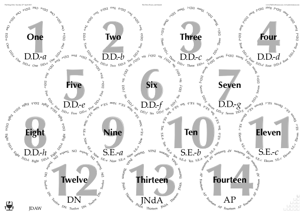
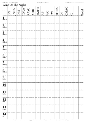
◊ Sat 20 Apr 2013 1983 Vintage Port Retrospective Planning www.jdawiseman.com/2013/20130420_1983a_GlennElliott.pdf …/20130420_1983b_GlennElliott.pdf
Made by Glenn Elliott.
◊ Thu 18 Apr 2013 Thirsty Third Thursdays: The Price is Right www.jdawiseman.com/2013/20130418_third_thursday.pdf
◊ Wed 17 Apr 2013 Oscar in London Planning Param’s www.jdawiseman.com/2013/20130417_oscar.pdf
Fonts: /Modern-Regular and /AvenirNextCondensed-DemiBold.
The latter is kinder to the eyes than the former.
◊ Tue 02 Apr 2013 1983-1985 Double Horizontal Review Param’s Planning www.jdawiseman.com/2013/20130402_1983_1985.pdf
Fonts: /Cochin-Bold and /BlueHighwayFreeCondensed.
◊ Fri 22 Mar 2013 Taylor vertical Review Param’s Planning www.jdawiseman.com/2013/20130322_taylor.pdf
Large Circlearrays array, from which other arrays and formatting computed.
There are similarities with placemats of and referenced in the Graham and Malvedos on 13 Nov 2012.
Fonts: /BookmanOldStyle, /Tahoma-Bold, /LiberateBold.
The variation in formatting was beautiful but dysfunctional, as such variation impedes colour comparison.
But any one of these four designs, with the Titles in plain sans-serif and the Overtitles in /LiberateBold, would be elegant, and should be repeated.
See PrePourRemoveDuplicatesByWithinTitles, which was coded following this tasting.
◊ Thu 21 Mar 2013 Thirsty Third Thursdays: “California versus France: Blind Smackdown” www.jdawiseman.com/2013/20130321_ThirstyThirdThursdays.pdf
A rare use of PaintBackgroundCode, and, even rarer, that containing a use of MakePathConnectingGlasses.
◊
Sat 09 Mar 2013
Velhíssimo Verdelho
![]() Review
www.jdawiseman.com/2013/20130309_Verdelho_GlennElliott.pdf
Review
www.jdawiseman.com/2013/20130309_Verdelho_GlennElliott.pdf
Made by Glenn Elliott.
◊ Wed 06 Mar 2013 Blind at short notice Review Planning www.jdawiseman.com/2013/20130306.pdf
Fonts: /TimesNewRomanPS-BoldMT and /LucidaSans-Demi.
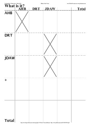
◊ Tue 26 Feb 2013 Ronnie Roots visits London Review Planning www.jdawiseman.com/2013/20130226_roots.pdf
In the six years between this tasting and this writing, my style has become sparser.
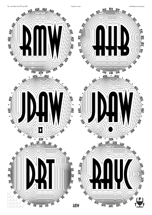
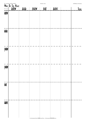

/CircletextFont /AsiaNormal def
/TitlesFont /AsiaThinBold def

/OutlineTitles true def
/OutlineTitlesInnerWidthWhite 7.2 def
/OutlineTitlesMultiplierWhite 0.875 def
◊ Thu 21 Feb 2013 Partly-blind 1970 horizontal: Chris Doty’s Thirsty Third Thursdays www.jdawiseman.com/2013/20130221_doty_1970_blind.pdf
/TitlesFont /HelveticaNeue-CondensedBold def
◊ Wed 20 Feb 2013 Alex’s Mystery Theme after the New Douro Tasting Review www.jdawiseman.com/2013/20130220_streatham.pdf
The variation in brightness was not clever. I had underappreciated the merits of consistency.
◊ Fri 15 Feb 2013 “Doty’s Triumphant Return” Review Planning www.jdawiseman.com/2013/20130215_doty.pdf
◊ Wed 06 Feb 2013 Some Churchill and some halves of Dow Bomfim Review Planning www.jdawiseman.com/2013/20130206_churchill_dow.pdf
(Rays never worked perfectly, and in July 2019 was removed from the code, a related effect being done with Droplets.)
◊ Sat 26 Jan 2013 CUTwC Dinner (T55, 2×SV99×3L) TNs www.jdawiseman.com/2013/20130126_cutwc.pdf
Decanter labels only, by /Names [ ] def.
◊ 18–20 Jan 2013 Extras for a trip to Portugal Review www.jdawiseman.com/2013/201301_greeks.pdf
Fonts: /AmerettoNormal and /AmerettoThinBold, with Greek letters in /Helvetica.
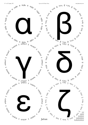
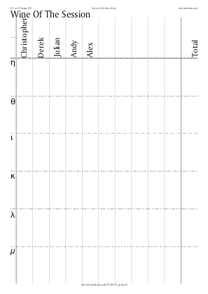
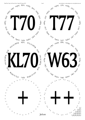
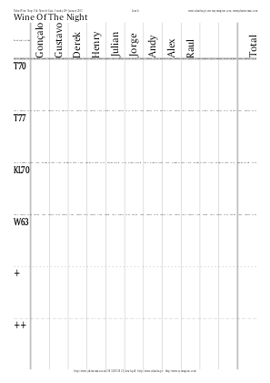
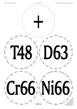
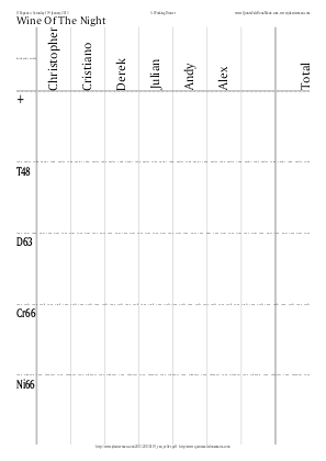
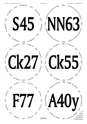
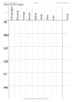

% Greek pages only:

/Greeks [
	/alpha /beta /gamma /delta /epsilon /zeta
	/eta /theta /iota /kappa /lambda /mu
	/nu /xi /omicron /pi /rho /sigma
	/tau /upsilon /phi /chi /psi /omega
] def  % /Greeks
/Circlearrays [
	Greeks {[
	exch dup dup length string cvs exch
	[exch {/Helvetica CurrentFontSize selectfont} exch]
	]} forall
] def  % /Circlearrays
/Titles [ Circlearrays {1 get} forall ] def
◊ Lunch, Sun 20 Jan 2013 Light lunch Review www.jdawiseman.com/2013/20130120_lunch.pdf
◊ Dinner, Sat 19 Jan 2013 A Working Dinner with Christiano Van Zeller Review www.jdawiseman.com/2013/20130119_van_zeller.pdf
◊ Lunch, Sat 19 Jan 2013 A Working Lunch with George Sandeman Review www.jdawiseman.com/2013/20130119_sandeman.pdf
◊ Fri 18 Jan 2013 With Five Symingtons Review www.jdawiseman.com/2013/20130118_five_plus_five.pdf
◊ Thu 17 Jan 2013 Dow magnums Review Planning www.jdawiseman.com/2013/20130117_dow_magnums.pdf
Fonts: /BookAntiqua-Italic, /HelveticaNeue-CondensedBold and /BookmanOldStyle.
◊ Thu 13 Dec 2012 The Unknown Shipper and His Peculiar Friends Review Param’s Planning www.jdawiseman.com/2012/20121213_bell.pdf
◊ Wed 05 Dec 2012 Borges muito velho and friends Review Planning www.jdawiseman.com/2012/20121205_old_wood.pdf
Fonts: /EdwardianScriptITC and /Futura-CondensedMedium.
◊ Mon 19 Nov 2012 The Hix Oyster & Chop House EC1M 6BN Review Planning www.jdawiseman.com/2012/20121119_hix_oyster_chop.pdf
The font, /PuritanSwash-Bold, was not such a good idea.
◊ Tue 13 Nov 2012 A Smattering of Graham and Malvedos Review Param’s Planning www.jdawiseman.com/2012/20121113_graham.pdf
Arrays in PermittedPackingStyles (since renamed to PackingStyles); and many parameters auto-computed from Circlearrays.
The formatting ‘convention’ was much used for verticals comprising a mixture of a shipper’s VPs and SQVPs.
But my opinion has shifted: the variation in brightness makes it harder to compare colours.
VPs were shown black, with the shipper name in the Belowtitles.
SQVPs were shown with InlineTitles being true, and the Quinta name in the Overtitles.
Variations on this had been used for the
Delaforce on 24 Apr 2012,
Fonseca on 04 Apr 2011, and
Malvedos on 22 Mar 2010.
◊ Tue 23 Oct 2012 A Trio of 1963s Review Planning www.jdawiseman.com/2012/20121023_1963.pdf
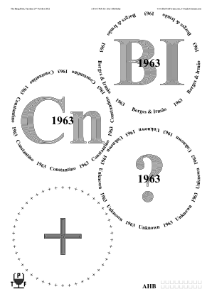

◊ Sat 20 Oct 2012 Blind in Los Angeles, 1 to 15 www.jdawiseman.com/2012/20121020_los_angeles.pdf
◊ Mon 15 Oct 2012 The Bung Hole, Delaforce 1958 and friends Review Planning www.jdawiseman.com/2012/20121015_Delaforce1958.pdf
Flowers in /Calibri-Bold; and the first use of TastingNotesCirclesBehind.
Documentation re code injection has code for dot below last character of “Bros”.
◊ Tue 09 Oct 2012 Blind, 1 to 6, in Portal Restaurant EC1M 4EH Review www.jdawiseman.com/2012/20121009_blind.pdf
◊ Mon 24 Sep 2012 Warre versus Fonseca Review Param’s Planning www.hallarn.com/placemats/120924_WarreFonseca.pdf
Placemats made by Phil Wakely, who included shipper-logo EPS elements.
◊ Tue 18 Sep 2012 Mostly Sandeman Vau Review Planning www.jdawiseman.com/2012/20120918_sandeman_vau.pdf
Fonts: /TrebuchetMS and /Garamond-Bold.
◊ Tue 04 Sep 2012 Blind and Mis-Guessed Review Param’s Planning www.jdawiseman.com/2012/20120904.pdf
Font = /IkariusADFStd-Bold; and
/ShapesStarsPointsAndStepsArray [ [7 2] dup [7 3] dup dup dup dup ] def.

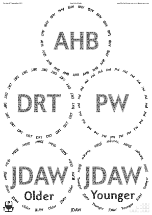
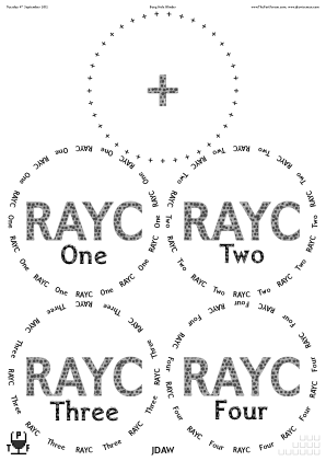
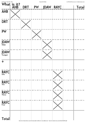
◊ Wed 25 July 2012 Olympic Years, ’48 to ’08, at the Portuguese Embassy Review Param’s Planning www.jdawiseman.com/2012/20120725_olympic.pdf
A complicated array in PermittedPackingStyles (since renamed to PackingStyles); and a rare use of FlightSeparationLines.
There was lots of code in the elements of Names to vary them between page types.
Since Sept 2013 this can be done more easily using the separate arrays NamesTastingNotes, NamesVoteRecorder, NamesStickyLabels, and NamesPlaceNames.
Fonts: /Baskerville-SemiBold and /LiberateBold.
Other than some decanter labels, the last use of FillTitles until January 2014.
◊ Tue 10 July 2012 A Blind Emergency Review Planning www.jdawiseman.com/2012/20120710_blind_emergency.pdf
Fonts: /FreebooterScript and /AccanthisADFStd-Bold.
Neither were an aesthetic success.
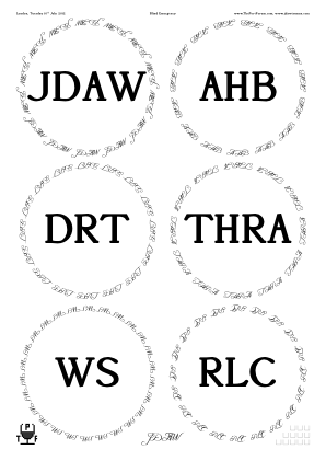
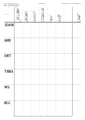
◊ Fri 15 June 2012 Dinner with Miguel Review www.jdawiseman.com/2012/20120615_evening.pdf
Font: /FranklinGothic-Medium.

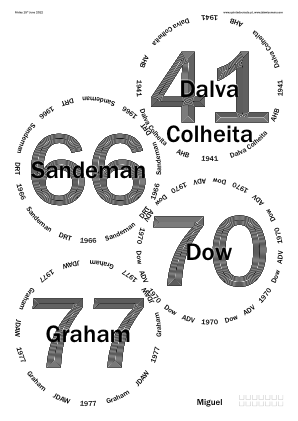
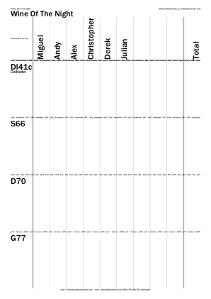
◊ Thu 14 June 2012 Some 1912s Review www.jdawiseman.com/2012/20120614_niepoort_1912.pdf
Font: /FranklinGothic-Medium.
◊ Wed 13 June 2012 Dinner at The Yeatman Review www.jdawiseman.com/2012/20120613_yeatman.pdf
Font: /FranklinGothic-Medium.
◊ Wed 13 June 2012 1955s at the Sandeman Lodge (originally to be at the Ferreira Lodge). Review www.jdawiseman.com/2012/20120613_ferreira_1955.pdf
Font: /FranklinGothic-Medium.
◊ Tue 12 June 2012 Graham at Bomfim Review www.jdawiseman.com/2012/20120612_bomfim_graham.pdf
◊ Mon 11 June 2012 Fonseca at Bomfim Review www.jdawiseman.com/2012/20120611_bomfim_fonseca.pdf
Fonts: /FranklinGothic-Medium and /QuillineScriptThin.
◊ Wed 06 June 2012 Farewell to our favourite waitress at the Bunghole Review Planning www.jdawiseman.com/2012/20120606_anait.pdf
Fonts: /Garamond-Bold and /CenturyGothic-Bold.
◊ Thu 24 May 2012 JDAW drinking Croft 2005 LBV near the Bunghole Planning www.jdawiseman.com/2012/20120524.pdf
It could be argued, and not wholly mischievously, that for one person and one Port, a placemat might be unnecessary. It could be argued.
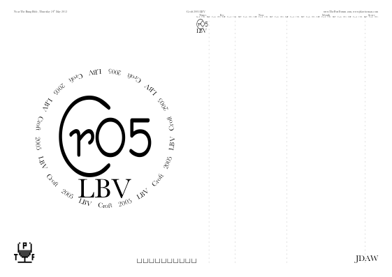
/Titles [
	[(C) {CurrentFontSize dup -0.48 mul exch 0.12 mul rmoveto} (r05)]
] def
% Uninteresting lines omitted
/CircletextFont /Baskerville         def
/TitlesFont     /BernieCondensedBold def
◊ Tue 15 May 2012 Horizontal of 1970 honouring Ronnie Roots Review Param’s Planning www.jdawiseman.com/2012/20120515_1970.pdf
(Rays never worked perfectly, and in July 2019 was removed from the code, a related effect being done with Droplets.)
◊ Wed 02 May 2012 Post-BFT with Johnny Symington and the Graham 1952 Single Harvest Tawny Review Param’s Planning www.jdawiseman.com/2012/20120502.pdf
The Titles in /TrebuchetMS-Bold (sans-serif, pleasingly weighted, with bright negative spaces) worked well, and worked well with Circlearrays in /Garamond-Bold.
◊ Tue 24 Apr 2012 Delaforce Vertical, 1960 to 2007 Review Param’s Planning www.jdawiseman.com/2012/20120424_delaforce.pdf
This was then the usual format for a vertical of VP and SQVP: (e.g., Graham and Malvedos on 13 Nov 2012).
But the variation in brightness makes it difficult to compare colours. Hence for this class of designs my enthusiasm has diminished.
Fonts: /BookmanOldStyle and /BookmanOldStyle-Bold.
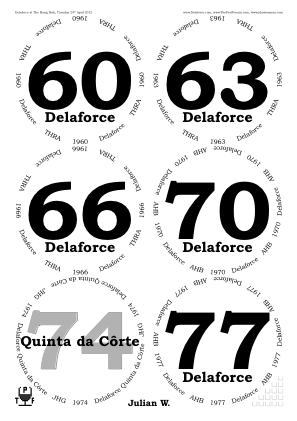
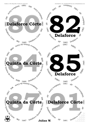
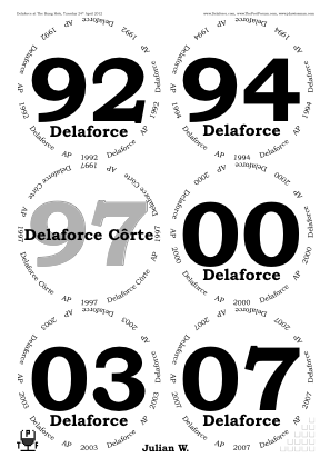
◊ Tue 17 Apr 2012 Six × 1966 Review Param’s Planning www.jdawiseman.com/2012/20120417_1966.pdf
◊ Wed 11 Apr 2012 A Small Blind Emergency Review Param’s Planning www.jdawiseman.com/2012/20120411_blind.pdf
Font = /Century
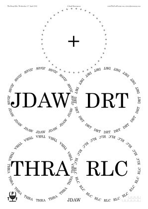
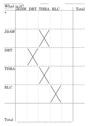
◊ Sat 31 Mar 2012 Roy’s Top 12 Tasting Planning www.jdawiseman.com/2012/20120331_Top12_GlennElliott.pdf
Made by Glenn Elliott.
◊ Thu 29 Mar 2012 The Birthday Boys, ruby then vintage Review Param’s Planning www.jdawiseman.com/2012/20120329_birthday.pdf
Striking variation in formatting within the placemats. With hindsight, such variation makes it more difficult to compare colours.
Fonts: /BookAntiqua-Bold and /Impact.
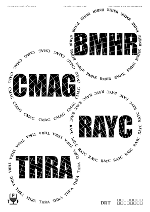
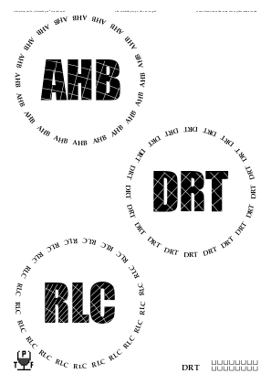
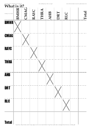
◊ Fri 23 Mar 2012 “The Reserve Ruby Taste Off” Planning www.jdawiseman.com/2012/20120323_ruby_GlennElliott.pdf
Made by Glenn Elliott.
◊ Thu 22 Mar 2012 JDAW’s oddments, being some unimpressive ports purchased in Paris Review Param’s Planning www.jdawiseman.com/2012/20120322.pdf
The abbreviation for Passadouro has since been decided to be “Ps”.
There might be merit in reusing, with better sizing control, the labelling of the three extras: “&” = “And”; “+” = “More”; “∞” = /infinity = “Much”.
◊ Wed 12 Mar 2012 Cynthia and Seven Blind Men Review Param’s Planning www.jdawiseman.com/2012/20120312_cynthia.pdf
◊ Sat 10 Mar 2012 “The Transcendental Terrantez Tasting” Review www.jdawiseman.com/2012/20120310_Terrantez_GlennElliott.pdf
Made by Glenn Elliott.
◊ Fri 02 Mar 2012 1980s in Leverkusen Review Planning www.jdawiseman.com/2012/20120302_1980.pdf
Rotate180AlternateNames; and font = /TrebuchetMS-Bold, which later become the default TitlesFont.
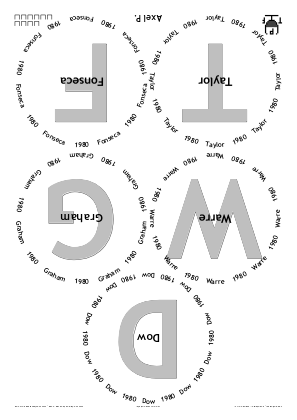
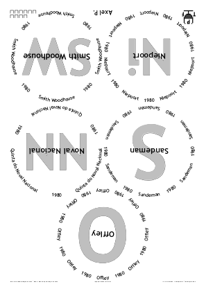
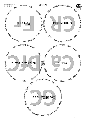
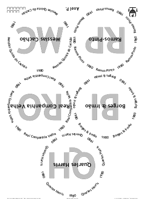
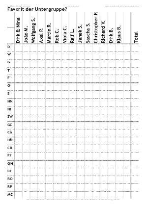
◊ Wed 29 Feb 2012 The Annual 29th February Leaping (2012) Review Planning www.jdawiseman.com/2012/20120229_leap_year.pdf
Font = /Georgia.
The final element of Titles is elegant: [/emdash /lozenge /emdash].
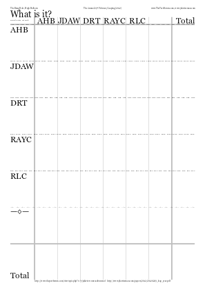
◊ Wed 22 Feb 2012 Jubilee (though some of the ‘Jubilee’ connections were tenuous) Review Planning www.jdawiseman.com/2012/20120222_jubilee.pdf
◊ Tue 14 Feb 2012 Valentine’s Day at El Vino’s Review Planning www.jdawiseman.com/2012/20120214_el_vino.pdf
An example of SideBySideGlassesTastingNotes.
Fonts: /LucidaSans and /LucidaSans-Demi.
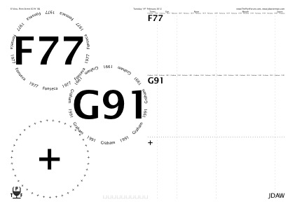
◊ Wed 08 Feb 2012 Blind at The Bung Hole Review Planning www.jdawiseman.com/2012/20120208_blind.pdf
First item of Circlearrays is [ [JDAW {-0.12 Kern} {SubscriptOn} (1) {SubscriptOff}] ], which had been preceded by /JDAW [(JDA) {-0.06 Kern} (W)] def.
◊ Tue 31 Jan 2012 A toast to Ko-ichi’s Retirement Review Planning www.jdawiseman.com/2012/20120131.pdf
Perhaps both OutlineTitles and Rays was too psychedelic?
(Rays never worked perfectly, and in July 2019 was removed from the code, a related effect being done with Droplets.)
◊ Mon 16 Jan 2012 Croft in The Bunghole Review Planning www.jdawiseman.com/2012/20120116_croft.pdf
Rotate180AlternateNames.
Fonts: /LucidaSans, /LucidaSans-Demi, and /LucidaSans-Italic.
◊ Tue 10 Jan 2012 The Bunghole: a splendid trial Review Planning www.jdawiseman.com/2012/20120110.pdf
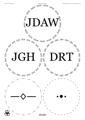
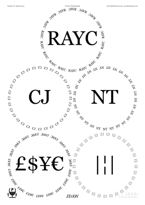
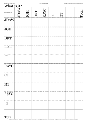
/Circlearrays [
	Names {[ exch ]} forall pop
	[  [/sterling    ($)   /yen   /Euro]  ]
	[  [/bar         /brokenbar 1 index]  ]
	[  [/emdash        /lozenge 1 index]  ]
	[  [/periodcentered /bullet 1 index]  ]
	7 2 roll
] def  % /Circlearrays

/TitlesFont     /Georgia   def
/CircletextFont TitlesFont def

/InlineTitles false def
◊ Tue 03 Jan 2012 1977 at The Crusting Pipe Review Planning www.jdawiseman.com/2012/20120103_1977.pdf
A pleasing format for a horizontal. /TitlesFont /LucidaSans-Demi def, and
/InlineTitles true def
(with /InlineTitlesMaxNumberContours 12 def, which was then its default value).
Every item of Abovetitles was [(1) {-0.12 Kern} (977)],
being a version of “1977” kerned by 0.12×the font size, and shown unadorned,
so /InlineAbovetitles false def.
But perhaps next time the CircletextFont should be a serif font, rather than /LucidaSans.
Perhaps, perhaps not.
◊ Tue 20 Dec 2011 Vintage Port at The Crusting Pipe (W70, F70, T70, D83, GC85) Review Planning www.jdawiseman.com/port/20111220.pdf
Font: /LucidaBright-Demi.
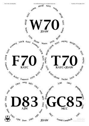
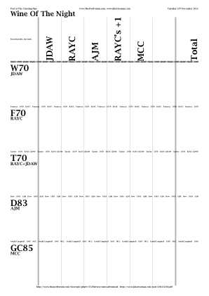
◊ Thu 15 Dec 2011 The Unknown Shipper and His Peculiar Friends, at The Bell Review Planning www.jdawiseman.com/port/20111215_bell.pdf
◊ Wed 30 Nov 2011 Dead Cow & Vintage Port (Ck67, Mz67, Ck75, T77, W77, Mz85) Review Planning www.jdawiseman.com/port/20111130.pdf
◊ Thu 17 Nov 2011 RAYC’s birthday, a triple-vertical of GC + SW + QH Review Planning www.jdawiseman.com/port/20111117_gc_sw_qh.pdf
This tasting caused the /Array base style to be a valid value in the parameter now called PermittedPackingStyles (which has since been renamed to PackingStyles).
◊ Wed 16 Nov 2011 SushiNorth at TCP with QH77 + Ch85 Review Planning www.jdawiseman.com/port/20111116.pdf
◊ Tue 08 Nov 2011 Port With Star Quality ★ ☆ Review Planning www.jdawiseman.com/port/20111108_star_quality.pdf
A compound string can include code that makes a path. Maybe this was excessive. Also, the first use of cork-display pages.
◊ Tue 11 Oct 2011 {D, F, G, T} × {’63, ’66, ’70, ’77} Review Planning www.jdawiseman.com/port/20111011.pdf
Fonts: /AmericanTypewriter, /AmericanTypewriter-Condensed, and /AmericanTypewriter-CondensedBold.
The backgrounds are in the code as vector images; as of 2020–2025 it isn’t clear from what font they were derived.
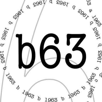
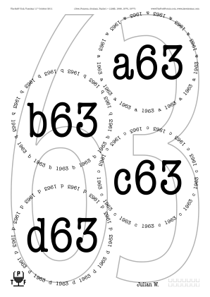
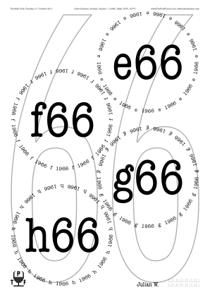
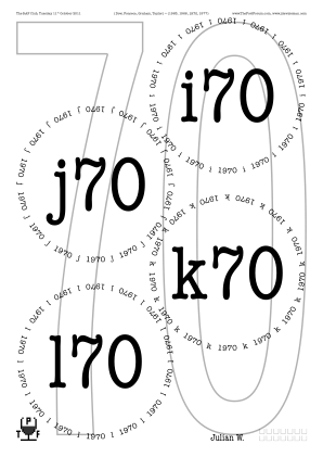
◊ Thu 22 Sep 2011 Made for a shipper www.jdawiseman.com/port/20110922_quevedo.pdf
◊ Mon 19 Sep 2011 A Ragbag of Good Port, at the Steak Exchange Review Planning www.jdawiseman.com/port/20110919_ragbag.pdf
Fonts: /TrebuchetMS-Bold and /TrebuchetMS.
◊ Thu 01 Sep 2011 G-man in San Francisco Review www.jdawiseman.com/port/20110901_san_francisco.pdf
First placemats in which the PDF has a Table of Contents, entailing the first use of ExternalLinks.
Fonts: /Cambria and /Cambria-Bold.
The latter is not beautiful at the size of the Titles.

◊ Fri 19 Aug 2011 Emergency Drinking at The Crusting Pipe Review Planning? www.jdawiseman.com/port/20110819.pdf
Fonts: /TimesNewRomanPSMT, /ArialRoundedMTBold, /TimesNewRomanPS-ItalicMT.
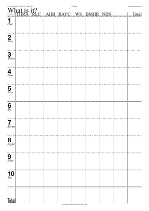
◊ Mon 08 Aug 2011 DB98 + TTF86 in Paris DB98 TTF86 www.jdawiseman.com/port/20110808_paris.pdf
An example of SideBySideGlassesTastingNotes.
In the early 2019 code, an approximation to this look can be made with PostScript fragments resembling:
/SideBySideGlassesTastingNotes true def
/TitlesFont      /HelveticaNeue-CondensedBold def
/OvertitlesFont  /Baskerville-Bold def
/InlineTitles true def
/InlineTitlesMaxNumberContours 10 def
/ColourSchemeTitles     /MidGrey def
/ColourSchemeOvertitles /Black def
◊ Mon 08 Aug 2011 Port from the Nineteen Nineties, at The Steak Exchange Review Planning www.jdawiseman.com/port/20110808_1990s.pdf
Non-constant RaysLinesPerGlass.
Anyway, Rays never worked perfectly, and in July 2019 was removed from the code, a related effect being done with Droplets.
◊ Tue 19 July 2011 With Richard Mayson www.jdawiseman.com/port/20110719.pdf
First inclusion of decanting-notes pages.
Font = /Optima-Bold.
◊ Thu 07 July 2011 Anything But Vintage II (the Warm-up), at The Crusting Pipe Review Planning www.jdawiseman.com/port/20110707_non-vintage.pdf
Font = /GoudyOldStyleT-Bold.
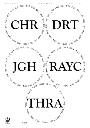
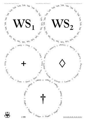
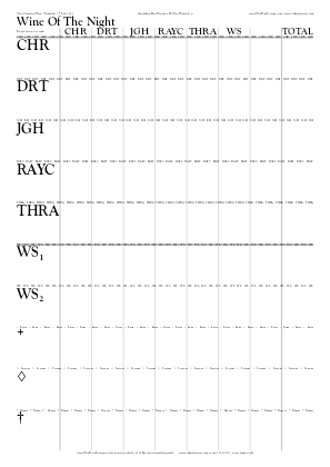
◊ Tue 28 June 2011 Three Blind Men, in The Crusting Pipe Review www.jdawiseman.com/port/20110628_three_men.pdf
My preference would have been a little lighter and simpler, but was asked “… tasting in London tomorrow evening …. Please make your finest … blind tasting one-page placemat using as many new features as possible.”
This was the version of the code in which the former single array of Subtitles was split into Abovetitles, Belowtitles, and Overtitles.
(Rays never worked perfectly, and in July 2019 was removed from the code, a related effect being done with Droplets.)
◊ Thu 23 June 2011 The Quest for Phil W’s new house port Review Planning www.jdawiseman.com/port/rayc/20110623_rayc.pdf
Placemats made by RAYC.
◊ Thu 09 June 2011 A test of The Steak Exchange (T48, Ck67, Dl70, G91) Review Planning www.jdawiseman.com/port/20110609.pdf
Whatever weird folly caused me to choose the font /BlackwoodCastle, it won’t happen again.
And it is rare to see SideBySideGlassesTastingNotes in /Portrait.
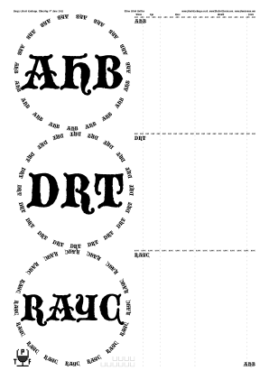
◊ Fri 13 May 2011 Sandeman Vertical Review Planning www.jdawiseman.com/port/20110513_sandeman.pdf
Fonts: /Optima-Regular and /Didot-Bold — for the two-digit years the latter worked very well.
◊ Fri 06 May 2011 London welcomes g-man, blind Review Planning www.jdawiseman.com/port/20110506.pdf
Fonts: /AmazeNormal and /FusiCondensedBold.
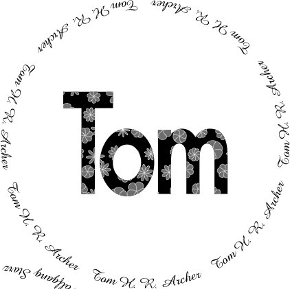
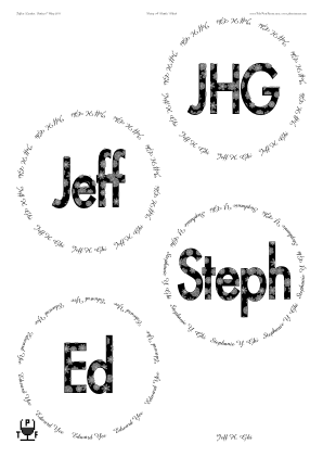
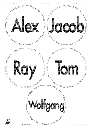
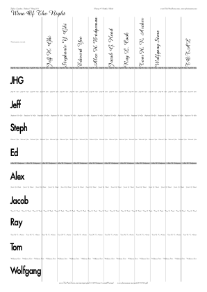
◊ Sat 23 Apr 2011 The Port Society launches on St George’s Day Review Planning www.jdawiseman.com/port/20110423_saint_george.pdf
The /Lautenbach-Normal font was an error. It’s horrible.
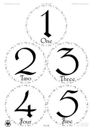
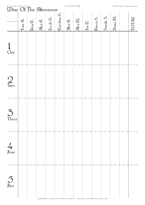
◊ Sat 16 Apr 2011 In Stouby, Denmark www.jdawiseman.com/port/20110416.pdf
As only two Names present, likely incomplete and hence not used.
◊ 04 Apr 2011 Fonseca Guimaraens, and some Fonseca Review Planning www.jdawiseman.com/port/20110404_fonseca.pdf
It was from these placemats that the log page was shown by default—the log-page code having been present since 20th January 2008.
See the comment on formatting in the Malvedos tasting on 13 Nov 2012.
Fonts: /Optima-Regular, /TimesNewRomanPS-BoldMT, and /Optima-Bold.
◊ Sun 03 Apr 2011 Pre-FG warm-up session Review Planning www.jdawiseman.com/port/20110403.pdf
Small variation of formatting by name, a feature later removed from the code.
Font = /EdenMills-Bold.
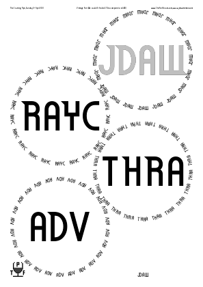
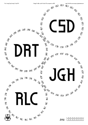
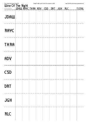
◊ Tue 15 Mar 2011 Blind at El Vino’s Review www.jdawiseman.com/port/20110315.pdf
An example of SideBySideGlassesTastingNotes.
Font = /Harrington.

◊ Thu 10 Mar 2011 Port Worth Sharing, blind at The Crusting Pipe Review Planning www.jdawiseman.com/port/20110310.pdf
Font = /Didot-Bold.
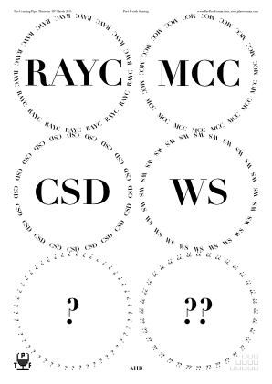
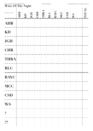
◊ Thu 24 Feb 2011 Review www.jdawiseman.com/port/20110224_colheita.pdf
And as had been foretold by the ancients, a madness came upon the land. And the madness was ugly; the madness was inconsistent; and the madness was gratuitous.
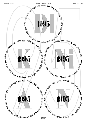

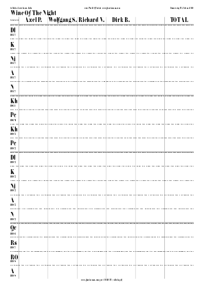
/TitlesFont /FloralCondensedNormal def
◊ Tue 22 Feb 2011 Half Bottles Review Planning www.jdawiseman.com/port/20110222.pdf
Font = /Didot-Bold.
Its thin horizontals are too thin, nonetheless, an elegant font.
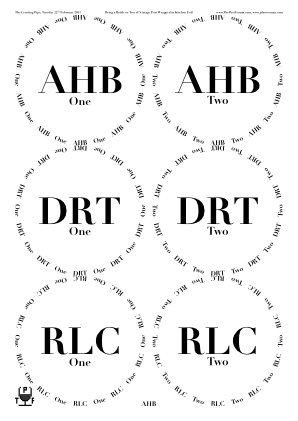
◊ Sun 06 Feb 2011 Emergency Tasting at The Crusting Pipe (Df66, Cr66, TV67, SW83) Review Planning www.jdawiseman.com/port/20110206.pdf
An example of SideBySideGlassesTastingNotes, the image being of the page of a left-hander.
◊ Sat 29 Jan 2011 Tasting-note sheets for use at the CUTwC Dinner www.jdawiseman.com/port/20110129_cutwc.pdf
◊ Wed 26 Jan 2011 LBV Old and New, Part 2 Review Planning www.jdawiseman.com/port/20110126_lbv.pdf
This was not my finest moment.
Fonts: /TimesNewRomanPS-BoldMT and /Arial-BoldMT.
◊ Wed 29 Dec 2010 www.jdawiseman.com/port/20101229_blind.pdf
◊ Sat 25 Dec 2010 www.jdawiseman.com/port/20101225.pdf
◊ Sun 19 Dec 2010 Emergency in Wokingham & Paris Review www.jdawiseman.com/port/20101219_emergency.pdf
An example of SideBySideGlassesTastingNotes.
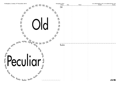
/TitlesFont /FusiCondensedNormal def
/NamesFont  /FusiExtendedBold    def
◊ Thu 16 Dec 2010 The Unknown Shipper and His Peculiar Friends at The Bell Review Planning www.jdawiseman.com/port/20101216.pdf
◊ Fri 10 Dec 2010 1955 Horizontal in Leverkusen, Köln www.jdawiseman.com/port/20101210_leverkusen_1955.pdf
Fonts: /Baskerville-Bold, /Baskerville-Italic, and /Baskerville.
In summer 2011, the scaling of the pre-pour pages was much improved, such that the content became bigger and the wasted space became less.
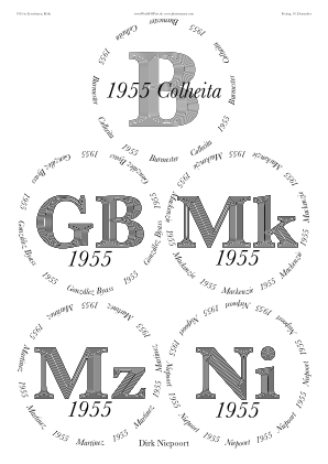
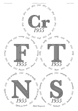
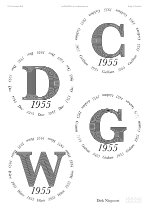

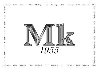
◊ Tue 07 Dec 2010 www.jdawiseman.com/port/20101207.pdf
◊ Thu 02 Dec 2010 Two Ports, total cost ≤£30 www.jdawiseman.com/port/20101202_gbp15.pdf
From Sep 2010 to May 2011 the software had a FoodChoices page type. This seems to be the only time it was used, and is mentioned in issue #163.
No review thread: perhaps this tasting was cancelled.
◊ Fri 12 Nov 2010 Niepoort vertical in Leverkusen, Köln Review www.jdawiseman.com/port/20101112_niepoort.pdf
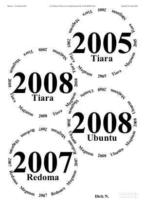
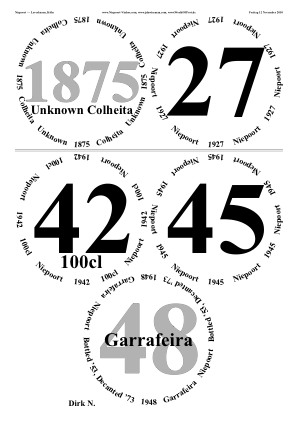
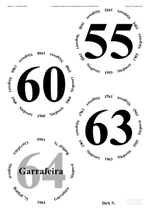
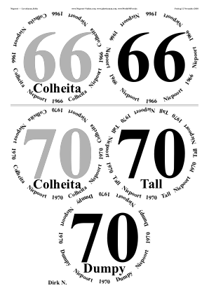
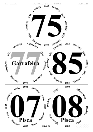
◊ Tue 12 Oct 2010 55s at 55 Review Planning www.jdawiseman.com/port/20101012_1955.pdf
My enthusiasm for the OutlineTitles has greatly diminished. YMMV.
◊ Tue 28 Sep 2010 www.jdawiseman.com/port/20100928_crasto.pdf
◊ Mon 27 Sep 2010 www.jdawiseman.com/port/20100927_noval.pdf
◊ Tue 07 Sep 2010 Dow and Quinta da Senhora da Ribeira at The Crusting Pipe. Review Planning www.jdawiseman.com/port/20100907_dow.pdf
There’s so much wrong with this.
The dense black is ugly.
The inconsistency between the black and gray probably impeded colour comparison.
And thirteen glasses fit perfectly well on a single /A3.
But if the look is rather 1960s, not wholly inappropriate.
Fonts: /Garamond-Bold and /HelveticaNeue-CondensedBold.
/ColourSchemeTitles {Circlearrays WithinTitles get 1 get (Dow) eq {/Black} {/MidGrey} ifelse} def, and, mutatis mutandis, ColourSchemeSubtitles.
◊ Sep 2010 Generic blanks www.jdawiseman.com/port/201009_blanks.pdf
◊ Thu 26 Aug 2010 Blind at TCP (Df85, W70, QH77, Cá85, Ck75, S82) Review Planning www.jdawiseman.com/port/20100826.pdf
Fonts: /Baskerville-Bold and /Handwriting-Dakota.
◊ Fri 13 Aug 2010 www.jdawiseman.com/port/20100813_quevedo.pdf
◊ Thu 05 Aug 2010 Anything But Vintage (I) Review Planning www.jdawiseman.com/port/20100805_abv1.pdf
◊ Thu 15 July 2010 Blind Tasting of 1970 Vintage Port Review Planning www.jdawiseman.com/port/20100715_1970_GlennElliott.pdf
Made by Glenn Elliott.
◊ Fri 09 July 2010 The F-Plan II, in Utrecht Review Planning www.jdawiseman.com/port/20100709_fonseca.pdf
◊ Mon 21 June 2010 1982 Horizontal at The Crusting Pipe. Review Planning www.jdawiseman.com/port/20100621_1982.pdf
First inclusion of vote-recorder pages.
And /TitlesFont /BasqueThinNormal def.
(Rays never worked perfectly, and in July 2019 was removed from the code, a related effect being done with Droplets.)
◊ Wed 19 May 2010 1960 Horizontal at The Bowler Review Planning www.jdawiseman.com/port/20100519_1960.pdf
Fonts: /Cochin-Bold, /Helvetica-Bold, and /Cochin, for the parameters since renamed to, respectively, CircletextFont, TitlesFont, and BelowtitlesFont.
◊ Fri 14 May 2010 1978 Horizontal at The RAF Club Review Planning www.jdawiseman.com/port/20100514.pdf
(Rays never worked perfectly, and in July 2019 was removed from the code, a related effect being done with Droplets.)
◊ Thu 06 May 2010 BMHR at an election party in Hove Review Planning www.jdawiseman.com/port/20100506_hove.pdf
◊ Thu 06 May 2010 Blind Port from Election Years (on day of UK General Election) Review Planning www.jdawiseman.com/port/20100506_blind.pdf
Fonts: /BookAntiqua, /BookAntiqua-Bold, /BookAntiqua-Italic.
Images are for a right-hander, and for a left-hander.
/SideBySideGlassesTastingNotes true def

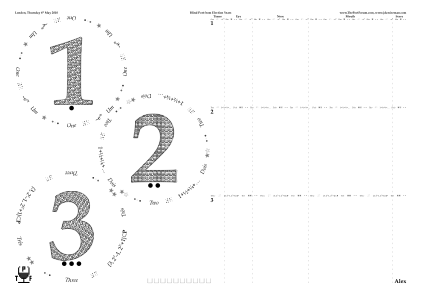
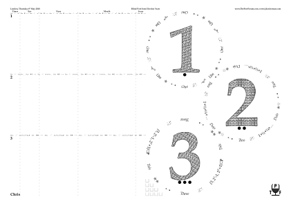
◊ Fri 30 Apr 2010 Two Brits on Tour Planning www.jdawiseman.com/port/20100430_BritsOnTour_GlennElliott.pdf
Made by Glenn Elliott.
◊ Mon 19 Apr 2010 Blind at TCP Review Planning www.jdawiseman.com/port/20100419.pdf
Fonts: /BookAntiqua-Italic; /BookAntiqua; /BookAntiqua-Bold.
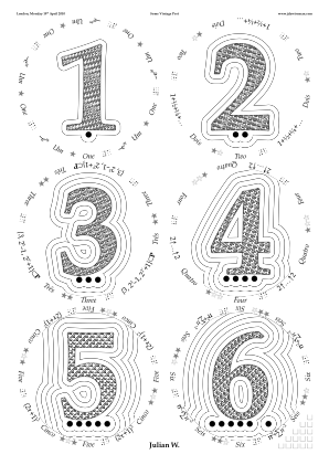
◊ Sat 17 Apr 2010 Warre II (1945 to 1985), in Sussex Review www.jdawiseman.com/port/20100417_warre.pdf
Excessively coloured Rays.
Anyway, Rays never worked perfectly, and in July 2019 was removed from the code, a related effect being done with Droplets.
◊ Fri 16 Apr 2010 Pre-Warre Exercises Review www.jdawiseman.com/port/20100416.pdf
An example of SideBySideGlassesTastingNotes, with elegant use of /InlineTitlesMaxNumberContours 2 def (subsequently becoming the default).
Fonts: /TimesNewRomanPS-BoldMT and /HelveticaNeue-Bold.
◊ Sat 10 Apr 2010 Whiskies from the Scotch Malt Whisky Society www.jdawiseman.com/port/20100410_whisky.pdf
Tested: the placemats work with barley as well as grape.
Fonts: /TimesNewRomanPS-BoldMT and /AmericanTypewriter-Bold.
And a feature later retired from the code: /Rays {Circlearrays WithinTitles get 2 get (Speyside) ne} def.
◊ Mon 22 Mar 2010 Graham’s Malvedos Vertical at The RAF Club Review Planning www.jdawiseman.com/port/20100322_malvedos.pdf
First use of pre-pour pages (though with a Penrose tiling since removed from code).
This was for a while the canonical format for a vertical comprising a mixture of VP and SQVP: see the Smattering of Graham and Malvedos tasting for links.
But the variation in darkness impedes colour comparison: I am now less keen.
Fonts: /TimesNewRomanPSMT; /Optima-Bold; /TimesNewRomanPS-ItalicMT.
◊ Mon 22 Mar 2010 The Graham’s Vertical (G80 and G85) Review Planning www.jdawiseman.com/port/20100322_graham.pdf
An example of SideBySideGlassesTastingNotes.
Fonts: /TimesNewRomanPSMT; /Optima-Bold; /TimesNewRomanPS-ItalicMT.
◊ Wed 17 Mar 2010 Emergency, ¾ flawed Review Planning www.jdawiseman.com/port/20100317.pdf
An example of SideBySideGlassesTastingNotes, the image being of the page of a left-hander.
Font = /TimesNewRomanPS-BoldMT.

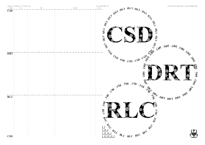
◊ Tue 16 Mar 2010 1970: A Near-Minimal Horizontal T70 KL70 www.jdawiseman.com/port/20100316_1970.pdf
An example of SideBySideGlassesTastingNotes.
Fonts: /TimesNewRomanPS-BoldMT and /Antiqua101ThinBold.
◊ Tue 09 Mar 2010 Bring A Bottle to TCP Review Planning www.jdawiseman.com/port/20100309.pdf
Font = /DukeThinBold.
The first placemats with named pages: … /PAGELABEL pdfmark.
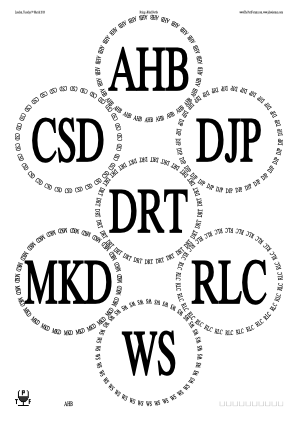
◊ Tue 23 Feb 2010 Vesuvio Vertical, 1989 to 2008 Review Planning www.jdawiseman.com/port/20100223_vesuvio.pdf
Page-ordering parameters used to split into two flights.
The design is horrendously baroque. Do not repeat this. Indeed, don’t even look — avert your delicate gaze. Shield your eyes.
◊ Thu 11 Feb 2010 Oscar Quevedo in London Review Planning www.jdawiseman.com/port/20100211_oscar_blind.pdf
Too many glasses per /A4, and excessively complicated Circlearrays.
Indeed, an aesthetic disaster.
Please do not repeat my errors: once was more than enough.
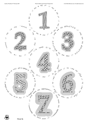
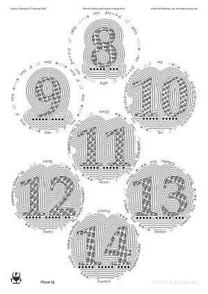
◊ Mon 01 Feb 2010 Bring a Bottle to the Library, with BMHR Review Planning www.jdawiseman.com/port/20100201.pdf
The visual effect is cool, but not necessarily appropriate for a port tasting.
Done with TitlesFont = /BasqueNormal; OutlineTitlesInnerWidthWhite = 6; OutlineTitlesMultiplierWhite = 0.9375; OutlineTitlesMaxNum = 96; and OutlineTitlesTargetTotalDistanceProportionRadius = 1.04.
◊ Mon 01 Feb 2010 Bring a Bottle to the Library Review Planning www.jdawiseman.com/port/20100201_without_bmhr.pdf
◊ Sat 30 Jan 2010 Decanter labels for the CUTwC Dinner www.jdawiseman.com/port/20100130_cutwc.pdf
Fonts: /LucidaBright-Demi and /LiberateNormal.
In October 2014 the decanter labels were reparameterised and recoded.
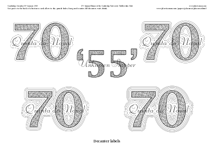
◊ Tue 05 Jan 2010 Four at TCP (O70, Cr70, W77, N85) Review Planning www.jdawiseman.com/port/20100105.pdf
TitlesFont = /Onyx; also /AmazeItalic.
Former aggressively kerned.
And ugly.
Ugliness is never praiseworthy.
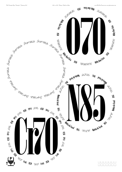
◊ Thu 17 Dec 2009 The Unknown Shipper and His Peculiar Friends, at The Bell Review Planning www.jdawiseman.com/port/20091217.pdf
◊ Fri 13 Nov 2009 Port To Share (Ck60, D63, D80, Fr63, F70, GC70, G63, G70, Mz60, Mg63) www.jdawiseman.com/port/20091113_share.pdf 1966 versus 1967 www.jdawiseman.com/port/20091113_1966_1967.pdf Review Planning
◊ Wed 28 Oct 2009 Portal Restaurant (Pç77, T77, Mg77, T63, D83) Review www.jdawiseman.com/port/20091028.pdf
◊ Fri 23 Oct 2009 Au Relais des Buttes-Chaumont, Paris 19ème (KL70, Ch85, T85, Qv07) Review Planning www.jdawiseman.com/port/20091023.pdf
◊ Wed 14 Oct 2009 Fonseca Emergency Review www.jdawiseman.com/port/20091014.pdf
Font = /TimesNewRomanPS-BoldMT.
◊ Fri 02 Oct 2009 Warre Vertical, 1947 to 2007, at The RAF Club Review Planning www.jdawiseman.com/port/20091002_warre.pdf
For a pure vertical, without a need for VP-SQVP distinctions, the elegance is enhanced by the slender font /Geo112ThinBold.
The cursive “Warre” was in /AmazeItalic; the Circlearrays in /AmerettoCondensedBold.
This design was revisited for the Warre vertical on 06 Oct 2021.
◊ Tue 15 Sep 2009 Demonstration page www.jdawiseman.com/port/20090915_acetate_example.pdf
The parameter (later renamed to) MirrorPagesGlasses was intended to allow printing onto the underside of acetate.
As of August 2024, it has not been used live: this was merely a test example.
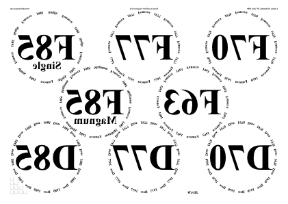
◊ 11–12 Sep 2009 DRT in Paris Review www.jdawiseman.com/port/20090912b.pdf …/20090912.pdf …/20090911_paris.pdf
First inclusion of place-name pages.
And an example of SideBySideGlassesTastingNotes.
Font = /BeagleBold.
◊ Tue 08 Sep 2009 A Small 1994 Horizontal Review Planning www.jdawiseman.com/port/20090908_1994.pdf
Fonts: /Cochin-Bold and /Courier-Oblique.
The complicated element of Circlearrays = “[ [{/ReversionFont CurrentFontName def /Courier-Oblique CurrentFontSize selectfont /ThisGray currentgray def 0.5 setgray} (AHB) {ThisGray setgray ReversionFont CurrentFontSize selectfont}] (1994) ]”.
◊ Thu 30 July 2009 FTLoP 4th Anniversary Planning www.jdawiseman.com/port/20090730_ftlop_4th_GlennElliott.pdf
Made by Glenn Elliott. The standard abbreviation of Quevedo is now ‘Qv’, and that of Porto Rocha is ‘Rc’.
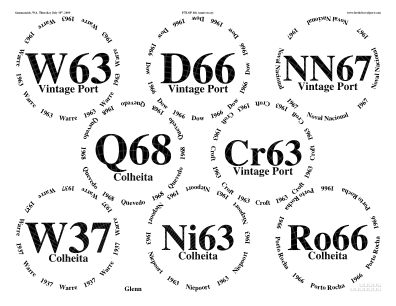
◊ Tue 21 July 2009 Eighties Night at TCP Review Planning www.jdawiseman.com/port/20090721_eighties.pdf
First inclusion in the code, invisible to output, of the error-tracing code parameterised by DeBugLevel.
The name-dependency in the formatting is no longer possible: /OutlineTitles {ThisName Titles WithinTitles get eq} def.
Fonts: /Palatino-Bold and /Chalkboard-Bold.
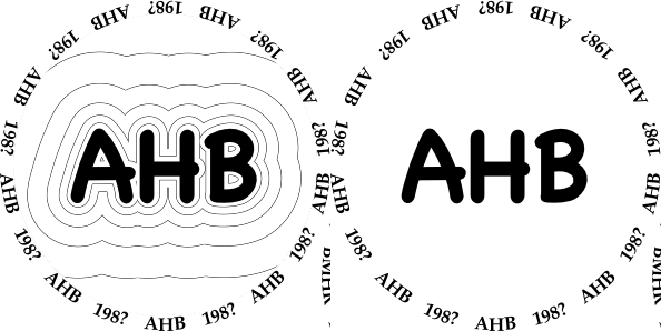
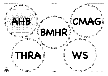
◊ Tue 07 July 2009 Farewell to New York Review Planning www.jdawiseman.com/port/20090707.pdf
The abbreviation for Cockburn was later standardised to “Ck”.
In December-2022 parameters, layout specified with /PackingStyles [ /PostsAndLintel ] def.
◊ Mon 29 June 2009 The Best Mature Ports to Drink Today, at Quinta do Noval www.jdawiseman.com/port/20090629_noval.pdf
Fonts: /Palatino-Bold; /ArialRoundedMTBold; /Harrington.
◊ Sat 27 June 2009 Lunch at Quinta S. Luiz www.jdawiseman.com/port/20090627_luiz.pdf
◊ Fri 26 June 2009 Sandeman Lunch at Quinta do Seixo www.jdawiseman.com/port/20090626_seixo.pdf
Fonts: /Palatino-Bold, /ArialRoundedMTBold, /Harrington.
◊ Fri 26 June 2009 Decent Drinking Port at Quinta do Passadouro www.jdawiseman.com/port/20090626_passadouro.pdf
It used to be possible to vary, by NameNum, the Titles etc and their decoration.
That is, each person would get placemats that varied by more than just the name on the page.
The parameter enabling this, VariesByNameTitlesAboveBelowOverOrnaments, became too difficult to reconcile with the growing number of page types, so after a long time of not working properly, was removed from the code in early 2019.
Fonts: /Palatino-Bold, /ArialRoundedMTBold, and /Harrington.
Elegantly kerned: [(T) {-0.1 Kern} (48)].
◊ Sat 13 June 2009 Fonseca Minivertical (for JDAW, MAW, AMK) F66 F70 F85 www.jdawiseman.com/port/20090613_fonseca.pdf
An example of SideBySideGlassesTastingNotes.
Fonts: /BookmanOldStyle, /Optima-Bold, and /EdwardianScriptITC.
◊ Thu 11 June 2009 The Leaky Bottle Review Planning www.jdawiseman.com/port/20090611_blind.pdf
From this version the naming of internal parameters was standardised, so that parameters could refer to the likes of SheetNum, WithinTitles, and WithinPage.
◊ June 2009 Spares for Portugal www.jdawiseman.com/port/200906_non-roman.pdf
/alpha /beta /gamma …;
/alef /bet /gimel …;
/acyrillic /becyrillic /vecyrillic ….
◊ Thu 28 May 2009 1977 Mini-Horizontal (Cr, W, Df, Gd, SW, Fr) Review Planning www.jdawiseman.com/port/20090528_1977_jes.pdf
Placemats made by JES.
◊ Fri 15 May 2009 Some Port for JB’s Class Review www.jdawiseman.com/port/20090515.pdf
Font = /TimesNewRomanPS-BoldMT/
◊ Sat 18 Apr 2009 Classic years of Taylor, Fonseca, Warre Review www.jdawiseman.com/port/20090418_tfw.pdf
Tacky to mention prices. Could have Kerned the ‘T48’.
Fonts: /Palatino-Bold and /ArialRoundedMTBold.
◊ Fri 20 Mar 2009 Emergency Port (GC80, GC97, Rr95, Rr99) Review Planning www.jdawiseman.com/port/20090320_emergency.pdf
Font = /ArialRoundedMTBold.
◊ Fri 13 Feb 2009 A Vertical of Graham in Brooklyn Review Planning www.jdawiseman.com/port/20090213_graham.pdf
Fonts: /BellMTItalic and /Helvetica-Bold.
◊ Sun 01 Feb 2009 FTLoP Gala: Port, ≤1970 www.jdawiseman.com/port/20090201_Gala_Port_GlennElliott.pdf Planning Planning
Made by Glenn Elliott.
◊ Sat 31 Jan 2009 FTLoP Gala: 1977 versus 1985 www.jdawiseman.com/port/20090131_Gala_1977_1985_GlennElliott.pdf
◊ Sat 31 Jan 2009 FTLoP Gala: 1994s www.jdawiseman.com/port/20090131_Gala_1994_GlennElliott.pdf
◊ Fri 30 Jan 2009 FTLoP Gala: Madeira www.jdawiseman.com/port/20090130_Gala_Madeira_GlennElliott.pdf
◊ Fri 30 Jan 2009 FTLoP Gala: Colheitas www.jdawiseman.com/port/20090130_Gala_Colheita_GlennElliott.pdf
◊ Fri 30 Jan 2009 1970 Horizontal at The RAF Club Review Planning www.jdawiseman.com/port/20090130_1970.pdf …/20090130_setup.pdf
Fonts: /Baskerville-Italic, /Baskerville-Bold, and /Baskerville.
The first use of InlineTitles.
The spelling error is regretted.
And the instructions were assembled in Illustrator, using the font /HoneyScript-SemiBold.
◊ Thu 15 Jan 2009 The Crusting Pipe: W70, TV67, MG85, F63, and a South African Review Planning www.jdawiseman.com/port/20090115.pdf
The font, /SnowtopCaps, is ghastly.
And /BernieItalic, though less awful, isn’t worth reusing.

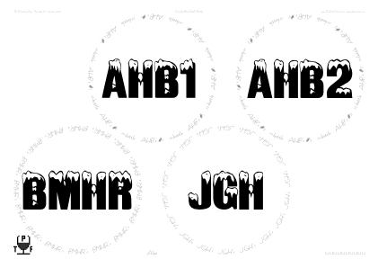
◊ Sun 04 Jan 2009 Emergency Port, Round 2 Review Planning www.jdawiseman.com/port/20090104.pdf
If less is more, then these two, 3–4 Jan 2009, are just less. Over-ornately awful.
◊ Sat 03 Jan 2009 Emergency Port www.jdawiseman.com/port/20090103.pdf
◊ Fri 26 Dec 2008 Some Fonseca Review Planning www.jdawiseman.com/ftlop/20081226.pdf
Both fonts, /ScottsdaleNormal and /BernieBoldItalic, were horrible.
◊ Thu 18 Dec 2008 The Unknown Shipper and His Peculiar Friends, at The Bell Review Planning www.jdawiseman.com/ftlop/20081218.pdf
Fonts: /TimesNewRomanPS-BoldMT, /Palatino-Italic, /AppleBraille-Pinpoint6Dot.
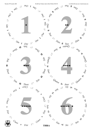
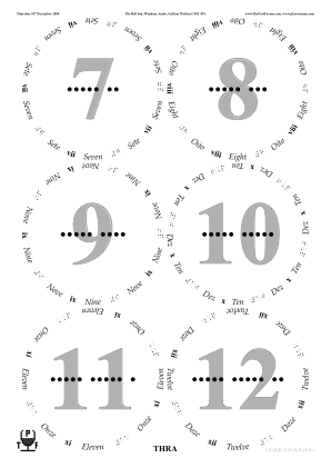
◊ Thu 20 Nov 2008 Old and Blind, at Portal Review Planning www.jdawiseman.com/ftlop/20081120.pdf
◊ Fri 14 Nov 2008 Planning www.jdawiseman.com/ftlop/20081114_danish.pdf
◊ Fri 07 Nov 2008 Old & Odd in New York Review Planning www.jdawiseman.com/ftlop/20081107_old_odd.pdf
The font, /MarkerFelt-Wide, was a gratuitous error.
◊ Sat 18 Oct 2008 A wonderful tasting of old Madeira, at Triomphe, 49 West 44th St, New York TNs www.jdawiseman.com/ftlop/20081018_madeira.pdf
Fonts: /Optima-Regular and /Cochin-Bold.
I failed to Kern between the ‘T’ and ‘e’ of ‘Terrantez’.
◊ Fri 17 Oct 2008 Ferreira in New York Review Planning www.jdawiseman.com/ftlop/20081017_ferreira.pdf
Six glasses on A4, /GaiaElegant (later renamed /PostsAndLintel).
Font = /Palatino-Bold.
First appearance of parameter PermittedPackingStyles (later renamed to PackingStyles).
◊ Thu 09 Oct 2008 www.jdawiseman.com/ftlop/20081009_bell.pdf
Fonts: /Palatino-Bold and /HelveticaNeue-CondensedBold.
◊ Wed 08 Oct 2008 The Cockburn Vertical, 1908 to 2007 Review Planning www.jdawiseman.com/ftlop/20081008_cockburn.pdf
Fonts: /GillSans with /Palatino-BoldItalic.
Fonts good, though I’m not a fan of the ‘1’ of /GillSans.
Also would have looked better with CircletextsTweakSize, which was coded almost 5½ years later.
◊ Sat 13 Sep 2008 ’83 and ’85 Double Horizontal in Brooklyn Review Planning www.jdawiseman.com/ftlop/20080913.pdf
Bad design — too much clutter.
Fonts: /BeagleCondensedBold and /Cochin-Bold.
◊ Fri 18 July 2008 AJRH visits JDAW for a 1997 mini-horizontal SV EV O www.jdawiseman.com/ftlop/20080718_1997.pdf
An early version, imperfectly successful, of SideBySideGlassesTastingNotes.
◊ Fri 11 July 2008 Old, Odd & Great, in Portal Restaurant Review Planning www.jdawiseman.com/ftlop/20080711_made_by_drt.pdf
A garish production of DRT. And 10.3 megabytes.
◊ Wed 02 July 2008 Utrecht, Blind 1977s Review Planning www.jdawiseman.com/ftlop/20080702_1977_blind.pdf Believed not used: …/20080702_1977.pdf
Something went wrong with the clipping.
◊ Wed 25 June 2008 After Cricket at The Crusting Pipe: ports costing ≤£15 Review Planning www.jdawiseman.com/ftlop/20080625_cricket.pdf
Font = /TimesNewRomanPS-BoldMT.

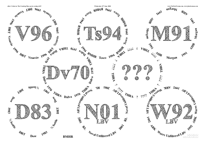
◊
Fri 20 June 2008
Review
Planning
First Anniversary: La Sirène, 558½ Broome Street, NY 10013-1508
www.jdawiseman.com/ftlop/20080620_jdaw.pdf
First Anniversary: The Roots’ Martinez 1994 and Cockburn’s Ruby
www.jdawiseman.com/ftlop/20080620_roots.pdf
First Anniversary: BMHR’s Taylor 2001 LBV
www.jdawiseman.com/ftlop/20080620_bmhr.pdf
First Anniversary: AHB’s Martinez 1985
www.jdawiseman.com/ftlop/20080620_ahb.pdf
First Anniversary: DRT’s Vesuvio 1994
www.jdawiseman.com/ftlop/20080620_drt.pdf (picture added using Illustrator)
◊ Tue 20 May 2008 Blind 1980 Horizontal in Wokingham Review Planning www.jdawiseman.com/ftlop/20080520_wokingham_blind.pdf Sighted, unused: …/20080520_wokingham.pdf
◊ Thu 08 May 2008 www.jdawiseman.com/ftlop/20080508_oo.pdf
◊ Thu 08 May 2008 www.jdawiseman.com/ftlop/20080508_lbv.pdf
The text-distortion routine TransformPath was removed from the code in May 2011.
◊ Thu 10 Apr 2008 Blind at The Crusting Pipe (G83, TV95, BBR83=W83, Mz55, W91) Review Planning www.jdawiseman.com/ftlop/20080410_blind.pdf
File naming changed from using hyphens (“-”) to using underscores (“_”).
Braille numbers, printed on a non-Braille printer: this makes no sense.
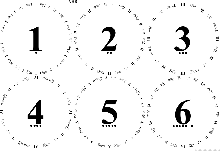
◊ Thu 03 Apr 2008 Roy Hersh’s Madeira Roadshow Planning www.jdawiseman.com/ftlop/20080403-madeira.pdf
The feature CirclifyTitles was a very bad idea, and was removed from the code in May 2011.
PostScript programmers wanting this code for some other purpose should peruse transformpath.ps.
◊ Sat 29 Mar 2008 1977 Horizontal at Dovetail Review Planning www.jdawiseman.com/ftlop/20080329_1977.pdf
“Ca” should have been “MsC”.
Font = /Helvetica-Bold.
Design too cluttered; redundancy between Titles and Overtitles: this design no longer liked.
◊ Thu 14 Feb 2008 Valentine’s Day 1970s in Brooklyn Review Planning www.jdawiseman.com/ftlop/20080214-1970.pdf
What was I thinking? Just gratuitously gaudy. Also reprehensible is the redundancy between the Titles and the Overtitles (as they have since been renamed). Please, readers, do not do this. Additionally, Messias Cachão is ‘MsC’—more awfulness.
◊ Sat 09 Feb 2008 Croft Vertical in Boston, 1896 to 1970 Review Review Planning www.jdawiseman.com/ftlop/20080209-croft.pdf
Fonts: /TimesNewRomanPS-BoldMT, /TimesNewRomanPS-ItalicMT, and /TimesNewRomanPSMT.
◊ Sat 02 Feb 2008 1963s in Sussex, and a decanting experiment Review www.jdawiseman.com/ftlop/20080202.pdf
A very worthwhile decanting experiment. My conclusion “But the results were close enough for there to be general agreement that the decanting method makes, at most, very little difference.” AHB’s conclusion: “… the differences were not pronounced enough to worry me at all in the future. I can now relax and be less obsessive about the way that I decant and hope others decant — now it just means that I can choose the easiest thing to do.”
The abbreviation for Cockburn was later standardised to “Ck”, and for Croft to “Cr”.
◊ Mon 28 Jan 2008 The ‘Deeper Underground’ 1966 Horizontal at The Crusting Pipe Review Planning www.jdawiseman.com/ftlop/20080128-1966.pdf …/20080128-holding-bay.pdf
The design was functional, but flawed.
I now dislike the redundancy between the parameters since renamed to Titles and Overtitles.
And I also dislike the aesthetics, though acceptable by the standards of 2008.
Documentation re code injection has code for dot below last character of “Bros”.
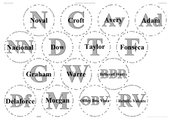
After March 2010 this ‘holding bay’ kludge handled in the code as pre-pour sheets.
◊ Sat 19 Jan 2008 The ‘Up North’ 1985 Horizontal Review www.jdawiseman.com/ftlop/20080119-1985.pdf
The abbreviation for Croft was later standardised to “Cr”; and for Martinez to “Mz”.
Font = /TimesNewRomanPS-BoldMT.
◊ Thu 03 Jan 2008 Colheitathon in Manhattan Review Planning www.jdawiseman.com/ftlop/20080103-colheitathon.pdf
It was too ornate, too baroque. And the standard abbreviation for Feist was later standardised to ‘Fs’, and that for Dalva to ‘Dl’.
◊ Jan 2008 DRT’s 1970 “One-Man-Marathon-Horizontal-Off-line” Review www.jdawiseman.com/ftlop/200801-drt-1970.pdf
◊ 26–27 Dec 2007 The ‘Emergency’ 1985 Horizontal Review Planning www.jdawiseman.com/ftlop/20071226-emergency.pdf
The /Harrington font still looks good.
But I’m not proud of the redundancy between the parameters since renamed to Titles and Overtitles.
Quinta do Infantado’s standard abbreviation is now “In”.
◊ Tue 11 Dec 2007 Vesuvios and 1994s in Bistro Citron Review Planning www.jdawiseman.com/ftlop/20071211-citron.pdf
The abbreviation for Croft was later standardised to “Cr”.
◊ Sat 08 Dec 2007 Graham Vertical in Munich TNs: 1927 ’45 ’48 ’55 ’63 ’70 ’75 ’77 ’83 ’85 ’91 ’94 ’97 2000 ’03 www.jdawiseman.com/ftlop/20071208-grahams.pdf
Event arranged by Axel Probst.
Eight glasses is too many on /A4; seven too many in this layout.
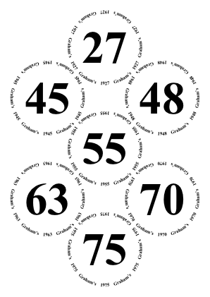
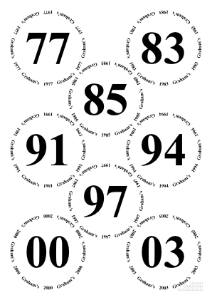
◊ Thu 06 Dec 2007 Taylor versus Fonseca: 1963, ’70, ’77, ’83, ’85, ’92, ’94. Review www.jdawiseman.com/ftlop/20071206-semi-blind.pdf Not used: …/20071206-fonseca-taylor.pdf
It might be that the commercial organiser of the tasting had different arrangements, so these were unused—I don’t recall. The sighted placemats definitely weren’t used. But this was the tasting at which the author sought New-York Port-drinking company, and found it.
◊ Mon 12 Nov 2007 www.jdawiseman.com/ftlop/20071112-ahb-asia.pdf
Silly.
◊ Wed 31 Oct 2007 Alex B. in Los Angeles Review Planning www.jdawiseman.com/ftlop/20071031-alexbandyv.pdf …/20071031-alexbandyv-mystery.pdf
First appearance of water boxes (having been requested during the tasting at Bistro Citron on 29th October 2007).
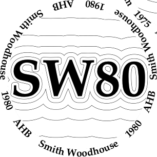
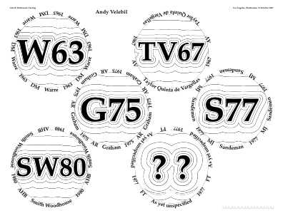
◊ Tue 30 Oct 2007 www.jdawiseman.com/ftlop/20071030-derekt.pdf
Silly.
◊ Mon 29 Oct 2007 Alex B. at Bistro Citron Review Planning www.jdawiseman.com/ftlop/20071029-citron.pdf
First appearance of HeaderLeftText etc (later renamed to HeadersLeft etc).
The use of FillTitles was ghastly.
◊ Fri 12 Oct 2007 Planning www.jdawiseman.com/ftlop/20071012-larsf.pdf
Font = /TimesNewRomanPS-BoldMT.
Example element of Titles is [(N20) /aring].
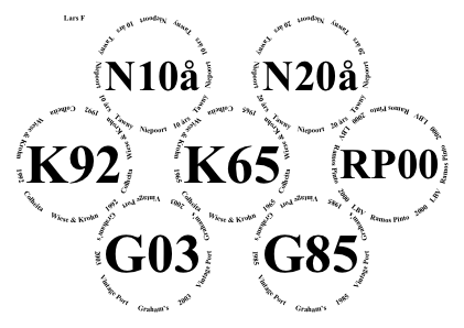
◊ Sat 01 Sep 2007 Fonseca Vertical, 1920 to 2000, in St. Helens Review Planning www.jdawiseman.com/ftlop/20070901-conky.pdf Silly colour version: …/20070901-conky-colour.pdf T-Shirt version: …/20070901-t-shirt.pdf
The font /WieynkFrakturZier-Bold for the ‘F’s was an error.
The psychedelic feature, used in the colour version, was removed from the code in September 2009.
It should never have been there.
◊ Wed 18 July 2007 “The Port Forum Offline #1” Review Planning www.jdawiseman.com/ftlop/20070718-crustingpipe-a3.pdf
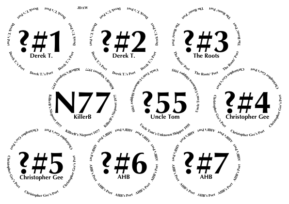
/TitlesFont /Optima-Bold def
◊ Sat 09 June 2007 Derek T. in St. Helens (D77, QH77, SW77, W80, W95LBV) Review www.jdawiseman.com/ftlop/20070609-derek-t.pdf
Error: “C” should have been “Cá”.
◊ Wed 30 May 2007 www.jdawiseman.com/ftlop/20070530-derek-t.pdf
First use of OutlineTitles.
Perhaps this tasting was postponed until 9 June 2007?
◊ Wed 04 Apr 2007 www.jdawiseman.com/ftlop/20070404-Axel1970-plain.pdf …/20070404-Axel1970-flamboyant.pdf
The standard abbreviation for Niepoort, even in 2007, was “Ni”; for Croft was “Cr”.
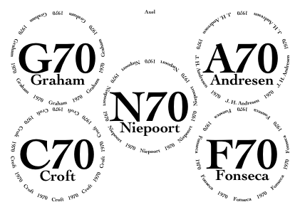
◊ Sat 31 Mar 2007 “Al-C” (ACC), “Al-K” (ARK), and “Al-D” (DRT) Review Review www.jdawiseman.com/ftlop/20070331-DerekTurnbull.pdf
Perhaps the first time the software had been used to make placemats for a tasting not attended by JDAW.
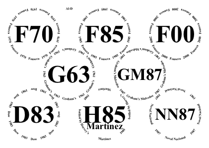
◊ Sat 17 Mar 2007 1985s in Sussex Review www.jdawiseman.com/ftlop/20070317-1985.pdf
At least one bottle from THRA via a thread on FTLoP.
Bad design — revoltingly cluttered.
Fonts: /BodoniSvtyTwoITCTTBookIta, /Helvetica-Bold, /HelveticaNeue-CondensedBold.
◊ Fri 16 Mar 2007 Cockburn and Taylor Review Review www.jdawiseman.com/ftlop/20070316-cockburn.pdf
An early version of the TN page code, the name appearing at the top. And the /Cochin-Bold font still looks good.
The cork of the Cockburn “believed 1950’s” said Cockburn 1960. So not perfect, but not bad.
In 2007 the abbreviation for Cockburn was “C”. In late 2011 there was discussion, others preferring “Ck”. I tried “exerting a little parental authority here: no. Cockburn had a century of being the most prestigious and highly-priced port, and for that reason is awarded the single letter. The records are very clear about the former (and perhaps future) relative prestige of this name.” But no, the consensus was against me: the standard abbreviation became “Ck”.
◊ Tue 11 Jul 2006 Nacional 1962, 1980, 1985 Review www.jdawiseman.com/port/20060711_nacional.pdf
The code that made this was 906 lines.
For comparison, the version of 3rd January 2026 is 17.7× longer at 16,060 lines, partly because it has fifteen page types (/Glasses, /TastingNotes, /PlaceName, /PrePour, /VoteRecorder, /DecantingNotes, /Accounts, /CorkDisplay, /NeckTags, /DecanterLabels, /BottleWrap, /StickyLabels, /OneCircle, /Empty, /DistillerLog), and partly because it has many controls and decorative possibilities.
Font = /TimesNewRomanPS-BoldMT.
◊ Sat 05 Nov 2005 In Sussex: Taylor and Warre Review www.jdawiseman.com/port/20051105_taylor_warre.pdf
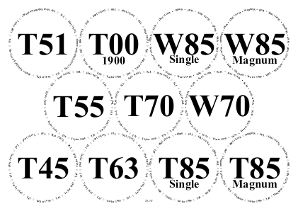
This PDF made by re-distilling the original PostScript, as the original PDF had not been retained. It is possible that the used placemats had slightly different people.
Far too many glasses on /A4.
Fonts: /TimesNewRomanPS-BoldMT, /TimesNewRomanPSMT.
Some Ports magnificent. Alas not the Taylor 1851, the genuineness of which is no longer without doubt (per page 554 of the first edition of Port Vintages, or p604 of the second edition).
◊ Sat 09 Apr 2005 A boys’ evening before a wedding Review www.jdawiseman.com/port/20050409_pre-wedding.pdf
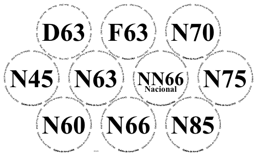
◊ Thu 21 Oct 2004 In Manhattan: three bottles www.jdawiseman.com/port/20041021_F77F85C85.pdf
Croft = “C”!? Yet still, these matters had not been settled.
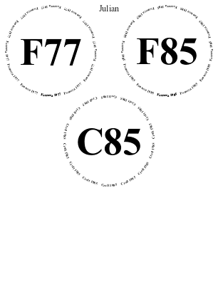
◊ Sat 03 Apr 2004 Noval in Fulham Review www.jdawiseman.com/port/20040403_noval.pdf
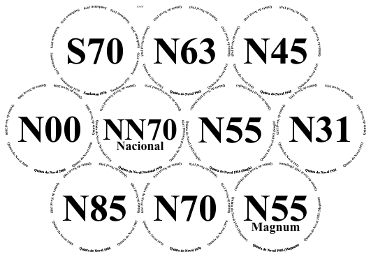
◊ Sat 20 Mar 2004 In Wimbledon: three bottles Review www.jdawiseman.com/port/20040320_wimbledon.pdf
The page was guillotined down the middle. Croft = “C”!? These matters had not yet been settled.
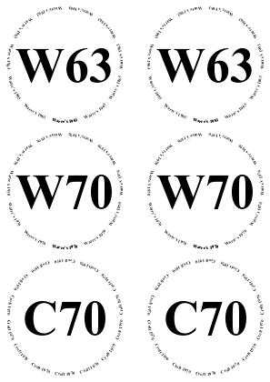
◊ Sat 30 Nov 2002 In Fulham: Sandemans, and 1970s Review www.jdawiseman.com/port/20021130_Sandeman_1970s.pdf
A draft of these placemats was made using Adobe Illustrator, about three weeks before the event. (The Illustrator file was converted to PDF in 2015.) Placemats for earlier events were also made in Illustrator. But the used placemats were made in PostScript. So this seems to have been the event at which placemats switched from being artisanal to being industrial.
Font = /TimesNewRomanPS-BoldMT.
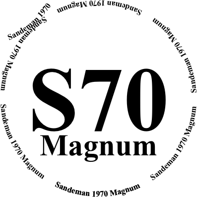
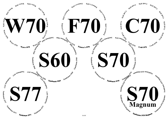
◊ Sat 12 Oct 2002 Chez RKA: excellent bottles Review www.jdawiseman.com/port/20021012_RKA_Taylor.pdf …/20021012_RKA_Graham.pdf
Before the software: made using Adobe Illustrator, with the two pages in separate files. N.B., two magnums!
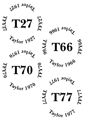
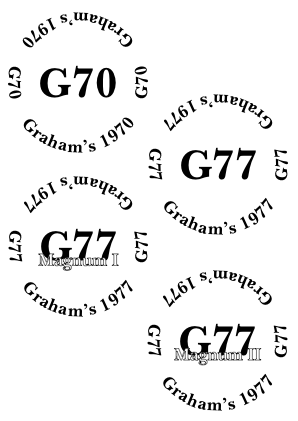
◊ Sat 13 Apr 2002 In Fulham: {Dow, Graham, Taylor} × {1980, 1983, 1985} Review www.jdawiseman.com/port/20020413_D_G_T_80_83_85.pdf
Before the software: made using Adobe Illustrator. (The Illustrator file was converted to PDF in 2015.)
The names of the people are in the wrong place. Perhaps the names were guillotined.
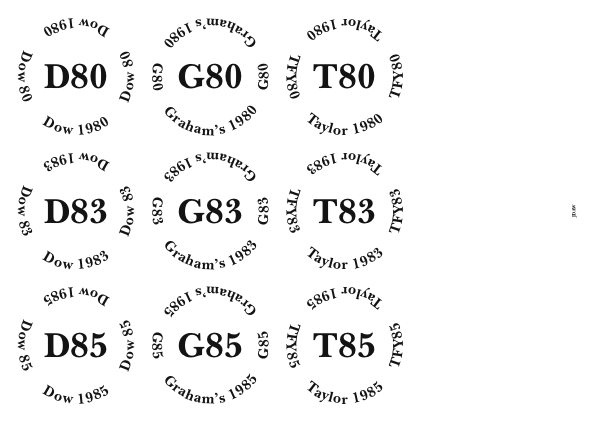
◊ Sat 12 May 2001 In Sussex: Taylor, Noval, Graham. Review www.jdawiseman.com/port/20010512_Taylor.pdf …/20010512_Noval_Graham.pdf
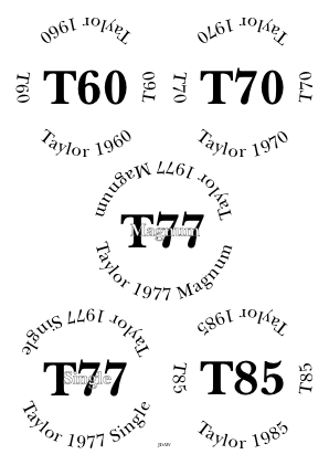
Before the software: made using Adobe Illustrator, with the two pages in separate files. (The Illustrator files were converted to PDF in 2015.) And abbreviating Quinta do Noval to a ‘Q’ is slightly embarrassing.
This design can be nearly replicated in the May-2024 software using the following parameters.
/Circlearrays [
	[ (Taylor 1960)  (T60) ]
	[ (Taylor 1970)  (T70) ]
	[ (Taylor 1977 Magnum) ]
	[ (Taylor 1977 Single) ]
	[ (Taylor 1985)  (T85) ]
] def
/Titles [ (T60)  (T70)  (T77)  (T77)  (T85) ] def
/Belowtitles [ () () () () () ] def
/Overtitles [ ()  ()  (Magnum)  (Single)  () ] def

/ThePortForumIconPlacement /None def
/HeadersLeft [] def  /HeadersCenter [] def  /HeadersRight [] def

/PackingStyles [ /Diamonds ] def
/WaterBoxes /None def

/CircletextFont /Baskerville def
/TitlesFont     /Baskerville-Bold def

/AbovetitleMaxFontSizeProportionTitles 33 90 div def
/ExclusionAnnulusProportionInnerRadiusTitlesAboveBelow 0.1917 def

/InlineTitles false def   /InlineOvertitles true def

/CircletextsTweakSize false def
/CircletextMaxFontSizeMayBeSlightlyExceeded false def
/CircletextFontSize 33 def
/CircletextsMaxCopies 2 def

/NamesFontSize 9 def
◊ ¿Sat 23 Aug 1997? www.jdawiseman.com/port/19970823.pdf
The found Postscript file was last modified 17 August 1997. Not remembered whether this tasting happened, nor, if it did, it was as guessed to be held on the following Saturday. I just don’t know. And possible guests have been asked, who also have no memory of such a tasting. So perhaps this file was only a doodle.
Postscript file converted to PDF in May 2019, after minor modifications such as updating font names and setting the page size. Self-evidently this PostScript is not general-purpose placemat software; instead it’s a collection of custom graphics.
But, all that said, the old-school typewriterness of the GC85 has a creaky charm. Maybe it could be reused, perhaps with its top and bottom rows resembling “--GC85----GC85--…”. (And, November 2025, code has been written, and then used and not used on 13 Nov 2025.)
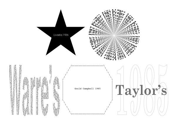
For tastings in 1988, 1989, 1990, the vintages being ≥1955 and mostly ≤1977, various placemats were made using (memory slightly fails) either Illustrator or FreeHand. These were lost in a hard-disk crash during 1990: the lesson about backups was thoroughly learnt. From 1990 until 2001 tastings were infrequent.
A Grace for a Port Tasting A4, 8½″×11″; Review
Te inuocamus, Liber Pater, ut nobis adsis qui id quod nunc bibemus dum profertur omnem ad gradum curauisti. te enim praesente uuae clarissimae leuissimis manibus carptae, te praesente pressae in uinum feruerunt. tu quoque adsis, o Siluane, qui durissimum corticem dedisti cuius puro in amplexu, tot per annos nullo calore, nullo frigore conturbatum dormiret. adeste igitur, di immortales, et concedite ut his uinis hodie ita ut uolebant auctores fruamur. Nunc est bibendum. |
Thee we invoke, Liber Pater: be present now, as you were at every step when what we are about to drink was made. For under your care the finest grapes were picked by gentle hands; under your care they were trodden and turned to wine. Be present too, Silvanus, for you gave of the long-lasting cork, in whose clean embrace the wine has slept for many years, disturbed by no excess of heat or cold. Come, Immortal Gods, and grant that we may enjoy these wines as their makers intended. Now is the time to drink! |
| Main index | Top | About author |